Analyzing Price movement comparison for you
(Edited)
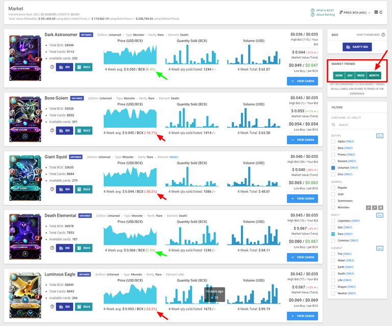
Yesterday we gave a tip about how to compare present prices to historical prices.
Today we released a small change where we analyse the prices for you.
So in the case above we chose MONTH in the "Market Trends" on https://peakmonsters.com/market
The number next to 4 week average gives you the math of how the PRESENT DAY price compares to the 4 week average price.
Maybe that will assist a few people in recognizing price movement in cards and also perhaps in finding cards they may want to buy.
Check it out on https://peakmonsters.com/market
0
0
0.000
This will help me a lot. Thanks!
Awesome feature. So, when the number of the average 4 weeks is a red minus percentage, prices went up compared to the average? Like with the Grenadier, who just spiked recently and now shows -39% for the average 4 week price?
@flauwy
Yeah for a buyer red is a negative thing.
So you'll see the low price is 2.644 and we are saying the average was 1.596 in a month... Therefore it changed 40%
HOW THIS IMPACTS BIDS
Just a reminder it's hard to find prices as low as what the averages tell you because that means they were bought and often they are bought through BIDS... so this is yet another pitch for BIDS.
If you really want the best prices possible consider making bids. And maybe use the price averages to help you inform your bids. If no one in the last month has sold a card below a certain cost why are you making a bid for that low?
Nice enhancements! PeakMonsters is increasingly becoming the market for those who want the most data and powerful features to get the best deals!
The 4 weak average price is a nice addition. It got me thinking about ways to show additional price information on the historical price chart. For example, you could draw a thin dashed line for the 4-week average. And perhaps dots at the current date for the bid/market/sell prices. Not sure whether this would work visually. Oftentimes have to try it to know.
I like that. I think it would be nice to have one big graph instead of 3 small ones. Perhaps we would need to drop the quantity graph and then superimpose the volume and price graph together. Or maybe just the ability to open a bigger more complex graph that has some filters on it. But all that would require us finding a plugin for some code to use I suppose. I guess if we work more on price history stuff then older price history may be the first thing to work on.
cc @asgarth