My Entry For The Splinterlands Art Contest
Hey,
Today I decided to spend some time and particiapte in this week's Splinterlands Art Contest.
In my youth I have spent hundreds of hours in Photoshop and Cinema4D, trying to become good at Graphicdesign and Animation. At the time I was a designer for spraylogos.de, a now defunct website which offered HL1&2 spraylogos for it's customers.
As life often has it, you end up in a totally different direction, but wish you would have atleast pursuited it a little more (atleast as a hobby).
Knowing that I wasn't anywhere near as good as I thought I was back then, I'm now trying to get back into the flow and learn more about this interesting topic. I think especially in these realms of social media and sharing content, it is beneficial if you know atleast the basic stuff of designing your own things (thumbnails, logos etc.)
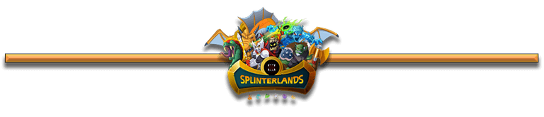
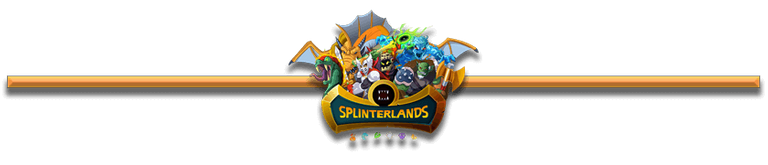
These are the two slightly different versions that I came up with. It is a pretty simple design for a blog divider. The only real difference is, that the last one has a slightly lower stroke opacity, which makes it look just a little more subtle.
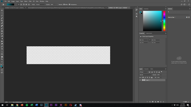
It isn't really magic to do one of these, so I'll quickly describe how to, if you want to give it a go yourself:
- Open Photoshop or any other design program of your choice.
- Create a new file with roughly these dimensions: 840x180 pixel
- Pick the rectangle selection tool to give the desired basic shape of your divider.
- Fill with any color/gradient of your choice (best is to use a new layer for that)
- Add anything else you want to be visible (like the Splinterlands logo for example)
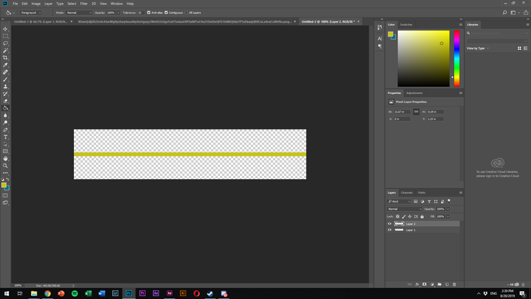
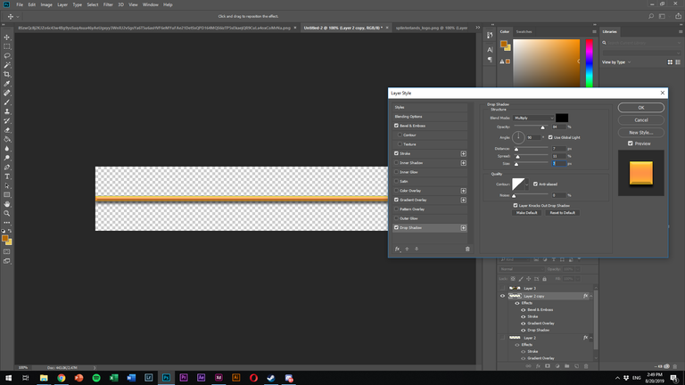
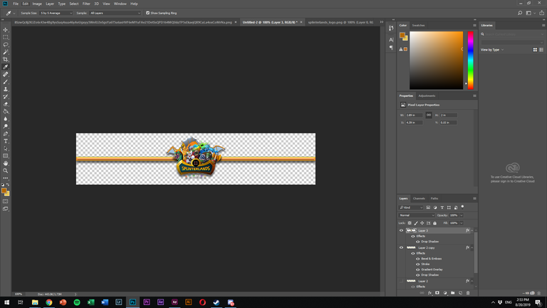
So this is already the basic concept of a divider. As the topic is Splinterlands I decided to keep the color palette to the colors in the logo.
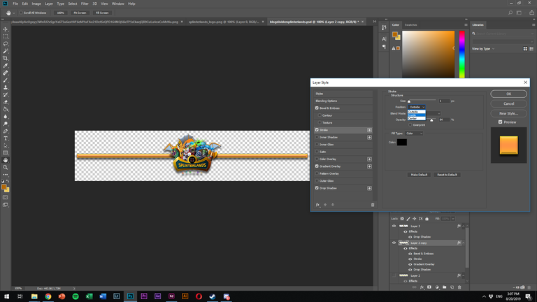
If you want to further increase the look of the divider you could play with different Blending options, like I did for example with:
-Bevel & Emboss
-Stroke
-Drop Shadow
If you have any more questions, just ask me.
And ofcourse anyone who wants to use these two dividers, feel free to! :)
P.S. This was a fun little excercise getting back in touch with things, looking forward to the next ones!
Congratulations @criticalthinkin!
You raised your level and are now a Minnow!
Vote for @Steemitboard as a witness to get one more award and increased upvotes!
One more thing: After finalizing your PNG, send it to https://tinypng.com/, where it will be compressed without visible quality loss.
Your file is 68kb large and afterwards only 15kb. This can make a huge difference in experience for your readers, particular when you use larger images in PNG format. I do that for all of my PNGs.
Cheers for the tip, I wasn't aware that there is much compression going on with png, thought that was only true for jpeg mostly :P
I'll upload there in a minute and will edit the photos afterwards, let's see if it does something for the quality :)
Is there any noticable difference now?