Splinterlands - A tester's view on the latest changes on the Inventory Items page
When you spent most of your professional life as a software tester, it is easy to spot out usability issues and improvements that could be done in a piece of software or game. Having an analytical thinking is something that you build up in time through experience and through letting your imagination push boundaries and see things as end users and try to act as they would with the app. And one thing that my eyes stopped on these days is the New Inventory Items page and through some exploratory testing while knowing the old UI by hearth, I couldn't but see small issues or ways to improve the experience of the player.
Overall UI feeling
First of all the Items page is now pretty slick and it has the mark of the new format and technologies that are swiftly integrated within the game. The UI is pretty clean and modern, although I liked the old UI as it gave a more chunky feeling, one which was more close to a little bit of chaos, dreamy and fantasy emerging. Sometimes bringing modern design into a fantasy game removes the diffuse elements and the shape of a realm which is not as real as the true life itself. So while the new UI is pretty awesome technologically, I hope that in the future some more artistic elements are introduces instead of straight lines in order to emerge us better within the game and the characters from here.
Search and filter menu
The Search and Filter menu was now moves as a Left Tab and one thing I observed from the beginning and which taps into expected usability, is the fact that it requires a Scrollbar. Before this the Filtering were as a Top Menu which didn't require any such lengths to see the information. I would prefer it to be moved back to the Top and maybe make it Collapsible in case it eats to much from the screen play. This would increase the usability and easiness to apply desired search and filters without clicking and moving too much around.
Format options
As Format options we can choose between Wild (All) and Modern. These are simple options, good segregation of our cards and nothing to comment about it.
Card set
On the Card set menu we can choose between different Sets like Chaos Legion, Untamed, Beta, Alpha and Other. Once we choose a Set we go through the available Sub-Sets. These implies a two level hierarchy and makes the use do quite some clicking to get to the desired option. I would redesign this element and make it simpler. One way to look at it we could have the current Sub-sets like Core, Reward, Promo, Gladiators and so on the main categories and apply the sets as second filters. In my case I am first interested in all my Rewards cards and only after that if those are from a specific set and not the other way around.
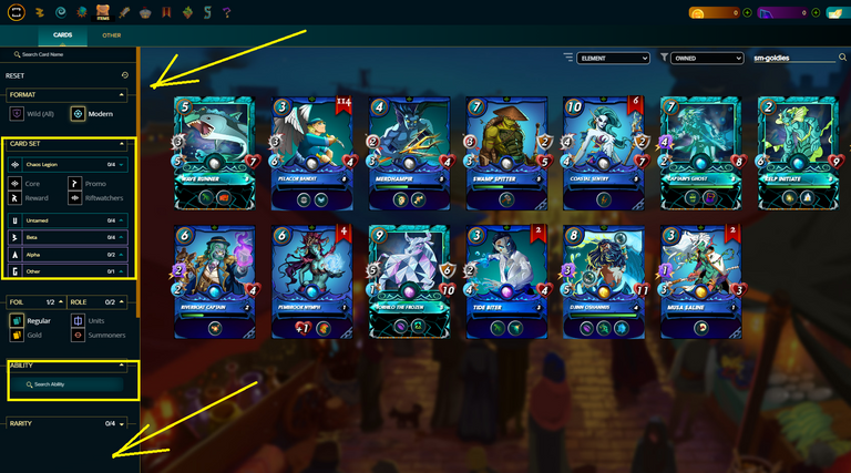
Ability search
Having a search in the middle of the other Filter options, makes it lose significance and it is simply a weird and unexpected positioning of the element. Free Search should be up to the top, first Filter available as that requires an Input from the end user and requires a clean representation.
Rarity
The Rarity presents current available options of Common, Rare, Epic and Legendary cards. Nothing to comment on this, simple options.
Element
The Element list is filled with the options of Fire, Water, Earth, Death, Dragon, Life and Neutral. First of all this is one of the menu that needs to be UP to the list. Players are starting to make their formation based on the element, thus having this at last is simply an oversight. Second the available options now seem mixed up, without any clear chronologic grouping or such of a sort. This is due to to arranging the options on two columns instead of a single one. But as we are using a Left TAB, we are limited to how to arrange the option in order not to add a too long scrollbar.

These are all my observations from a tester's perspective on the new Items page in the Splinterlands. It is not that I don't like change, but we need to have a balance between the usability, user experience and doing things programmatically and modernizing stuff. I believe that the Search and Filtering should not be a Left Menu, but rather a Top Menu that should eliminate scrollbars and other intertwined levels to get to the needed options. While I might look critical on this, please believe that there is good reasoning behind it and all is to have a better product that will allow players to move easily between the available options. Hopefully someone will read this and maybe take this feedback and consider it. Roger out!
Come and join the amazing world from the Splinterlands!
Posted Using LeoFinance Alpha
Overall, I think the slickiness of the UI is what I particularly prefer. I think the changes are a whole lot to begin to adjust to, but I'm guessing we'll get use to the changes. The usability is decent.
To be honest, I didnt like the new UI very much, it feels so congested and I was even finding it hard to understand the whole thing. THe old one was spread and easier to use,or I was too used to the old UI that I am messing up with the new one lol 😅😂
Amazing post!
Thanks for sharing! - @mango-juice
