Splinterlands | Mobile battle screen redesign
Not signed up for splinterlands yet? Make sure to use this link and sign up!
This post is about me learning new design software by redesigning a splinterlands screen and sharing the process for fun. Note that this has nothing to do with a real redesign of the mobile application.
In this post I'm going to show you my take on redesigning the most important screen of the mobile application. Please note that the purpose of this is personal improvement on design skills and learning to work with new design software. However, I thought it might be fun to share the process.
The main idea
Alright, so before I actually start designing I think about what I actually want to achieve and what problems I want to solve.
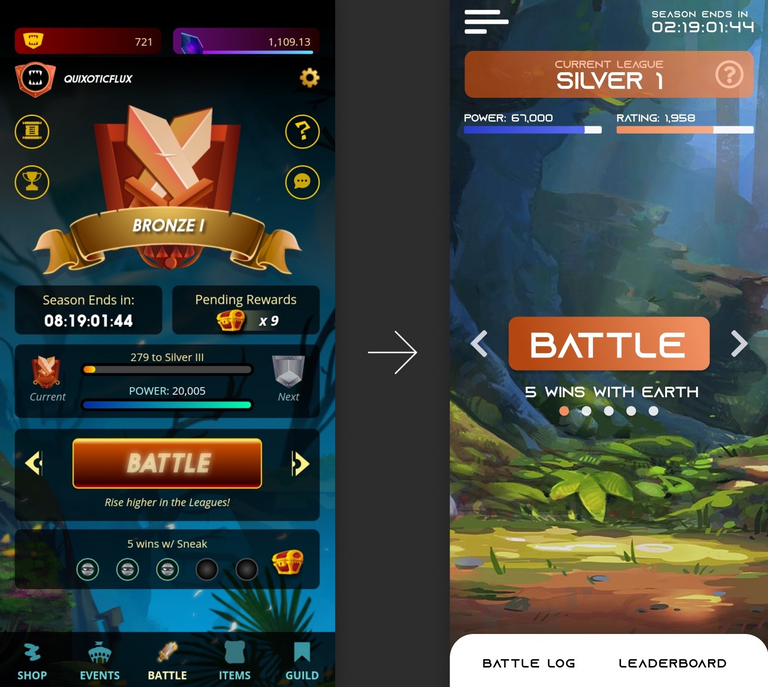
The first thing that I see when I see the screen is that there is a lot going on and it's kind of hard to "scan" the entire screen in a couple of seconds. That's one thing I intend to address, making the screen very clean and easy to scan.
Also, I always think about where the user's attention should go. To be honest, this is pretty good in the current design as well. The Battle button is by far the most prominent button on the page and really asks for attention and this is exactly what we want because this button is the primary action on the page. However, at the same time, there is also a huge illustration of your current rank. Don't get me wrong, this is important information, but not that important. Sure, the illustration looks pretty nice, but splinterlands has amazing art, if we want to make the application more visually appealing it seems a lot more logical to really make use of the splinterlands art.
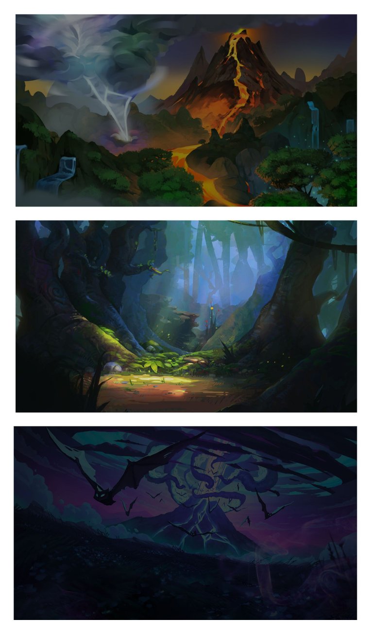
That brings me to my last and potentially most important idea: bring the splinterlands art alive in the design. I'm mainly thinking about the background images that are being used in the website, but never really gets the attention that it deserves. For those of you who don't know what I'm talking about:
The process
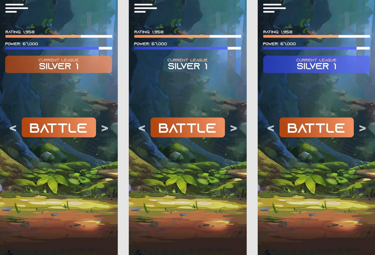
Okay, now that I have a general idea of what I want to do it's time to get started. Let's start really simple and mainly use the power of the art. In the first example I only care about a hamburger icon and a button. The seconds screen also contains the league information, however, we still need to work on the presentation.
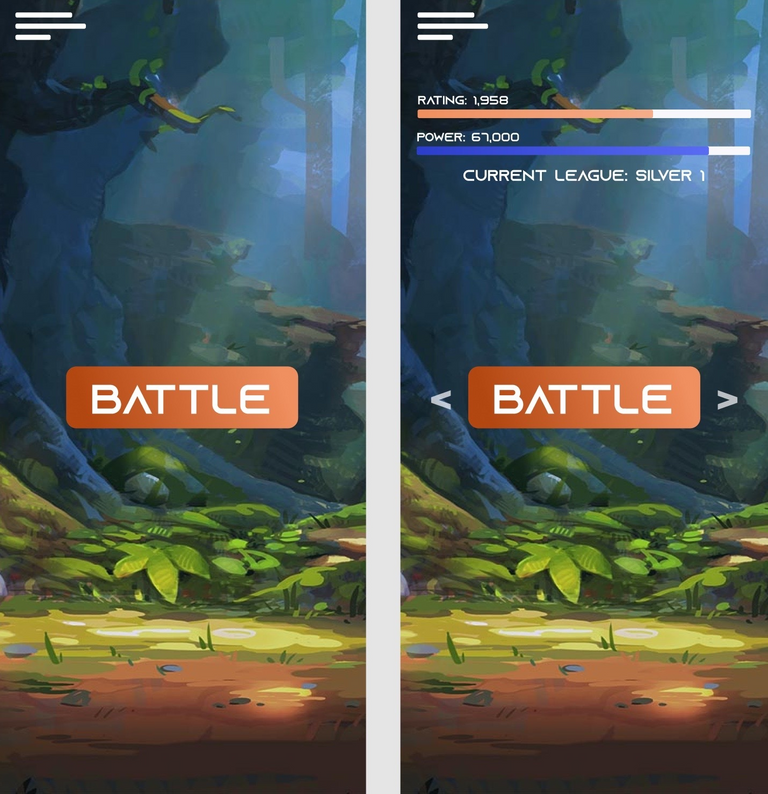
The next phase consists of struggling to come up with a good design where I can successfully group the league information (consisting of rank, rating and power) in a clean way without creating too much overlay on the background art.
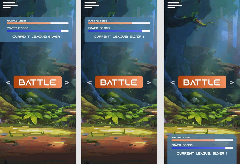
Eventually I end up with a design that I'm pretty happy with:
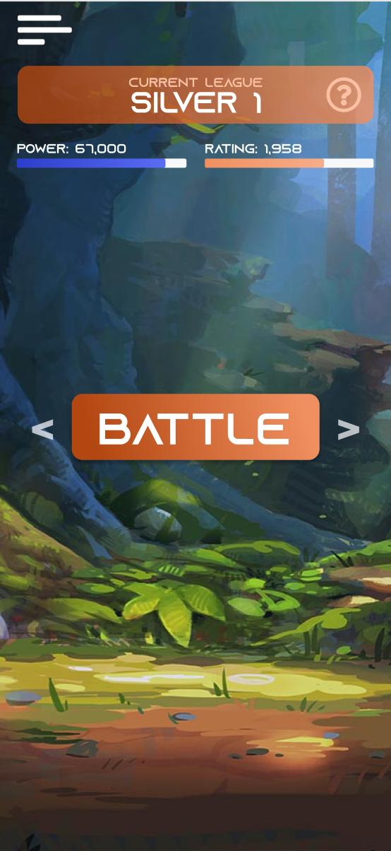
The information is nicely grouped together, easy to read and doesn't interfere much with the background art. The rank definitely draws attention to it, but not that much that it starts to compete for the biggest attention seeker on the page (the battle button is still our attention queen). We add a question mark icon where the users can find all the additional information like how many rewards they receive per rank, what the rules are per rank etc.
I want to keep the homepage clean and remove the clutter as best I can. I want to remove the information that we don't need to see all the time away from the main screen. For example, it's important to see how many power we have because this changes every game. However, seeing how many rewards you are going to get at the end of the season is not something you have to see every time you end a battle. Also, the user would see a nice popup every time they go up in rank, where they would be informed what the changes are (like how many reward chests they get for their quest in their new rank etc.)
All that being said, there is still some information that we absolutely have to include on this page.
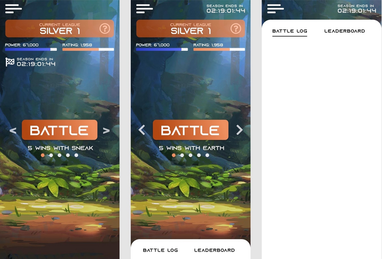
The season end is important to constantly be aware of and is obviously constantly being updated so it earns it's place on the main page. I thought it would be fitting to use a "finish flag", but this actually makes the page more crowded and is not needed because there is a label that explains the purpose. Also, it's less distracting when it's put in the right top corner.
I also included the daily quest information. I intentionally positioned this information close to the battle button because this is directly related with your current battles.
Eventually I add the battle log and leaderboard links at the bottom of the page. The idea is that when a user presses any of the two buttons that the panel expand from the bottom to the top and that the information will be displayed within the popover (actually designing the battle log and the leaderboard would be a bit too much work for now, but I wanted to show you the idea).
The links at the bottom of the page would be moved to the side menu that pops open when the hamburger icon is clicked. Actually, all the links that are not shown on the page are moved to the side menu.
Now that I review my own design I think I would have to find a way to include the DEC and capture rate on this page as well. This is important information that's directly related to battling. I can always change this later.
The final version
Okay, let's forget my last words of the previous paragraph and call this our final version!
One thing I wanted to do is work with a background that changes over time. On most other pages we would have to include a lot of information and presenting the background art in a way like I did in this design would often be impossible. Therefore, I don't want to work with a different background per page, I want to work with a dynamic background.
This could happen random om a time interval or this could change after every battle. However, I like the idea of the background adapting to the daily quest that you get presented. For example, when you get a fire quest, show the volcano background, when you get the earth quest, show the forest background, etc...
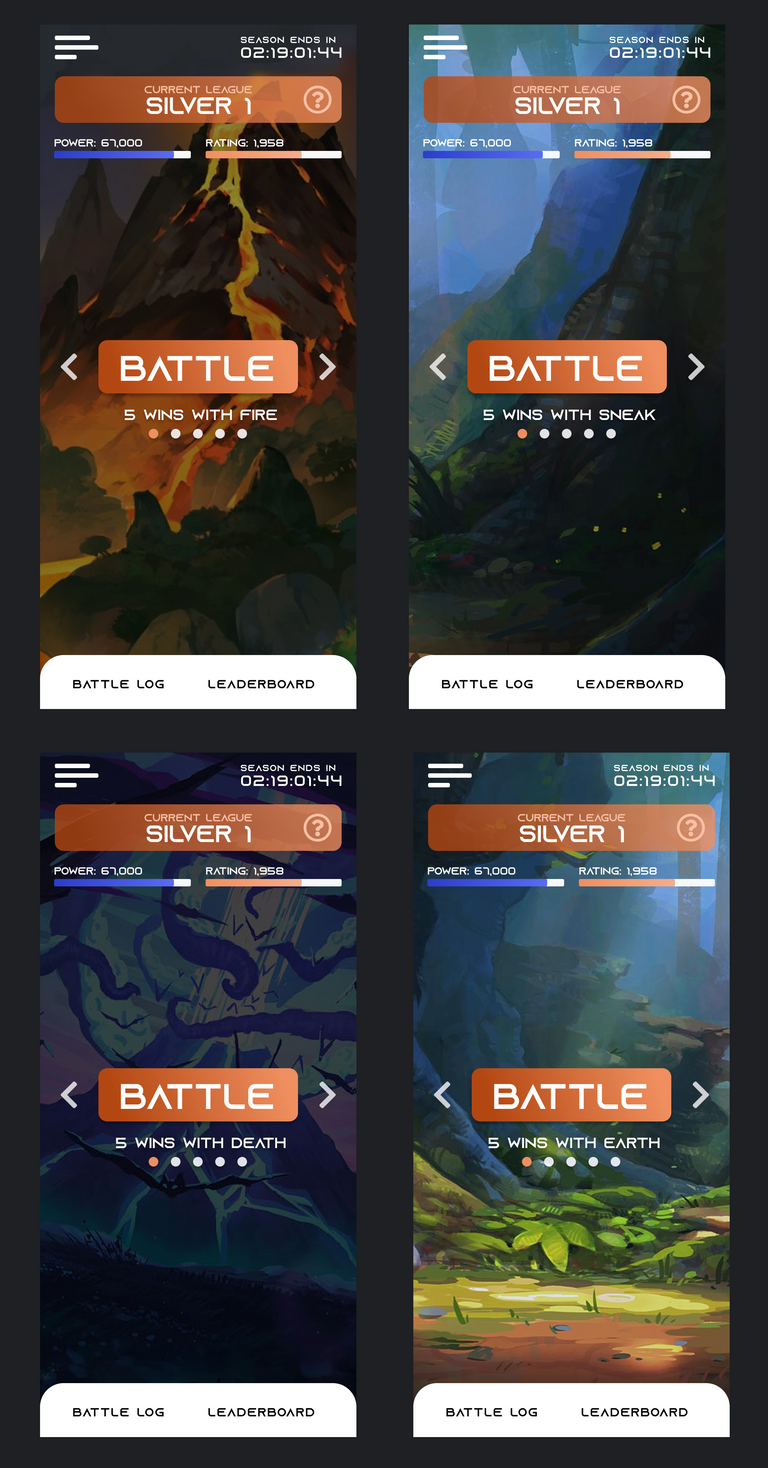
I actually really like this idea because I think it's a real shame that the landscape art isn't displayed as much as it should in splinterlands.
That's it!
Once again, the purpose of this post was simply to share my personal learning process in a fun way. I have never done a game screen design and I don't claim this design is extremely good or anything, but I do think it solves some issues and really brings the landscape art into the picture. Which where my main goals.
Feedback is always welcome 🙏
Want to earn more money with blogging? Start cross-posting to publish0x
Congratulations @freeztag! You have completed the following achievement on the Hive blockchain and have been rewarded with new badge(s):
Your next target is to reach 500 comments.
You can view your badges on your board and compare yourself to others in the Ranking
If you no longer want to receive notifications, reply to this comment with the word
STOPTo support your work, I also upvoted your post!
Support the HiveBuzz project. Vote for our proposal!
Thanks for sharing! - @cieliss
