Lamest Gold Foil Art?
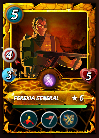
Let's talk about the Splinterlands Cards Artworks. Am I the only one annoyed with the color of the newly released Gold Foil Cards? They have the lamest color and were not as bright as a gold card should be. These new cards' normal color was better than their gold versions.
Take a look (PS. pics were snipped from the MP):
Frame/Border#1:

Frame/Border#2:

Frame/Border#3:
Frame/Border#4:
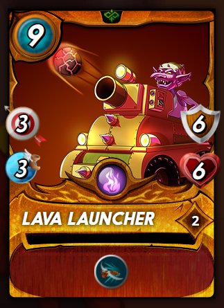
They are getting darker and darker until the new cards have a poor gold color. Is that intentional in order to give the first-generation (Alpha/Beta) cards higher value?
Let me know your opinions about these new Gold Foil Cards.
0
0
0.000
The new gold foil is a wood frame :D