Some thoughts or improvements ideas about the new Splinterlands Collection / Marketplace / Card Details Page
Splinterlands has released on Monday a new design and new features for the own collection page, the marketplace pages and the detail pages of each card. The reason for this is the modernization of the frontends so that they can be seamlessly adapted to mobile devices like smartphones and tables. Gradually, the entire Splinterlands webpage will be rebuilt to operate on the new modern framework.
However, while reviewing the said pages, I noticed a few things that can be improved or optimized in some places. So that I don't spam the Mavericks chat, I'll just put my ideas and thoughts about it here in the post, so that the frontend/Dev/UI-UX team can have a look at it. Whether SL will implement this, no idea, but feedback would be good.
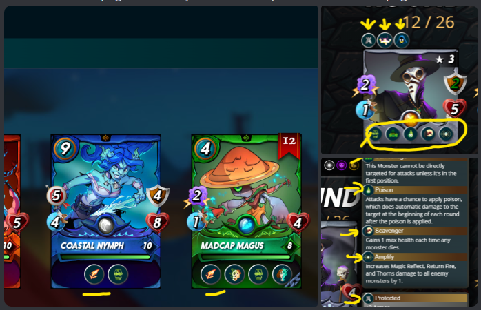
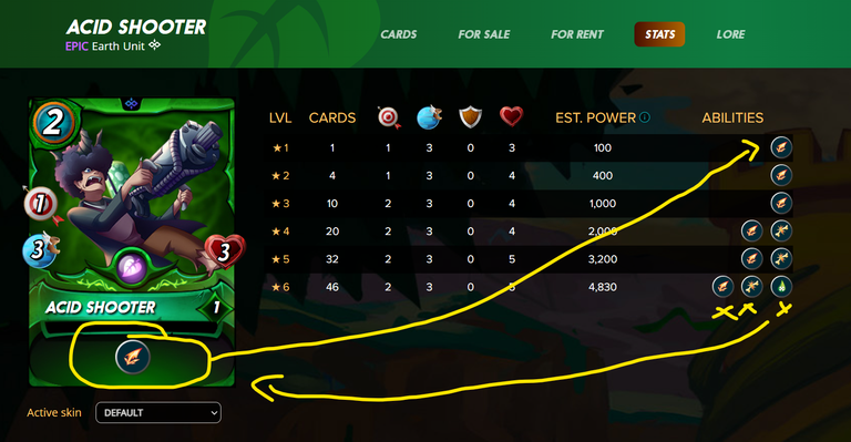
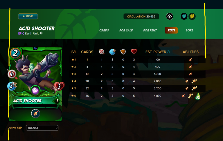
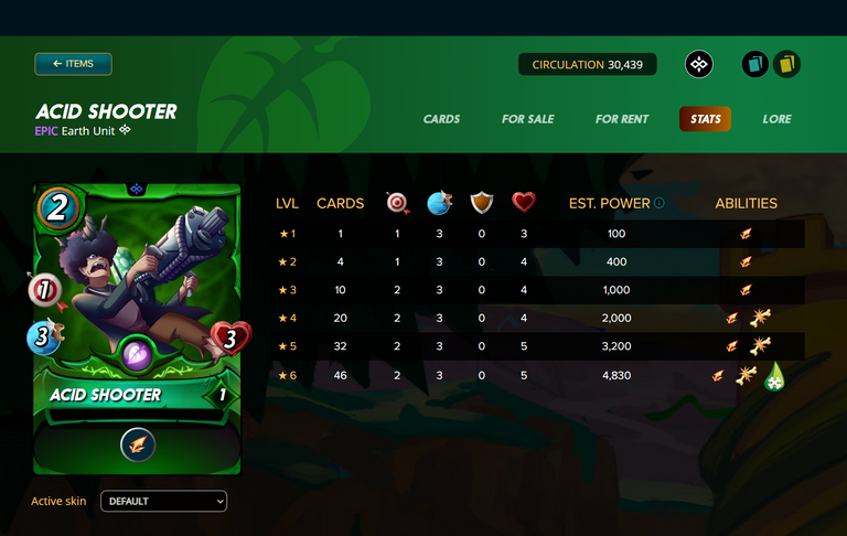
Unused icons for Abilities of the Units
On the detail page of a unit, there is a tab for the stats. Here graphics are used that are not used on the Marketplace, Collection pages and are only used on the Gameplay FAQ page as well as on the Stats and can therefore be replaced by graphics previously loaded in the view. This also leads to using a consistent visual language when it comes to the abilities of the Splinterlands cards.
Actual Situation
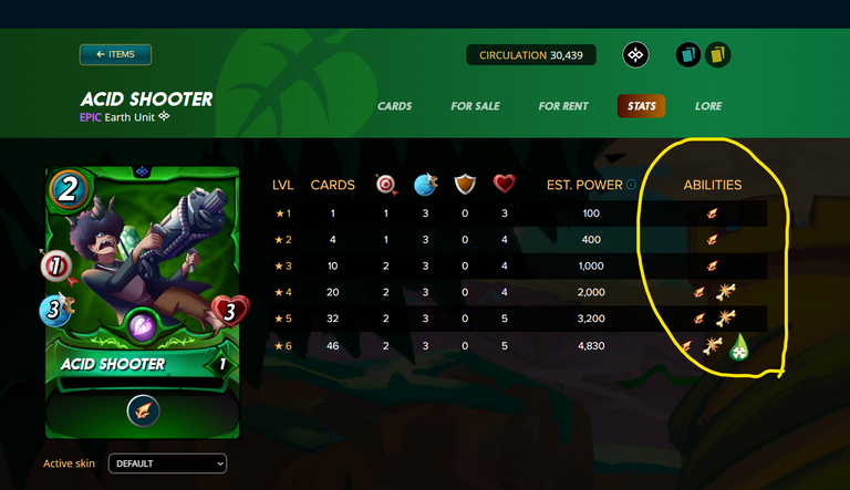
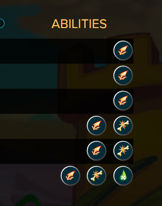
The icons of the capabilities look unordered, just slapped together, without structure. Furthermore, graphics are used here that have different sizes. My idea would be to use these graphics by previously used graphics on the cards to have on the one hand uniformity and therefore also recognition values. Furthermore, to reduce the loading times on these pages, if unnecessary graphics are not loaded.
More better Solution?
Align everything in a grid
Currently, the content area looks very untidy, there are elements / divs larger than they actually should or should. In this example, the area can be adjusted, at least on the desktop variant, which we actually use for the most part - The area with the button to come back, the name of the card, all this can be gladly to the left to the layout end - the same also on the other side with the foil selection and the navigation within the card.
To accomplish this, all you need to do is set the content width of the top area to 1130px instead of 1030px. The result is tidier and clearer:
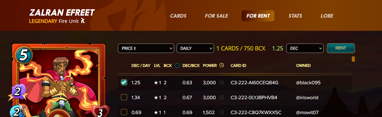
Rent a Card
When you want to rent a card, and select a card, the layout above the available offers breaks because more text is displayed at the location
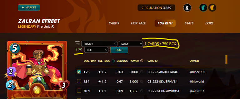
However, if you select a card that contains only 1 BCX instead of, for example, a card with 750 BCX, everything looks OK.
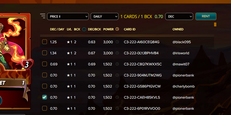
If you remove the unnecessary graphic, which symbolizes that you can filter here, there is enough space again. But if the graphic should remain there, you could at least make the width of the dropdown fields a bit narrower, because they are unnecessarily long.
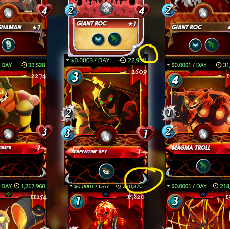
Hover Cards - z-Index
In the overview, e.g. in the Rental Market, the cards overlap strangely. Here the z-index values do not fit, because the upper card still remains visible when mouse-over over the actually selected card, which should not be so.
Own Collection - Interaction Bar
This is just a personal opinion - I personally would like to see the filter info on the right side, rather on the top left above Collection, so that all filter possibilities are visible at a glance and accordingly are on one page. Here is my customized representation with a little CSS.
But, to make it easier to see that this is also a kind of navigation area, you should also choose the same background color as the left filter navigation bar. It would look like this:
The above are a few things that caught my eye. Whether they are all easy to implement for the team or need a lot of dev work, I don't know. Anyway, they are things I would personally adjust - At least for the desktop variants.
Greetings

Vote for my Hive Witness
U can vote for my Witness using Hive Keychain here: https://vote.hive.uno/@louis.witness

Vote for my Hive Engine Witness
Vote for my Witness on Hive-Engine using Primersion Tool: https://primersion.com/he-witnesses Enter your Username and search for louis.witness
Great ideas Louis! Hopefully, the SPL team sees this and implements some or all of these suggestions. Thanks for doing this.
As we are here, I think it looks pretty ugly that the numbers are not right-aligned:
!PGM
!PIZZA
!CTP
BUY AND STAKE THE PGM TO SEND A LOT OF TOKENS!
The tokens that the command sends are: 0.1 PGM-0.1 LVL-0.1 THGAMING-0.05 DEC-15 SBT-1 STARBITS-[0.00000001 BTC (SWAP.BTC) only if you have 2500 PGM in stake or more ]
5000 PGM IN STAKE = 2x rewards!
Discord
Support the curation account @ pgm-curator with a delegation 10 HP - 50 HP - 100 HP - 500 HP - 1000 HP
Get potential votes from @ pgm-curator by paying in PGM, here is a guide
I'm a bot, if you want a hand ask @ zottone444
$PIZZA slices delivered:
@torran(3/10) tipped @louis88
1130px is bigger than the 1920x1080 screen, probably why they used 1030px. But tech modernization should mean 100% responsive.