Please fix this counterintuitive UI/Navigation between the Marketplace, Collection and detailed card view.
So you are browsing your collections, looking to see if we have any golden rares.
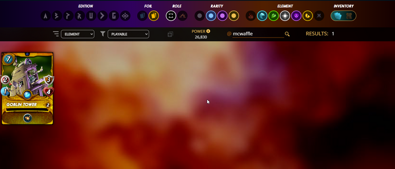
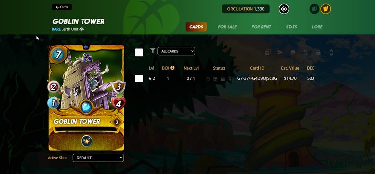
So we click the card to see more details
From here we could click this button and return to our filtered collection we just were:

But lets say we wanna check out rentals or sale prices:

Now afterward we wanna return to the collection so we click that button but now it's not the same:

It's the same in rentals. It now takes us to the marketplace and removes our search parameters. The lack of a simple text search makes this more annoying as well. Please note the game and browser seem to be aware by the second arrow we are in our collection or came from there as that is the highlighted active tab in the UI.
IT works vice versa too if you start in the marketplace and go to the card tab for what you own you go back to the collection. That button should always return you to the page of origin. I can't think of any circumstance where it is known is advantageous or even convenient. If I want to go from my collection into the card view, and then afterward go right to the sales there is already a button for that here:

You currently have 2 buttons that do the same thing 15 pixels apart.
There is no replacement button for, return me to the filtered results of the page I originated from. That button is only present on the "Cards" tab if you came from the collection, and if not the Sales, Rentals, Stats, and Lore tab all return to the marketplace. Again opposite is true if you come into a detailed card view from the collection.
I know it's not a super big deal but so counterintuitive and hopefully an easy fix.
Edit: Fixed some grammar + Typo. New here, not really sure what to post here but I thought a visual depiction would be easier then trying to explain to someone an email or help ticket. @steemmonsters @splinterlands/
Dear @mcwaffle,
The previous HiveBuzz proposal expired end of December.
Do you mind supporting our proposal for 2022 so our team can continue its work next year?
You can do it on Peakd, ecency, Hive.blog or using HiveSigner.
https://peakd.com/me/proposals/199
Thank you. We wish you a Happy New Year!