Splinterlands Art Contest 225: Lorna Shines in Modern Time
👋 Wecome! 👋
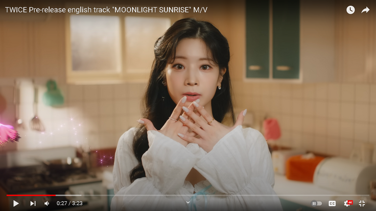
Hi! 😊 It's been a long time since I last participated in the contest, and I'm glad to be able to participate again. ❤️ I have been busy with other commitments, but I always make sure to set aside time for my passion for art. Today, I was inspired by @jijisaurart's entry from last week, which featured a modern take on a character from the game Spinterlands.This time, I decided to draw Lorna Shine. I was really inspired by the K-pop vibes of the art she created last time, and since TWICE just released their new song "Moonlight Sunrise," 🎼 I decided to use my bias Dahyun as a reference! 😆
Reference:

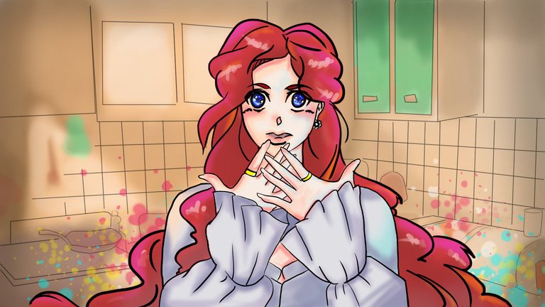
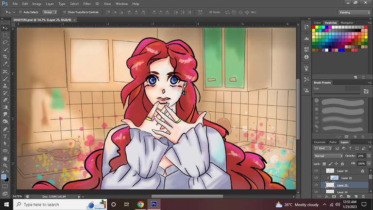
HERE'S MY ART 😊
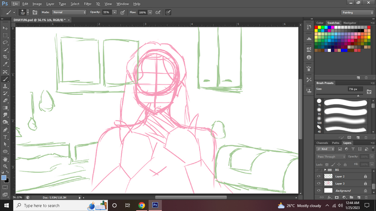
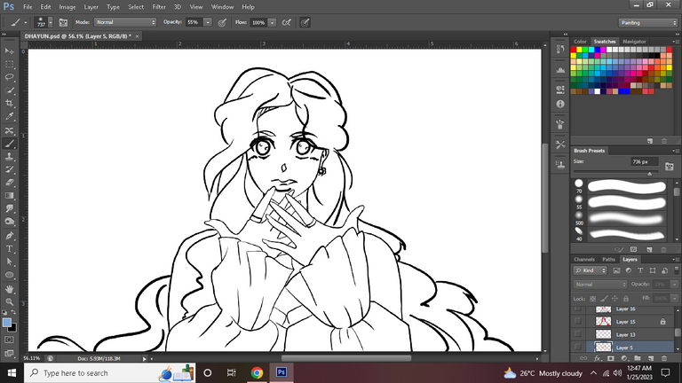
Step 1 ✔️
To start, I made a simple sketch using Loomis method. This step helps me plan out the size and placement of my character and the background.
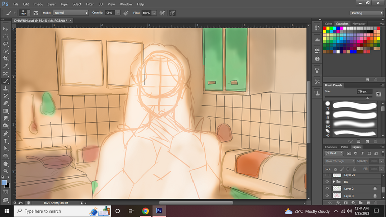
Step 2 ✔️
Next, I added color to my background. I chose to use a combination of brown and orange as the main colors for my background. I find that these colors complement each other nicely and create a warm and inviting atmosphere. When it comes to my line art, I prefer to use thin lines. This is because I want the focus to be on the character and the background, rather than the lines themselves. By using thin lines, I feel that it doesn't detract from the overall image and helps to create a cleaner and more polished look.
Step 3 ✔️
After finishing the background, I moved on to drawing the line art for the character. I knew that I wanted the character to have a similar look to my bias Dahyun, but I also wanted to put my own unique spin on it.
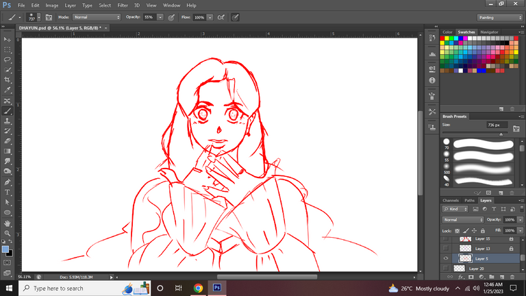
So, I drew the line art for the character three times. The first variation looked too similar to Dahyun, so I decided to keep experimenting with the lines until I was happy with the final design. I experimented with different hairstyle until I ended up with a design that I was satisfied with.
It was a bit of a process, but I think the final result was worth it. The line art came out exactly how I wanted it to and I was really happy with the outcome.
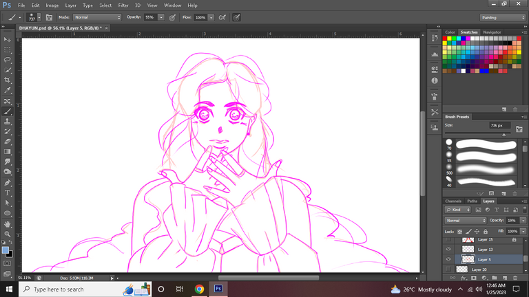
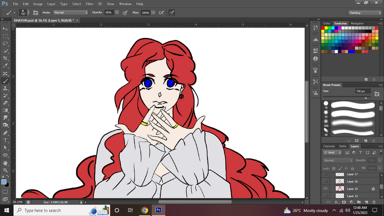
Step 4 ✔️
I then added the flat color. I selected the colors that I wanted to use for the character, making sure that they complemented the background and each other. I used a combination of bright and muted colors in this piece.
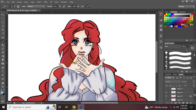
Step 5 ✔️
"Next, I added shadows and midtones to the character. This step is crucial in bringing the character to life and giving it a sense of dimension. I carefully placed the shadows and midtones to create a sense of depth. I used the combination of of orange and blue for this one. I used the color orange for my main light source and shadow while I use the color blue for my bounce light.
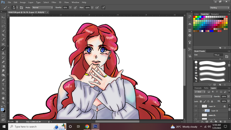
Step 6 ✔️
Next, I added highlights to the character. I paid special attention to the hair and eyes, as I wanted them to stand out. I placed highlights on the parts of the hair and eyes that would catch the most attention, like the bangs of the hair and the irises of the eyes. This helped to create a focalpoint for my character. Additionally, I also added highlights on other parts of the character's body to make it look more dynamic and detailed.
Step 7 ✔️
Finally, I added some minor details to the piece. I added a vignette effect to the edges of the image to help focus the viewer's attention on the character. I also added some color splash effects at the bottom of the image to add an extra pop of color and to create a sense of movement. These small details helped to bring the piece together and make it feel more complete. I also made sure to adjust and balance the saturation and brightness to make the final image more visually pleasing.😊
And that is how I made this piece! I hope you enjoyed it. ❤️
🔴 Contest link: https://peakd.com/hive-13323/@splinterlands/splinterlands-art-contest-week-225
🔴 Want to play Splinterlands? Here's my referral: Here!
About Me
I am Shineko009 and I post Art, Spinterlands and sometimes Writing here on HIVE. I love watching Anime and Vtubers and I also enjoy listening to TWICE that is why I always reference them in my blogs. 🤣 Feel free to follow me if you enjoy this kind of content! ❤️

Do you like kpop too? 😁 I like Twice's song What is Love. 😊
You are improving, Shin! As per usual cute art. I feel like you have the same style to @takuri. But of course, different personal touch.
Keep going ~
!PIZZA
We going to surpass you!
Let's do our best to defeat the Jijisaur and her army of chibis 💪😆🤣
Thank you po! 😊 yes I love kpop and I also love that song 🎵😍 !PIZZA
I gifted $PIZZA slices here:
@shineko009(1/5) tipped @jijisaurart (x1)
jijisaurart tipped shineko009 (x1)
Please vote for pizza.witness!
Yoooo! A photoshop user, hello fellow adobe fan.
Also Woaaaaah the post is so nice, Finally another artist with a detailed step by step process!
Thank you! I'm glad you enjoyed my process hehe 😁
Thanks for sharing! - castleberry#6859

Thank you! 😊