Splinterlands Art Contest Week 282 | SPORCERER🍄
Hello Splinterlands community, Participating almost at the end of the day I bring this card that I found interesting to make. Starting from the magical idea and that it is about a mushroom, I gave it a nature environment with some toxins dispersed in itself. Let's move on to the process.
Hola comunidad de Splinterlands, Participando casi al final del dia traigo esta carta que me pareció interesante de realizarla. Partiendo de la idea mágica y que es sobre un hongo, le otorgue un ambiente de naturaleza con algunas toxinas dispersadas en sí mismo. Pasemos al proceso.
PROCESS
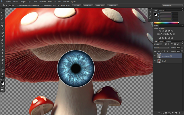
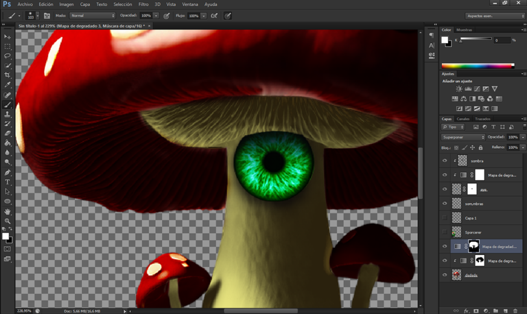
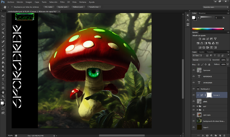
With a generated mushroom, I proceeded to place an eye on top and began to lay out the design. First, I used a layer mask to remove the upper excess of the eye and change it to green.
Con un hongo generado, procedí a colocar un ojo encima y comencé a diseñar la maqueta. En primer lugar, utilicé una máscara de capa para eliminar el exceso superior del ojo y cambiarlo a color verde.
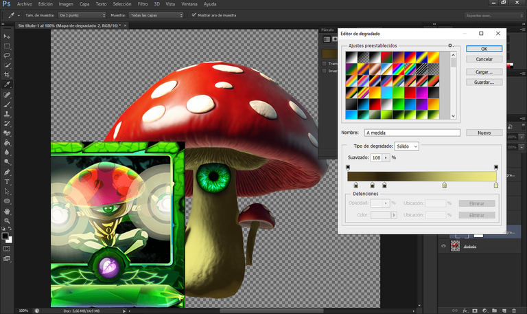
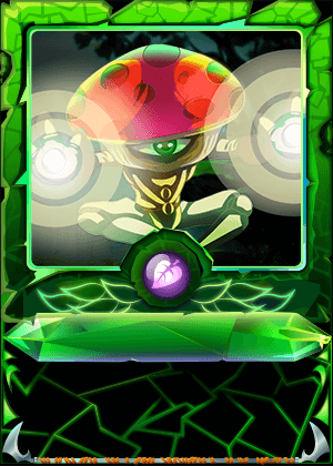
I placed the card for reference and used the eyedropper tool to pick up its color. Then, I created a gradient map layer to fine-tune the lights and shadows until I achieved a color that was "similar" to its base. For the top part of the mushroom, I also applied a darker red gradient to contrast with the body.
Coloqué la carta como referencia y utilicé la herramienta de selección de color para capturar su tono. Luego, creé una capa de mapa de degradado para ajustar las luces y sombras hasta obtener un color "similar" en la base del hongo. Para la parte superior del hongo, también apliqué un degradado de tono rojo oscuro para crear contraste con la parte de su cuerpo.
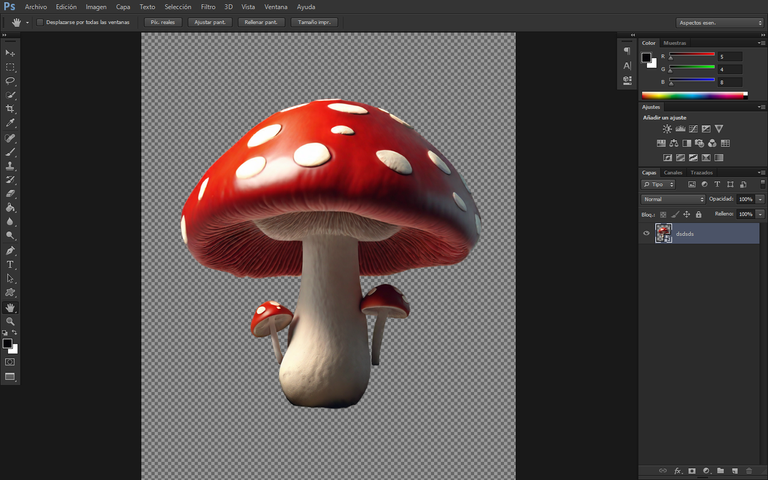
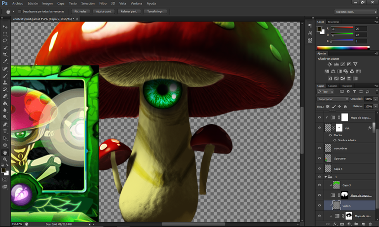
For the mushroom's body, I created another layer and used a darker color to try to add details resembling those on the card. Once I was "satisfied" with the main design, I added a background and applied a "gaussian" blur filter to it, creating depth in the poster design I had in mind.
Para la parte del cuerpo del hongo, creé otra capa y, utilizando un color más oscuro, intenté agregar detalles que se asemejaran a los que tiene en la carta. Una vez que estuve "conforme" con el diseño principal, procedí a agregarle un fondo. Luego, apliqué un filtro de desenfoque "gaussiano" a este fondo, lo que le daría profundidad al diseño del "póster" que tenía en mente.
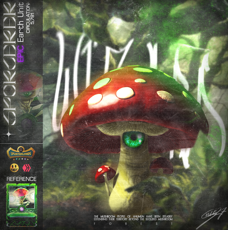
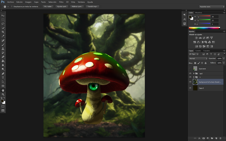
Above the red top, I added a "reflection" of green light, resembling a form of toxicity, which allowed me to read its lore, and I interpreted it as part of the magical essence these mushrooms possess.
Encima de la parte superior roja, añadí un "reflejo" de la luz verde, como una especie de toxicidad, que permitía leer su historia (lore) y lo consideré como parte de la esencia mágica que poseen estos hongos.
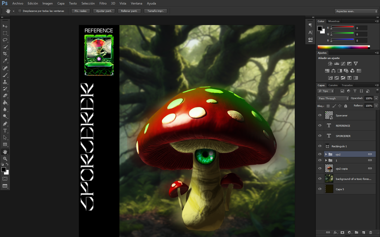
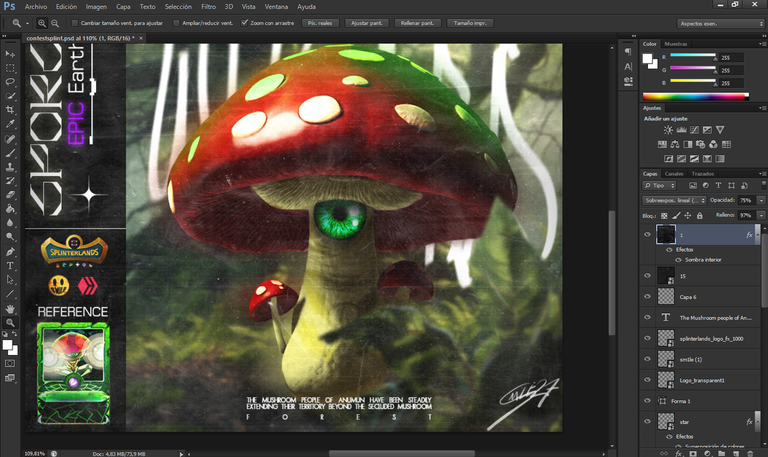
With the main design in place, I proceeded to create a distinctive bar using a variety of fonts, within which I included its name and the card's characteristics, such as its energy cost, rarity, and type.
Con el diseño principal en su lugar, procedí a crear una barra característica utilizando una variedad de fuentes, dentro de la cual incluí su nombre y las características de la carta, como su coste de energía, rareza y tipo.
To add more depth to this design, I made a copy of the leaves and used them to fill in the empty spaces that I found unsatisfactory. I applied an additional Gaussian blur effect to ensure that the leaves didn't obscure the main object, allowing the space to be filled without interference.
Para darle más profundidad a este diseño, hice una copia de hojas y las utilicé para rellenar los espacios vacíos que me resultaban insatisfactorios. Añadí un efecto gaussiano adicional para que las hojas no obstruyeran el objeto principal y, de esta manera, se pudiera apreciar y rellenar el espacio sin que las hojas interfirieran.
With the design completed, I added noise and plastic textures, along with the main icons of the game, Hive, and my personal logo. Below the bar, I included a portion of the lore sentence, organized into paragraphs to distinctly highlight the word "FOREST" from the rest.
Con el diseño listo, añadí texturas de ruido y plástico, así como los iconos principales del juego, Hive y mi logotipo personal. También incluí una parte de la frase de su historia por debajo de la barra, separada por párrafos para destacar la palabra "FOREST" del resto.
Tools Used :
Photoshop
WACOM CTL 472
Font AI Style Cinematic
I like the textures that you added because it almost makes it look like an old faded collectible card. Great effect.
Hey thanks bro
Checkout our BDVoter Daily Hive Showcase & Participate into our Daily giveaway to win various prize.
Deymmmmm Smooth Art Bro...
And also you won the 2nd spot. Congrats..
!PIZZA
Thanks bro
$PIZZA slices delivered:
@eustace-kidd(1/5) tipped @smile27