Designing A Business Card Using H.T.M.L and C.S.S.
Hello everyone! I'm here again with another (newbie) design.
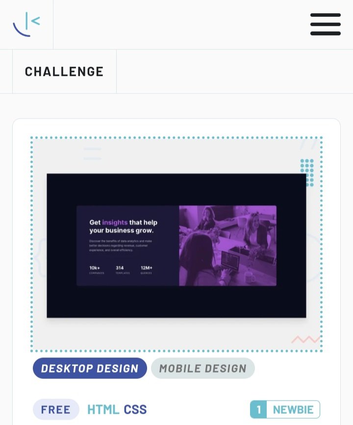
Click here to view the original design. Though this design isn't as complex as the grid in my last post, it made me much better in the area of using display: flex;.
Like always, I will love to hear your opinion, and suggestions, based on my code, so as to help me create more effective and efficient web designs and pages in the near future. Now let's begin!!!

A) Like always, as a good developer, you are meant to follow due process, and the very first thing to start with is the pre-code, which like I said I my previous posts, is what provides us with ability to add titles, and other plugins such as the Web logo, css file, and even the java script file. So I employed this with the shortcut SHIFT + ! + enter to give 👇;
Thereafter, I moved over to step (B).1 <!DOCTYPE html>
2 <html lang="en">
3
4 <head>
5 <meta charset= "UTF-8">
6 <meta name= "viewport" content= "width-device-width, initial-scale =1.0">
7 <title> Document </title>
8 </head>
9 <body>
10
11 </body>
12 </html>
(B) Here I created my css file, named it ' stylesheet.css', and linked it immediately to my html file;
7 <link rel="stylesheet" href="./stylesheet.css">
(C) I imported the Google fonts needed for the design into my HTML, ensuring that the font weights matched what was needed (All this were inserted in the head section);
4     <head>
5             <meta charset= "UTF-8">
6             <meta name= "viewport" content= "width-device-width, initial-scale =1.0">
7             <link rel="stylesheet" href="./stylesheet.css">
8             <link rel="preconnect" href="https://fonts.googleapis.com">
9             <link rel="preconnect" href="https://fonts.gstatic.com" crossorigin>
10           <link href="https://fonts.googleapis.com/css2?family=Inter:wght@400;700&family=Outfit:wght@300;600&display=swap"
11            rel="stylesheet">
12           <link rel="preconnect" href="https://fonts.googleapis.com">
13           <link rel="preconnect" href="https://fonts.gstatic.com" crossorigin>
14           <link
15                   href="https://fonts.googleapis.com/css2?family=Inter:wght@400;700&family=Lexend+Deca&family=Outfit:wght@300;600&display=swap"
16                   rel="stylesheet">
17
18
19            </head>
(D) Thereafter, I gave the webpage a title ' @timix648| box', and linked it to my code too
18 <title> @timix648| box</title>
(E) I created a section, to serve as the box which will carry all the design for this particular work.
 <body>
          <header></header>
          <main>
                <section>


                </section>
          </main>
          <footer> </footer>
</body>
(F) Right in the section, I created two major divs, one to carry the text part, and the second to carry the image. I went further to give the two divs classes namely 'first-div', and 'sec-div', so as to be able to pass instructions to them independently;
<body>
          <header></header>
          <main>
                <section>
                              <div class="first-div"></div>
                              <div class="sec-div"></div>
                </section>
          </main>
          <footer></footer>
</body>
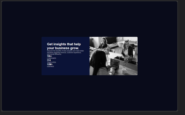
(G) with the above step done, I proceeded to add more structure and text to the Webpage;
<body>
<header></header>
<main>
<section>
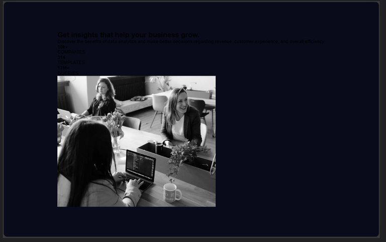
<div class="first-div">
<h1>Get<span>insights</span> that help your business grow.</h1><p class="para"> Discover the benefits of data analytics and make better
decisions regarding revenue, customer experience, and overall efficiency.</p>
<div class="info">
<div>
<h4>10k+</h4>
<p class="special-p1">COMPANIES</p>
</div>
<div>
<h4>314</h4>
<p class="special-p2">TEMPLATES</p>
</div>
<div>
<h4>12M+</h4>
<p class="special-p3">QUERIES</p>
</div>
</div>
</div>
<div class="sec-div">
<div class="overlay"></div>
<img src="./image-header-desktop.jpg" alt="image">
</div>
</section>
</main>
<footer></footer>
</body></html>
The span used in my above code, is an inline tag, in the sense that it doesn't occupy a whole line....it takes up space just enough for its content, and as such can be used to style a text differently from other text. Just as will be done in my design.
The header, and footer tags were left empty, because this is just a single design and isn't a full/ standard website or webpage.
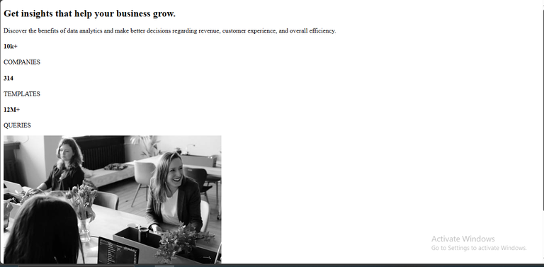
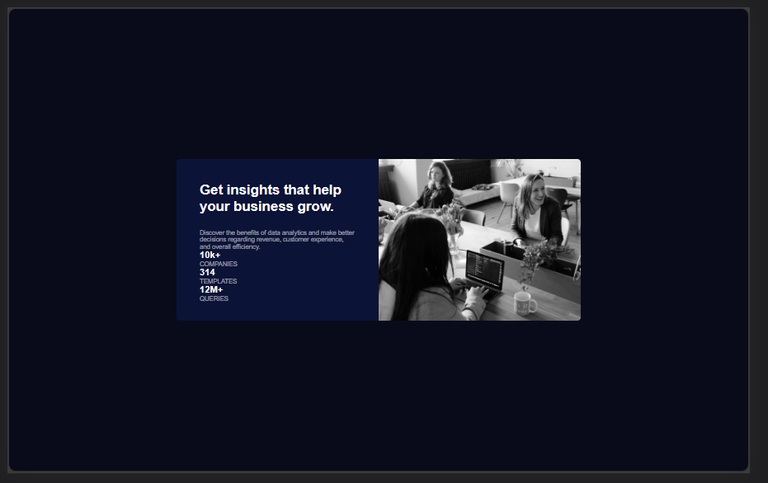
Before moving to my css, I took a screenshot of what the webpage looked like before styling and of course there really was no style except the texts and image, as expected;
(H) with the foundation of my design properly laid(at least in my own best way lol), I went over to css, to begin the styling.
I again started with the pre-code for css.
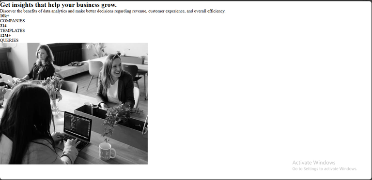
Below Is the webpage before including the css pre-code;
1        *{
2            margin: 0;
3            padding: 0;
4            box-sizing: border-box;
5           }
Below was the Web page, after adding the above css pre-code (no much difference, just the spacing);
(I) Next stop was to style the body of the webpage, using a similar color, to what they used, and as usual, placing the content at the center of the screen, and also giving all text by default, a font style which I have already downloaded, and linked properly in my HTML;
6      body{
7             display: flex;
8             background-color: hsl(233, 47%, 7%);
9             justify-content: center;
10           align-items: center;
11           height: 100vh;
12           font-family: 'Inter', sans-serif;
13    }
The above code gave this output 👇👇;
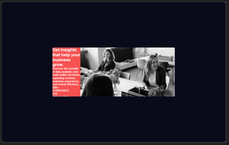
(J) I styled the section box next, by first assigning a width, and flexing it so my work rests majorly on the horizontal axis...I also gave it a background color that was very visible, for easy identification (I will change the background color, to the right one later in my code);
14       section{
15                    width: 700px;
16                    display: flex;
17                    justify-content: center;
18                    border-radius: 6px;
19                    height: 280px;
20                    color: hsl(0, 0%, 100%);
21                    overflow: hidden;
22                    background-color: rgb(245, 81, 81);
23      }
This gave the output below👇;
(K) I called all paragraphs, and gave them a font size, font color, and weight;
24         div p{
25                font-size: 11px;
26                color: hsla(0, 0%, 100%, 0.6);
27                font-weight: 400;
28          }
Output;
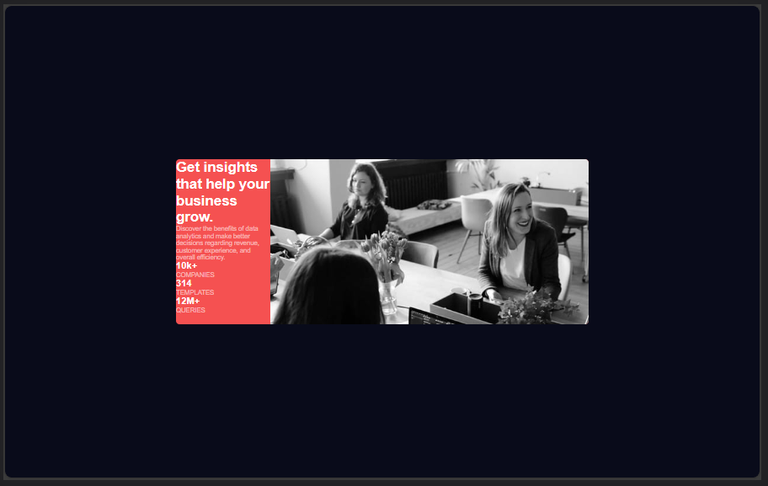
Looking at the output, you will at least notice the color of the paragraphs changed.
(L) I gave the paragraphs with class 'special-p1', 'special-p2', and 'special-p3' a font style, and size (on writing this, I noticed there was no need to give font size to each of them again, because I had already done that generally for all paragraphs before)
29      .special-p1{
30                      font-family: 'Lexend Deca', sans-serif;
31                      font-size: 11px;
32      }
33      .special-p2{
34                     font-family: 'Lexend Deca', sans-serif;
35                     font-size: 11px;
36      }
37      .special-p3{
38                     font-family: 'Lexend Deca', sans-serif;
39                     font-size: 11px;
40      }
(M) looking at the previous output, you can attest that the image is a bit too long...hence the reason why I targeted it, and gave it a width and height too;
41     .sec-div img{
42                          width: 350px;
43                          height:280px;
44      }
Output;
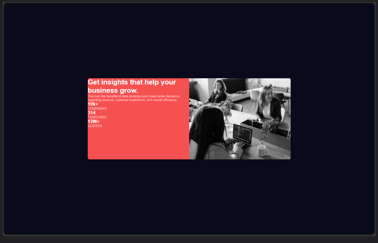
(N) I went on to give the first div, same width as the second, and gave it the correct background color, removing the initial color I gave the section box as it will no longer be needed;
44       .first-div{
45                    background-color: hsl(229, 66%, 13%);
46                    width: 350px;
47                    padding: 40px;
48       }
Output;
(O) Here I tried to reduce the congestion around h1, which was in the first div/box, by making use of padding;
49      h1{
50            padding: 0 0 25px;
51            font-weight: 700;
52      }
Output;
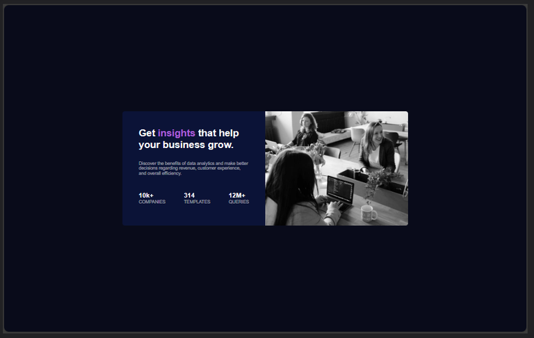
(P) Remember the span we used in our code earlier? This is time to put it to good use...here I styled the span, and flexed the div with 'info' as it class;
53       span {
54                color: hsl(277, 64%, 61%);
55       }
56       .info{
57                 display: flex;
58                 justify-content: space-between;
59                 align-items: center;
60                 margin: 40px 0;
61      }
Output;
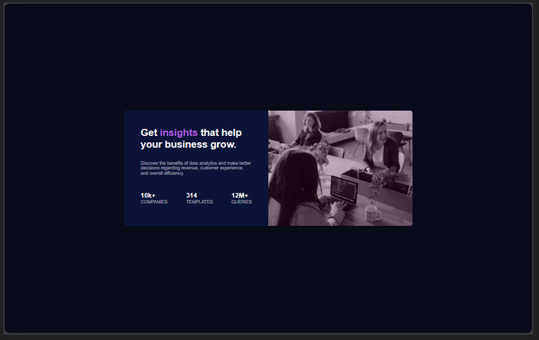
(Q) This part took me so long to figure out😩...the image they gave seemed to have a filter on, and after doing research, I found out that overlay was the solution to this. So I created an overlay, making use of the empty div, and giving it the exact same size and border radius as the image so as to fit perfectly, then I gave it a color close to what they used;
62       .overlay{
63                     width: 350px;
64                     height:280px;
65                     background-color: rgba(73, 1, 55, 0.3);
66                     position: absolute;
67                     border-radius: 6px;
68      }
Output;
All Images Are Mine, Except Stated Otherwise.
Thanks For Reading.
Wow, this was the challenge i was still looking at just now on frontend mentor to do and i can see you have done justice to it, we can be working together also boss, that will increase my learning way
Wonderful 😅😅
Yeah no problem at all!
Thanks for your contribution to the STEMsocial community. Feel free to join us on discord to get to know the rest of us!
Please consider delegating to the @stemsocial account (85% of the curation rewards are returned).
You may also include @stemsocial as a beneficiary of the rewards of this post to get a stronger support.
Oh, I remember this Frontend mentors challenge, it was a bit challenging for me at first but later on it became easier. Just like you said, the filtered image was really tough to deal with but I didn't use the solution you used, I can't remember clearly (it has been 2 years) but I think I created a class that has both the background-image and the background-color (the color didn't show of course), then I also used the background-blend-mode property, and set it to multiply. That overlayed the purple color on the image
Wowww another approach wonderful... I will try it out to see for myself. Thanks 🤝🤝
Congratulations @timix648! You have completed the following achievement on the Hive blockchain And have been rewarded with New badge(s)
Your next target is to reach 5000 upvotes.
You can view your badges on your board and compare yourself to others in the Ranking
If you no longer want to receive notifications, reply to this comment with the word
STOPCheck out our last posts: