Designing A Result Summary Page, Using H.T.M.L and C.S.S.
Hello everyone, long time no see😁...I'm back with another (not too hard) design I found, and you probably should try it out if you are currently working on responsive designs...this design again, was gotten from frontend mentor, and you can click here to view the actual design i will be discussing here in this post.
I do hope this post helps beginners like myself...in the meantime, I'm open to suggestions, questions, and advice, as I need it to become a better developer.
I will be listing the stages my code passed through, down below...so let's begin!!!

A) First things first, I included my precode for my HTML. As I was advised to always do;
1       <!DOCTYPE html>
2       <html lang="en">
3
4       <head>
5       <meta charset= "UTF-8">
6       <meta name= "viewport" content= "width-device-width, initial-scale =1.0">
7       <title> Document </title>
8       </head>
9       <body>
10
11  </body>
12  </html>
B) Here, i moved on to create my css file, gave it a name "STYLE" (all in capital letters), and attached it to my HTML...I attached it this way(just like an external link);
<link rel="stylesheet" href="./STYLE.CSS">
C) Here I searched for the needed font(s) from Google Fonts, and l linked it just like I did for my stylesheet;
<link rel="preconnect" href="https://fonts.googleapis.com">
<link rel="preconnect" href="https://fonts.gstatic.com" crossorigin>
<link href="https://fonts.googleapis.com/css2?family=Hanken+Grotesk:wght@500;700;800&display=swap" rel="stylesheet">
D) I gave the webpage I was working on, a title which was already given to me;
<title>Frontend Mentor | Results summary component</title>And with that, the head section was wrapped up, and I moved over to the body, which is the part that occupies majority of the screen.
E) In the body, I first created a section, which is similar to a div (I used section, so as to reduce my use of divs, so I don't get confused lol);
<section></section>
In the section, I created two divs, and named them "first-div", and "second-div";
<body>
    <section>
        <div class="first-div">
        </div>
        <div class="second-div">
        </div>
    </section>
</body>
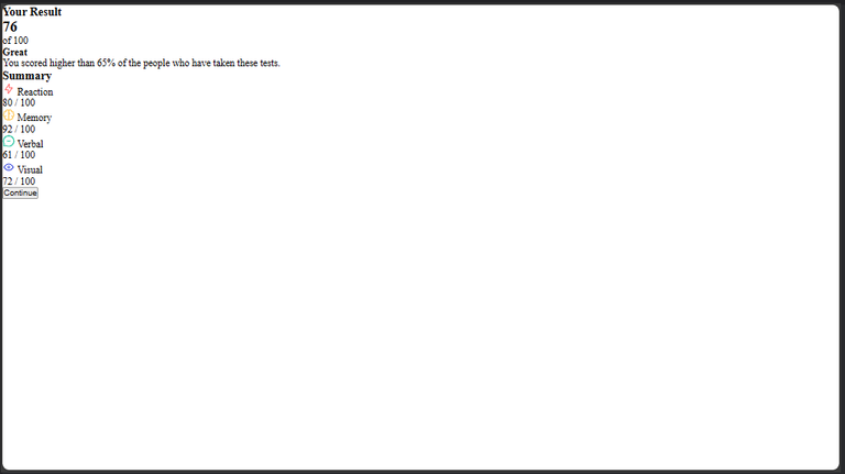
F) Here, I began to populate "first-div", by putting the text, as seen in the original design;
<body>
    <section>
        <div class="first-div">
            <h3>Your Result</h3>
            <div>
                <h2>76</h2>
                <p class="of-100">of 100</p>
            </div>
            <h4> Great</h4>
            <p class="grade">You scored higher than 65% of the people who have taken these tests.</p>
            </div>
        <div class="second-div">
        </div>
    </section>
</body>
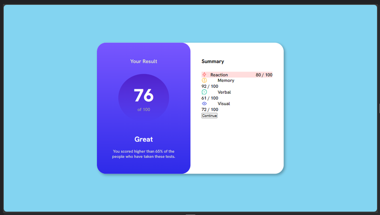
G) Here. I also populated the "second-div" by adding the required tags and text as seen in the original design;
        <div class="second-div">
            <h3 class="summary">Summary</h3>
            <div class="grid-box">
                <div class="grid-1">
                    <div class="align">
                        <img src="./images/icon-reaction.svg" alt="">
                        <span class="one">Reaction</span>
                    </div>
                    <div><p>80 <span class="ash">/ 100</span></p></div>
                </div>
                <div class="grid-2">
                    <div class="align">
                        <img src="./images/icon-memory.svg" alt="">
                        <span class="two">Memory</span>
                    </div>
                    <div><p>92 <span class="ash">/ 100</span></p></div>
                </div>
                <div class="grid-3">
                    <div class="align">
                        <img src="./images/icon-verbal.svg" alt="">
                        <span class="three">Verbal</span>
                    </div>
                    <div><p>61 <span class="ash">/ 100</span></p></div>
                </div>
                <div class="grid-4">
                    <div class="align"> <img src="./images/icon-visual.svg" alt="">
                        <span class="four">Visual</span>
                    </div>
                    <div><p>72 <span class="ash">/ 100</span></p></div>
                </div>
            </div>
            <button>Continue</button>
        </div>
In all of the above code, I tried as much as possible to group the texts with divs, as well as possible, because the HTML is the foundation for the design, and if there happens to be any errors it could cause more work in the css, or even lead to restarting the design afresh.
With all this said and done, I moved to the real deal(CSS), to begin my styling.
H) Before Inputting my css default code, this is what my Web page already looked like (just pure HTML);

I then moved on to adding the css default code
1   * {
2       margin: 0;
3       padding: 0;
4       box-sizing: border-box;
5   }
After adding this code, it gave me this as output;
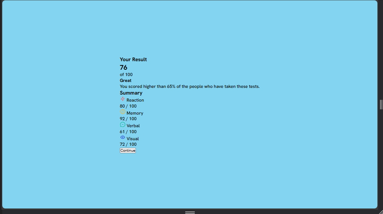
I) Here, I styled the body, and tried to center the whole text, since the original design looks like everything was centered too.
NB; The original design didn't have any background color for the body, but I added a light blue color, just for beautification, and to let the design be easily visible.
6       body{
7           background-color: hsl(196, 80%, 73%);
8           display: flex;
9           justify-content: center;
10      align-items: center;
11      height: 100vh;
12      font-family: 'Hanken Grotesk', sans-serif;
13      }
The above code gave this output;
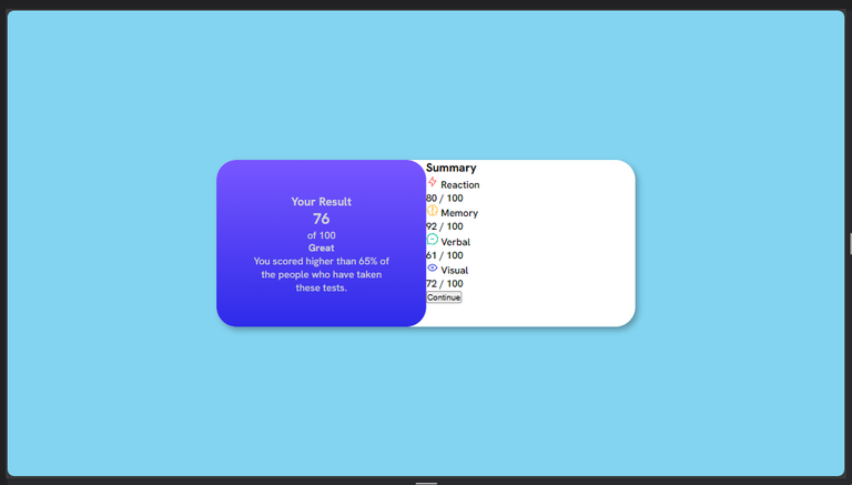
J) Next, I styled the section, giving it the white background color, gave it the curved edges, and I also gave it a width, so as not to occupy the whole screen.
14      section{
15          background-color: white;
16          display: flex;
17          width: 50%;
18          margin: 0 auto;
19          border-radius: 2rem;
20          box-shadow: 5px 5px 10px rgba(0, 0, 0, 0.3);
21      }
All this can be seen below;

K) Next, I focused on the first-div, giving it a linear gradient that smoothly transitions to more than a color from the top to the bottom.I also gave it a width of 50%(half) of its parent, which is the section. I also gave the div a padding so the texts, aren't too close to the borders, with the code below...I also tried my best to reduce the use of height, so as to let the text take up the amount of spaces they need, as all this count when building responsive Web pages;
22      .first-div{
23      background: linear-gradient(to bottom, hsl(252, 100%, 67%),  hsl(241, 81%, 54%));
24          color: hsl(200, 3%, 83%);
25          width: 50%;
26          padding: 8%;
27          text-align: center;
28          border-radius: 2rem;
29      }
This gave the output;
L) Here, I targeted the child-div of "first-div", which contains the text "76 of 100", so as to style it by giving it a circular shape, and a linear gradient color, just as seen on the original design.
30      .first-div>div{
31          background: linear-gradient(to bottom, hsla(256, 72%, 46%, 1), hsla(241, 72%, 46%, 0));
32          padding: 15% 0 15% 0;
33          border-radius: 50%;
34          width: 80%;
35          margin: 0 auto 20% auto;
36      }
The output;
M) I tried to give gaps between the texts here, so I used margin;
37      h3{
38          margin-bottom: 15%;
39          font-weight: 700;
40      }
41      .summary{
42          margin-bottom: 10%;
43      }
Output;
N) I gave my h2 which is "76",a font size, weight/thickness, and color...I also styled the "of 100", and gave it an ash color.
After that, I gave the "great" text a font size, and spaced it afterwards.
44      h2{
45          font-size: 4rem;
46          font-weight: 800;
47      }
48      h2,h4{
49          color: white;
50      }
51      .of-100{
52          color:hsl(240, 1%, 64%) ;
53      }
54      h4{
55          font-size: 1.6rem;
56          margin-bottom: 8%;
57      }
Output;
O) The major thing I did here, was styling the "second-div", instructing it to take up the second half of the section, and giving it a padding, so as to distance the texts from the section border;
58      .grade{
59          font-size: 0.9rem;
60      }
61      .second-div{
62          padding: 8% 6% 8% 6%;
63          width: 50%;
64          color: black;
65      }
Output;

P) I applied the display: flex; function here;
66      .align{
67          display: flex;
68          align-items: center;
69          gap: 15%;
70      }
Output;
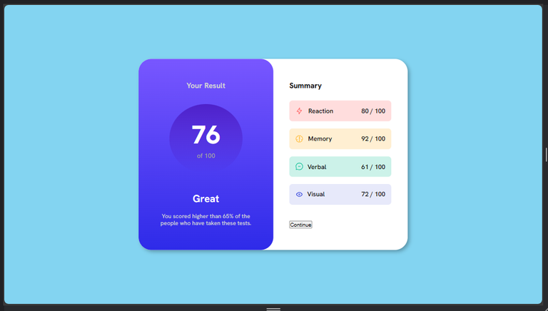
Q) Here I tried to give each of my smaller cells a background color which is lighter/more transparent than the text color...i also used the display:flex; property here too;
71      .grid-1{
72          background-color:hsla(0, 100%, 67%, 0.2);
73          display: flex;
74          justify-content: space-between;
75          align-items: center;
76      }
Output;
With this done. I easily just replicated is for the rest, and there after, distanced the button from them;
77      .grid-2{
78          background-color: hsla(39, 100%, 56%, 0.2);
78          display: flex;
80            justify-content: space-between;
81          align-items: center;
82      }
83      .grid-3{
84          background-color: hsla(166, 100%, 37%, 0.2);
85          display: flex;
86          justify-content: space-between;
87          align-items: center;
88      }
89      .grid-4{
90          background-color: hsla(234, 85%, 45%, 0.1);
91          display: flex;
92          justify-content: space-between;
93          align-items: center;
94          margin-bottom: 15%;
95      }
Output;

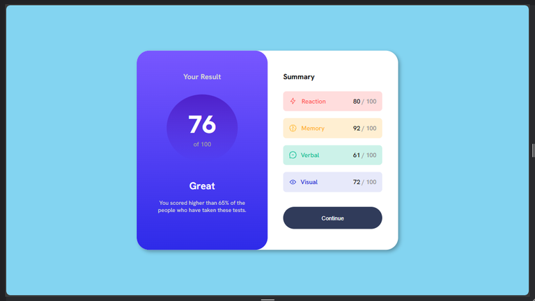
R) I gave the cell divs the same padding, and border radius. I also tried to distance them a little bit along the vertical axis;
96      .grid-1,.grid-2,.grid-3,.grid-4{
97          padding: 6%;
98          border-radius: 0.5rem;
99      }
100     .grid-1,.grid-2,.grid-3{
101         margin-bottom: 7%;
102     }
Output;
S) Next, I gave majorly, the texts in the second-div, their colors;
103     .ash{

104         color:hsl(240, 1%, 55%) ;

105     }

106     .one{

107         color:hsl(0, 100%, 67%) ;

108     }

109     .two{

110         color:hsl(39, 100%, 56%);

111     }

112     .three{

113         color:hsl(166, 100%, 37%);

114     }

115     .four{

116     color: hsl(234, 85%, 45%);

117     }
Output;

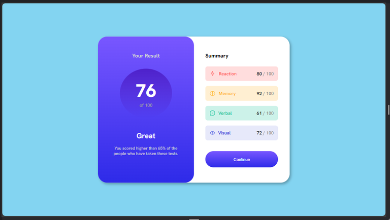
T) I moved on to the last section of my Web page, which is the styling of my button, and i also added font-weight, to some other texts too;
118     button{
119         color: white;
120         width: 100%;
121         padding: 8% 0 8% 0;
122         border: none;
123         border-radius: 5rem;
124         font-size: 0.9rem;
125         background-color: hsl(224, 30%, 27%);
126     }
127     p,.one,.two,.three,.four{
128         font-weight: 500;
129     }
Output;
U) After this I hovered on the button, and also clicked it but there was no effect/ change to show I had performed any action on the button, so i decided to add the hover effect on the button, so that whenever I hovered on the button, it changes to a darker color;
130 button:hover{
131     background-color:hsl(222, 23%, 17%) ;
132   }
Output;

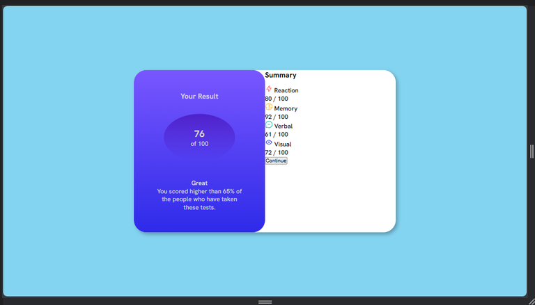
Thereafter, I also did something similar, for clicking, using one of the linear gradients given.
133    button:active{
134    background: linear-gradient(to bottom, hsl(252, 100%, 67%),  hsl(241, 81%, 54%));
135   }
In other words, whenever I click the button, it transforms to a lighter color;

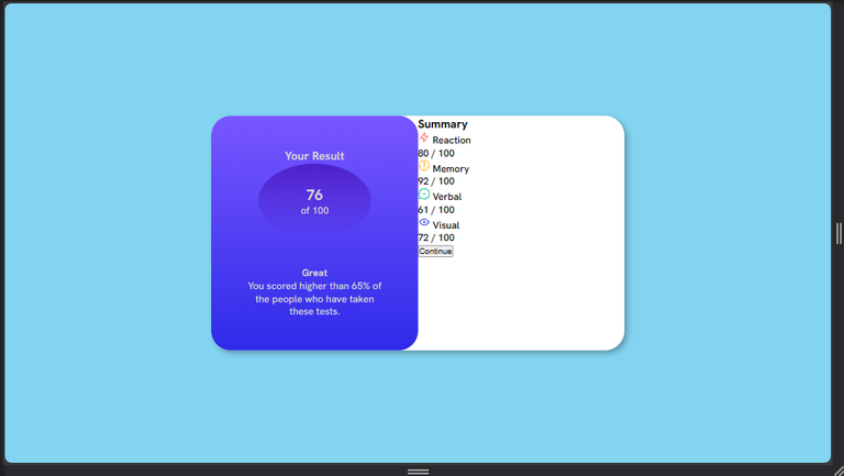
Finally guys, this is what my work looks like when the button is inactive;
And this is what is looks like when active;
It looks pretty nice on a large screen like this but what happens when I reduce the screen to that of a mobile phone??🤔🤔🤔

The above is what it looks like on a smaller screen. Meaning I need to make use of media queries here but I'm still working on that, and will show you the outcome in my next post.
All Photos Are Mine, Except Stated Otherwise.
Thanks For Reading.
Yay! 🤗
Your content has been boosted with Ecency Points, by @timix648.
Use Ecency daily to boost your growth on platform!
Support Ecency
Vote for new Proposal
Delegate HP and earn more