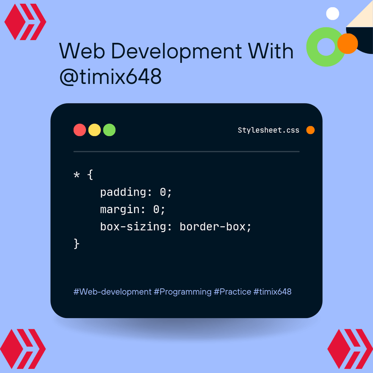
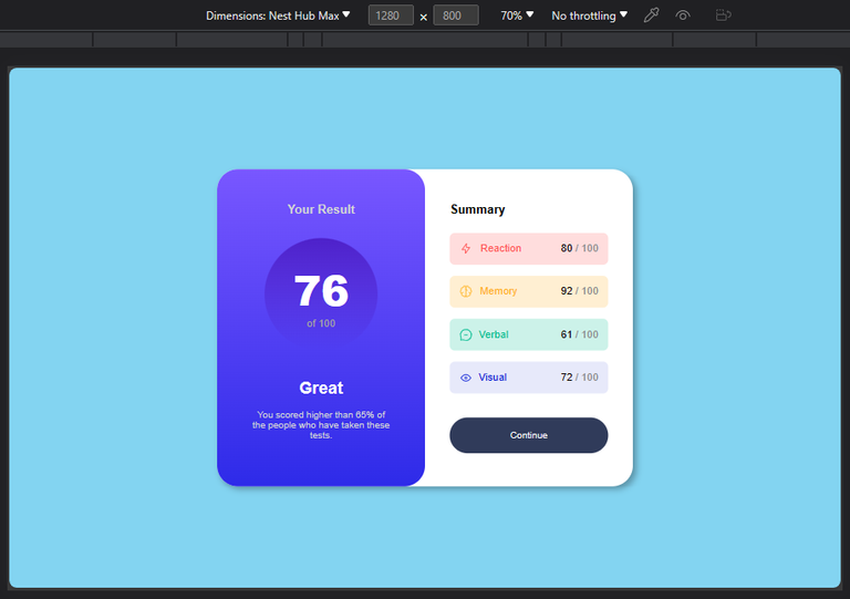
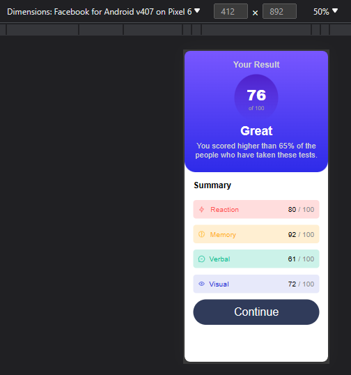
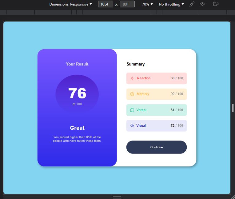
Designing A Result Summary Page, Using H.T.M.L and C.S.S. [PT.2]
Hello people!! I'm back like I promised, with a solution to the issue I had in my last post ( Issue of responsiveness on smaller screen devices). Just like the major aim in my last post, was not just trying to clone the design, but to make the design nice and compatible with all screen sizes big or small.
I must say, this particular work pushed me into making research on media queries, and I'm glad I did, and will in fact be making use of what I learnt in this post, so as to complete my last post, and in all make the webpage a responsive one.
I will be listing the stages my work passed through to get to its final state down below. Let's begin!!!

A) I'm just gonna drop the HTML code I worked with, Which Is actually from my previous code;
    <!DOCTYPE html>
    <html lang="en">
    <head>
    <meta charset= "UTF-8">
    <meta name= "viewport" content= "width-device-width, initial-scale =1.0">
       <link rel="stylesheet" href="./STYLE.CSS">
       <link rel="preconnect" href="https://fonts.googleapis.com">
<link rel="preconnect" href="https://fonts.gstatic.com" crossorigin>
<link href="https://fonts.googleapis.com/css2?family=Hanken+Grotesk:wght@500;700;800&display=swap" rel="stylesheet">
    <title>Frontend Mentor | Results summary component</title>
       </head>
       <body>
<section>
        <div class="first-div">
            <h3>Your Result</h3>
            <div>
                <h2>76</h2>
                <p class="of-100">of 100</p>
            </div>
            <h4> Great</h4>
            <p class="grade">You scored higher than 65% of the people who have taken these tests.</p>
            </div>
        <div class="second-div">
            <h3 class="summary">Summary</h3>
            <div class="grid-box">
                <div class="grid-1">
                    <div class="align">
                        <img src="./images/icon-reaction.svg" alt="">
                        <span class="one">Reaction</span>
                    </div>
                    <div><p>80 <span class="ash">/ 100</span></p></div>
                </div>
                <div class="grid-2">
                    <div class="align">
                        <img src="./images/icon-memory.svg" alt="">
                        <span class="two">Memory</span>
                    </div>
                    <div><p>92 <span class="ash">/ 100</span></p></div>
                </div>
                <div class="grid-3">
                    <div class="align">
                        <img src="./images/icon-verbal.svg" alt="">
                        <span class="three">Verbal</span>
                    </div>
                    <div><p>61 <span class="ash">/ 100</span></p></div>
                </div>
                <div class="grid-4">
                    <div class="align"> <img src="./images/icon-visual.svg" alt="">
                        <span class="four">Visual</span>
                    </div>
                    <div><p>72 <span class="ash">/ 100</span></p></div>
                </div>
        </div>
<button>Continue</button>
        </div>
    </section>
    </body>
    </html>
B) I will also do same by dropping my compiled css code down to where I stopped In my last post;
- {
margin: 0;
padding: 0;
box-sizing: border-box;
}
body{
background-color: hsl(196, 80%, 73%);
display: flex;
justify-content: center;
align-items: center;
height: 100vh;
font-family: 'Hanken Grotesk', sans-serif;
}
section{
background-color: white;
display: flex;
width: 50%;
margin: 0 auto;
border-radius: 2rem;
box-shadow: 5px 5px 10px rgba(0, 0, 0, 0.3);
}
.first-div{
background: linear-gradient(to bottom, hsl(252, 100%, 67%), hsl(241, 81%, 54%));
color: hsl(200, 3%, 83%);
width: 50%;
padding: 8%;
text-align: center;
border-radius: 2rem;
}
.first-div>div{
background: linear-gradient(to bottom, hsla(256, 72%, 46%, 1), hsla(241, 72%, 46%, 0));
padding: 15% 0 15% 0;
border-radius: 50%;
width: 80%;
margin: 0 auto 20% auto;
}
h3{
margin-bottom: 15%;
font-weight: 700;
}
.summary{
margin-bottom: 10%;
}
h2{
font-size: 4rem;
font-weight: 800;
}
h2,h4{
color: white;
}
.of-100{
color:hsl(240, 1%, 64%) ;
}
h4{
font-size: 1.6rem;
margin-bottom: 8%;
}
.grade{
font-size: 0.9rem;
}
.second-div{
padding: 8% 6% 8% 6%;
width: 50%;
color: black;
}
.align{
display: flex;
align-items: center;
gap: 15%;
}
.grid-1{
background-color:hsla(0, 100%, 67%, 0.2);
display: flex;
justify-content: space-between;
align-items: center;
}
.grid-2{
background-color: hsla(39, 100%, 56%, 0.2);
display: flex;
justify-content: space-between;
align-items: center;
}
.grid-3{
background-color: hsla(166, 100%, 37%, 0.2);
display: flex;
justify-content: space-between;
align-items: center;
}
.grid-4{
background-color: hsla(234, 85%, 45%, 0.1);
display: flex;
justify-content: space-between;
align-items: center;
margin-bottom: 15%;
}
.grid-1,.grid-2,.grid-3,.grid-4{
padding: 6%;
border-radius: 0.5rem;
}
.grid-1,.grid-2,.grid-3{
margin-bottom: 7%;
}
.ash{
color:hsl(240, 1%, 55%) ;
}
.one{
color:hsl(0, 100%, 67%) ;
}
.two{
color:hsl(39, 100%, 56%);
}
.three{
color:hsl(166, 100%, 37%);
}
.four{
color: hsl(234, 85%, 45%);
}
button{
color: white;
width: 100%;
padding: 8% 0 8% 0;
border: none;
border-radius: 5rem;
font-size: 0.9rem;
background-color: hsl(224, 30%, 27%);
}
p,.one,.two,.three,.four{
font-weight: 500;
}
button:hover{
background-color:hsl(222, 23%, 17%) ;
}
button:active{
background: linear-gradient(to bottom, hsl(252, 100%, 67%), hsl(241, 81%, 54%));
}
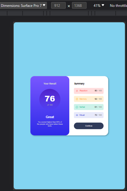
C) Continuing/ updating my css, my first media query, was to target screens with width of 1060px, mainly because I noticed around 836px, that the design was already getting mixed up, and was now overlapping each other,
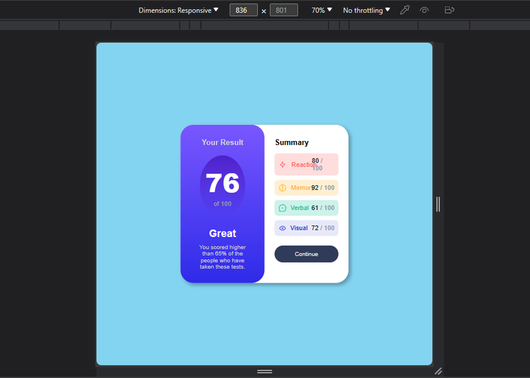
so I decided to Increase the width of my design, so that the design will contain the texts without overlapping;
@media (max-width:1060px){
    section{
        width: 70%;
    }
}
Output;
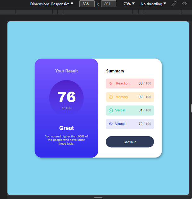
In the above you will notice that we are still on width 836px, but this time the design looks way better with no overlaps.
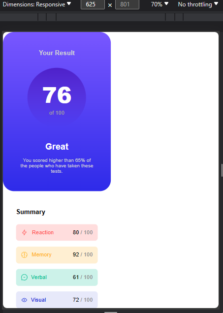
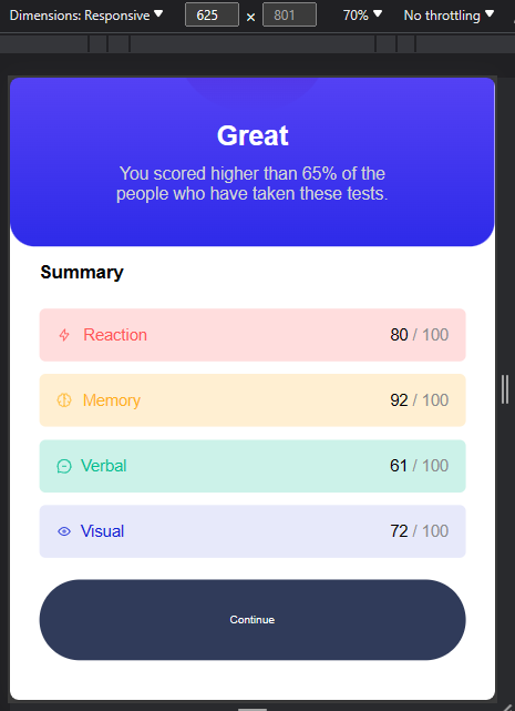
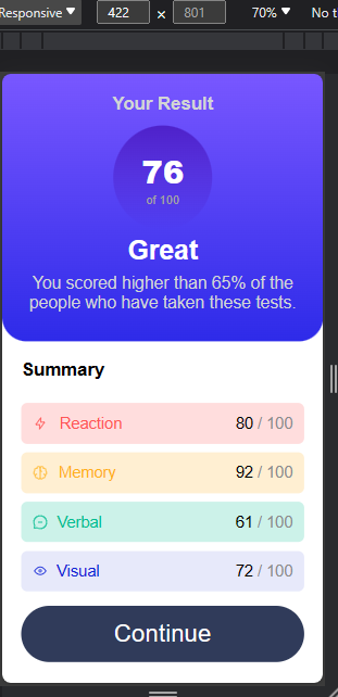
D) I noticed something similar when I reduced the screen below 672px, and since this is usually within the width for tablets, I decided to restructure the design to one that will work properly for mobile devices (Tablets inclusive);
@media (max-width:672px){
    section{
        width: 100%;
        display: block;
        height: 100vh;
        border-radius: 0px;
        overflow: scroll;
    }
Output;
E) Next, I started styling the first div of the section, instructing it to take up the width of the whole screen, and giving it a padding to follow so as to distance it from the borders;
    .first-div{
        width: 100%;
        padding: 6%;
        border-radius: 0px 0px 2rem 2rem;
    }
Output;
F) Here, I worked on the child div of the "first-div",giving it that perfect circular shape it's supposed to have;
    .first-div>div{
        padding: 8% 0 8% 0;
        border-radius: 50%;
        width: 35%;
        margin: 0 auto 2% auto;
    }
Output;
G) I formatted most of the text here, reducing their space vertically, and giving some of them font-size to fit the new width size ( I was trying so hard here to ensure the design doesn't take up two pages on smaller screens);
    .of-100{
        font-size: 1rem;
    }
    h4{
        margin-bottom: 3%;
        font-size: 2.2rem;
    }
    h3{
        font-size: 1.5rem;
        margin-bottom: 4%;
    }
    .summary{
        margin-bottom: 6%;
    }
    h2{
        font-size: 2.6rem;
    }
Output;
H) The major thing I did here, was to Increase the font size of the text with the class "grade";
    .grade{
        margin: 0 auto 3% auto;
        font-size: 1.4rem;
        max-width: 400px;
    }
Output;
I) I moved on to style the second div of the section, telling it to also take up the full width of the device screen;
    .second-div{
        padding: 3% 6% 8% 6%;
        width: 100%;
    }
Output;
J) The increase in width, resulted in smaller font-sizes here too, so I tweaked the font-sizes of the texts with class "p" and "span", to a more suitable one for smaller screens;
    p,span{
        font-size: 1.3rem;
    }
Output;
K) The next on the list, was to reduce the padding of each cell like I said earlier, I was trying to make the design end in just a page, or almost, 1.2 pages (you get what I mean?😅😅);
    .grid-1,.grid-2,.grid-3,.grid-4{
        padding: 4%;
        border-radius: 0.5rem;
    }
Output;
L) I did something similar here too— I reduced the vertical spacing of the cells too;
    .grid-1,.grid-2,.grid-3{
        margin-bottom: 3%;
    }
Output;
M) I also reduced the vertical distance of the last cell from the button...I should have done this once by grouping, but I wanted the gap to be slightly more that the spacing within other cells as seen in step (L) hence the reason for handling it separately;
    .grid-4{
        margin-bottom: 5%;
    }
Output;
N) You can clearly see the text in the button now looks way too small for mobile device users, so I increased it too;
    button{
        font-size: 2rem;
        padding: 5%;
    }
}
Output;

O) Nothing much occurred in this step, apart from the fact that I still tried to tweak the spacing for even smaller screens (530px and below);
@media (max-width:530px){
    .summary{
        margin-top: 3%;
        margin-bottom: 8%;
    }
Output;
grid-1,.grid-2,.grid-3{
        margin-bottom: 5%;
    }
}
Output;
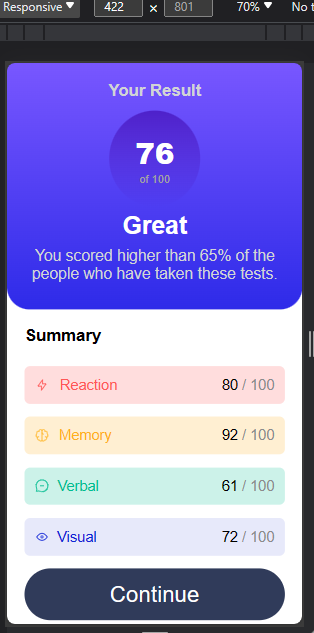
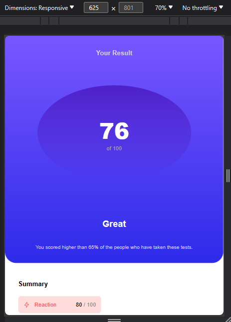
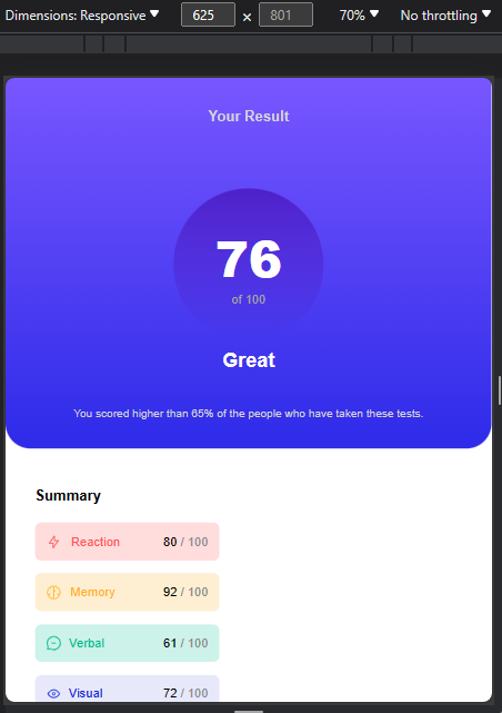
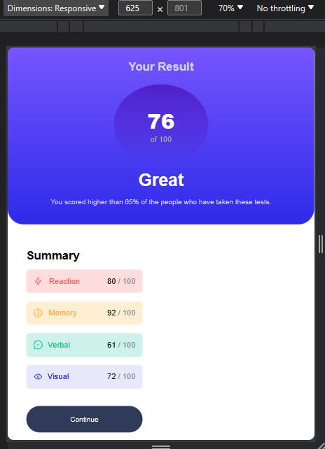
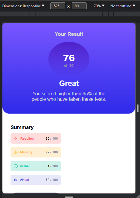
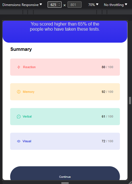
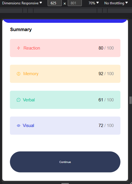
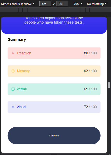
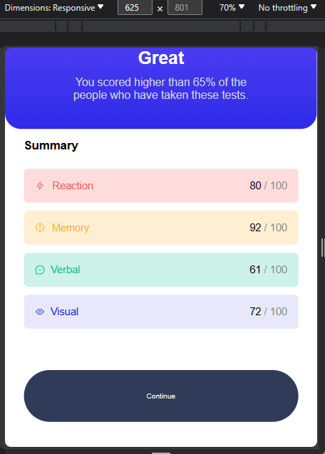
And that's all for the responsive layout for this design...I'm now going to drop the photos I took of different screen width, so you can see how the design responded for the decrease or increase in screen size;

Click Here To See The Original Design.
All Photos Used Here Are Mine Except Stated Otherwise.
Thanks For Reading.
Post manually reviewed. 😊
Thank you 🤗
Yay! 🤗
Your content has been boosted with Ecency Points, by @timix648.
Use Ecency daily to boost your growth on platform!
Support Ecency
Vote for new Proposal
Delegate HP and earn more
Congratulations @timix648! You have completed the following achievement on the Hive blockchain And have been rewarded with New badge(s)
Your next target is to reach 1500 comments.
You can view your badges on your board and compare yourself to others in the Ranking
If you no longer want to receive notifications, reply to this comment with the word
STOP