Splinterlands Art Contest Week 288!My version AGANJU.
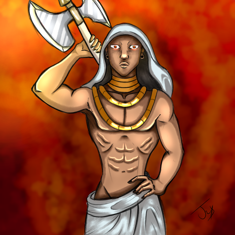

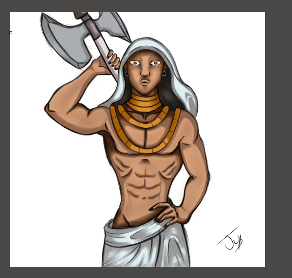
Hello friends from the @splinterlands community, I come to share with you my entry to the contest number 288 with this version of AGANJU, a legendary category fire element card, I wanted to make this character since I thought it was great, a guardian who is a great protector who has an ability useful when it comes to battles, I performed a different pose and I liked how the anatomy turned out, I hope you like it as much as I do and below I will show you the steps I performed.
- Hola amigos de la comunidad de @splinterlands vengo a compartir con ustedes mi entrada al concurso numero 288 con esta versión de AGANJU una carta de elemento fuego categoría legendaria, quise hacer este personaje ya que me pareció genial ,un guardián supe protector que posee una habilidad útil a la hora de las batallas, realice una pose diferente y me gusto como quedo la anatomía, espero te guste tanto como a mi y a continuacion te muestro los pasos que realice.
PROCESS
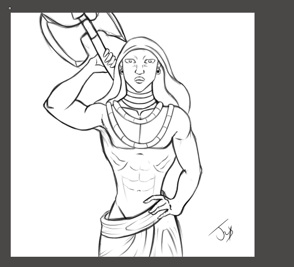
I made the sketch of the character in a first layer, I wanted to make a different pose of the character, notice that the character is only with a tunic so I wanted to highlight the body, then add the details that characterize the character such as his chains and his axe, then From this apply the base color and the other details of the character.
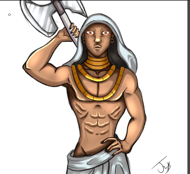
I applied the base color in the drawing using the tones that the card has and it looked very good, then apply the shadows with a medium tone to start creating a little volume then apply a darker tone to create depth.
Realice el boceto del personaje en una primera capa, quise hacer una pose diferente del personaje, note que el personaje esta solo con una túnica así que quise destacar el cuerpo, luego agregue los detalles que caracterizan al personaje como sus cadenas y su hacha, luego de esto aplique el color base y los demás detalles del personaje.
Aplique el color base en el dibujo usando los tonos que posee la carta y quedo muy bien , luego aplique las sombras con un tono medio para empezar a crear un poco de volumen luego aplique un tono mas oscuro para crear la profundidad.
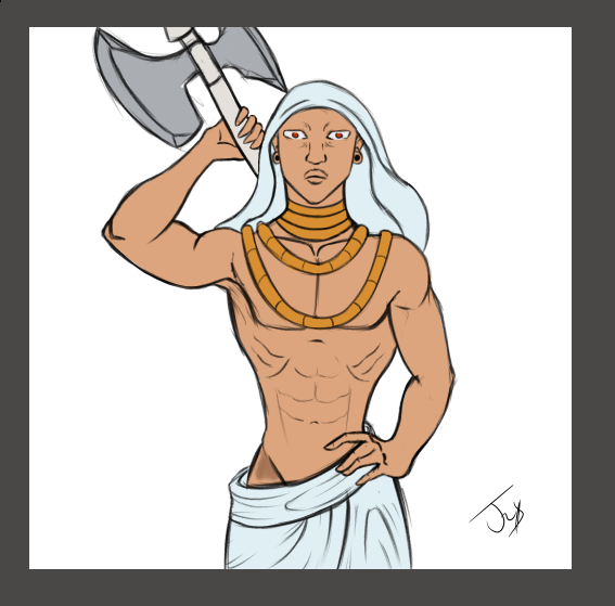
I applied the shadows trying to use a point of light to apply to each part of the body and create the effect of volume. I also used a little bit of a darker tone to create depth and improve the appearance of the drawing.
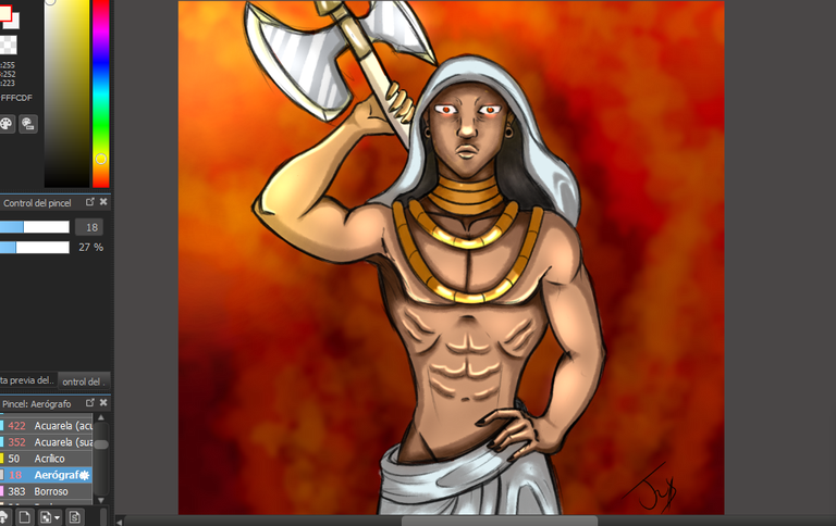
Apply a little light on the body to give a better finish and highlight the point of light that the character receives, and it looks great when applying a background.
Las sombras las aplique tratando de usar un punto de luz para ir aplicando en cada parte del cuerpo y crear el efecto de volumen también use un poco de un tono mas oscuro para crear profundidad y mejorar el aspecto del dibujo.
Aplique un poco de luz en el cuerpo para dar un mejor acabado y resaltar el punto de luz que recibe el personaje, y queda muy bien al aplicar un fondo.
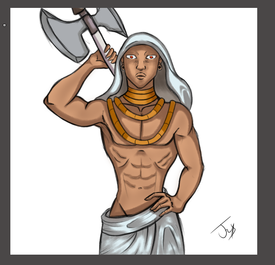
To finish the drawing, apply a color in the background, an effect created with a brush to resemble the smoke of the fire and a little light to finish, I really liked the result I made with this drawing, making different poses helps me improve in My drawing and using creativity to make the poses is the best part, I hope you like this work as much as I do, thank you very much and I'll see you in a next post.
- Para finalizar el dibujo aplique un color en el fondo un un efecto creado con un pincel para asemejar el humo del fuego y un poco de luz para terminar, me gusto mucho el resultado que hice con este dibujo, realice poses diferente me ayuda a mejorar en mi dibujo y usar la creatividad para hacer las poses es la mejor parte, espero te guste tanto como a mi este trabajo , muchas gracias y nos leemos en un próximo post.
All the images with captures made by me.
Todas las imágenes realizadas por mi.
THANK YOU VERY MUCH FOR READING.
MUCHAS GRACIAS POR LEER
Checkout our BDVoter Daily Hive Showcase & Participate into our Daily giveaway to win various prize.