How to read a Chart Rule #1: When in doubt... ZOOM OUT :)
Good morning Hivers & Splinterlandians!
For my first post of 2024 I want to take some time to teach a FUNDAMENTAL lesson on How to Read a Chart, Support/Resistance Levels and Market Cap... in my usual "Not Boring" way...
My hope is that you can learn WHAT these terms are and WHY a "zoomed out" view is EXTREMELY HELPFUL... if you understand it.

The main driving force behind the Price of Alt Coins is the emotion behind Bitcoin and Crypto as a whole. If Bitcoin is being hyped up and the masses are in favor... It goes up and thus Alt Projects like Splinterlands do too!
The reverse is true too - if people think Bitcoin is "failing" or have negative emotions like fear... they pull their money out - especially from fringe projects and thus projects like Splinterlands suffer WILD PRICE SWINGS...

Just like my last post with Charts and TA -- THIS IS NOT FINANCIAL ADVICE. I AM NOT TELLING ANYONE TO DO SOMETHING. NOR AM I SUGGESTING THAT SOMEONE SHOULD BUY/SELL/HOLD ANYTHING. I AM JUST SHOWING AND SHARING WHAT I HAVE LEARNED OVER THE LAST DECADE I HAVE SPENT DOING THIS.
With that covered - do what you want to with this info but as the title says:
If you want to see what MIGHT happen in the future... one MUST look to the PAST to see what HAS happened.
Here's the important part!! Here's WHAT you're looking for and WHY...
Where price stays constant for long periods of time - this usually represents periods where Buyers or Sellers can't produce enough of either volume to overcome either side and make the price move one way or the other...
This represents LEVELS of Support & Resistance...
Let's take a look at some simplified examples of this:
FICTIONAL Buyer Example: Timmy Scooper has played the online #NFT based card game #Splinterlands for years... even though the price of the $SPS Token has gone down significantly, his faith in the project and #web3 gaming is stronger than ever!!
#Land has finally released version 1.5... The new Card Set #Rebellion has just came out and he truly believes that current token prices are a BARGAIN!!!
Timmy thinks: "I can't believe this Token is only $.02!!! It's going to be worth $.20 OR MORE some day!! I am going to put in $100/week at $.02 and BUY AS MUCH AS I CAN!!"
Multiply this times "the population" (# of ppl interested in said Token and how much $$$ they put in) and you get a "Resistance" to the price of said Token dropping below that "Bargain buy" level... $.02 in this COMPLETELY FICTIONAL EXAMPLE...
This "Resistance Level" is because of their "belief" that $.02 is a bargain and willingness to drop in fresh capital - whether daily, weekly or lump sums... AS LONG AS IT REMAINS AT THIS LEVEL...
So, with the buyers $$$ coming in, there aren't enough Sellers to push the price lower than $.02 because every time someone sells... There's a Buyer waiting to "scoop it up" 😎
This makes the $.02 Price a sticking point that won't vary much and thus becomes a "Support Level"...

Now let's look at an oversimplified Seller example - it's pretty much the same as the Buyer but in reverse...
Let's say "Timmy" was the Buyer from the example above...

Great job Timmy!! You scooped up soooooooooo many Tokens at $.02!! You reaaaaaaaally loaded up! Your bags are SO FULL... you can barely move!!

Timmy believed and hoped and prayed that the Token he bought so much of at $.02 would hit $.20... and eventually with a ton of patience - Timmy was right!!
The Token is now $.20 and guess what... Timmy starts unloading his Tokens onto the market at $.20... the tokens he bought at $.02...
This usually plays out in two scenarios with some variations in between:
Scenario A: Timmy the n00b says "OMG I CAN'T BELIEVE IT - IT HIT $.20 AND I DID IT"... Timmy looks at the market and sees the buy orders stacked up from $.13 to $.20 and moves the mouse over to Sell button and thinks:
"You know... if I sell ALL my tokens RIGHT NOW... the price would drop to $.13 because there's not enough demand at $.20 to cover my entire balance..."
What does Timmy the n00b do?? You guessed it - chucks the whole lot onto the market in one big go and TANKS THE PRICE...

This is where those big dips show up on charts come from - someone foolishly unloaded a HUGE holding onto a Market that couldn't sustain it... and drops the price.
Scenario B is the smarter play and it goes like this:
Timmy says "Ok... I've had patience until now... I'll just put a little out there at $.20 today... and when that's bought up... I'll do it again and again... and again..."
This ensures Timmy gets the full 10x on his trade AND creates a really hard Price Point to get past... All these buyers keep purchasing tokens at $.20 and Timmy keeps unloading his supply... so $.20 becomes a sticking point or "Resistance Level".
It was necessary to explain the Support/Resistance Fundamental to help understand WHAT we are looking at and WHY we are looking for it.
These Support/Resistance Levels indicate prior EMOTIONAL PRICE POINTS where things got "sticky"... Recognizing them is important but understanding them is... IMPORTANTER!!!

New Abbreviation: Support/Resistance = S/R because I am not typing all that out a bunch... it's ridiculous 😑
Ok... Understanding the BASIC Psychology of S/R Levels... and WHY it's important.
Now look... at this point - you may be wondering... "what the f**k is rambling about??? I came here to ZOOM OUT...???"
Please bear with me - I have a point... but to truly understand THAT point and be able to recognize the next one yourself... I need you to hang in there a bit longer...

If you're like me... you've never ever, not once, made a bad trade in your life... you've never BOUGHT THE TOP... or SOLD THE BOTTOM... Nope... ZERO TIMES...

Ok so what happens when someone FOMOs into something and "Buys the Top"... there's a couple paths it could take but we will focus on this one:
FICTIONAL Seller Example:
This psychological process usually derives from the "It's only a loss if you sell bro" mentality - and in the past Crypto markets, with SOLID projects... was usually the correct thought... That's where term "HODL" came from after all. Drunken typo from a guy who was DETERMINED not to sell for a loss.
So let's say Timmy... no we used him... uhh... Let's say Jimmy Bagholder buys the TOP at $.20 and the price drops back down to $.10... FUCK!
Jimmy is PISSED and SCARED because he bought the Token based off of HYPE not KNOWLEDGE - Something like: "YO BRO!! THIS THING IS UP 10X BRO!! IT'S GOING TO $1 BRO!!!! MOONLAMBOBRO!!!!"
Jimmy, not knowing a fucking thing about said Token, takes some savings or extra cash and just YEETS IT into the Token at $.20... which then drops... BECAUSE IT WAS UP TEN FUCKING X from $.02!!!
So... What does Jimmy do at this point?? Is he going to take a %50 L on the Token he just FOMOd into???
Not a fucking chance!!! Jimmy just HOLDS THE TOKEN... because JIMMY ISN'T A BITCH!!! AND HE AIN'T SELLING FOR A LOSS!!! #DIAMONDHANDSBRO (sound familiar?)

Unbelievably, against all odds... the price is now $.20 again!!! Jimmy has looooooooooong awaited this moment... because Jimmy "DiamondHands" Bagholder didn't sell for a LOSS...
Guess what Jimmy (and others like him) do??
They fucking SEND IT... They think "I didn't sell for a LOSS... BUT I WILL SELL FOR BREAKEVEN MADDAFAKKAS!!!!!!!!!!!!!!!!!!!!!!! Thank GOD I am OUT!!"

Everyone who felt "duped" they bought the top, who managed to HODL until the price got back up to where they bought... who DIDN'T learn about the Token and WHY they should keep it... WILL BE UNLOADING THEIR TOKENS AT $.20... What does that do??
Now you got it - it creates a level of RESISTANCE... In many scenarios, these "Jimmy's" will start to panic, not seeing the price go over $.20 and start selling a little lower... and lower... and lower... creating another dip...
What happens next depends on several key factors which I won't cover today... but I will soon!!
If you made it this far... thank you! Now... let's get to looking at some REAL LIFE examples of S/R Levels and WHY "Zooming out" is important!
If you're really new to understanding Price Charts and Technical Analysis and if those words are literally a foreign language to you... let me throw out an explanation for those who may not understand:

Many people look at the price of a token... TODAY. Or perhaps they look at TODAY and the All Time High (ATH) or the All Time Low (ATL)... Maybe they glance at CoinMarketCap and see a SUPER DUPER BASIC CHART with no detail... maaaaaaaaybe they see the "Weekly Change"...
The term "Zoom Out" simply means to look at Token and it's performance over a LONGER PERIOD OF TIME...

Instead of looking at a Tokens performance over "Today" or the previous "Week"... How has the Token performed over the previous "Year"? How has it performed over the last "5 Years"... How has it performed "FROM THE BEGINNING OF TIME!!!!!!!"
Ok maybe not that dramatic... but the "All Time Chart" shows how a Token has performed SINCE IT WAS CREATED! THIS. IS. VERY. USEFUL...
If you know WHAT to look for and WHY! (That's what we're learning)
Knowing what a Token HAS done... can give us clues as to what it MIGHT do... Because we can spot where "Jimmy" might DUMP his "Bag"... or Timmy might try to "scoop up" some "cheap" Tokens...

Without further ado... armed with our new knowledge... Let's go look at some REAL LIFE EXAMPLES!!!
For the first example, we are going to look at Bitcoin $BTC... It's the OG of Cryptocurrencies and as such - has the most data and also the most trust...
Bitcoin and Crypto are still NEW and thus "High Risk" investments... The newer the project - the "Riskier" it is... I like to think of Bitcoin as a huge planet and the Altcoins as Moons... When Bitcoin "orbits up"... The Alts follow suit and slingshot past it... when Bitcoin "orbits down"... the Alts do so too.
For our first peek - we shall focus on Bitcoin today and take a quick look at another chart - Total Market Cap... more on that later...
Let's take a moment to consider something simple, yet profound:
If you didn't know that the squiggly lines on your screen represented LETTERS and when put together they represented WORDS... and those words had SPECFIC MEANING...
Staring at this article wouldn't help you very much... now would it?
If someone is looking at a Chart but they can't READ the Chart... WHAT GOOD DOES THAT DO??

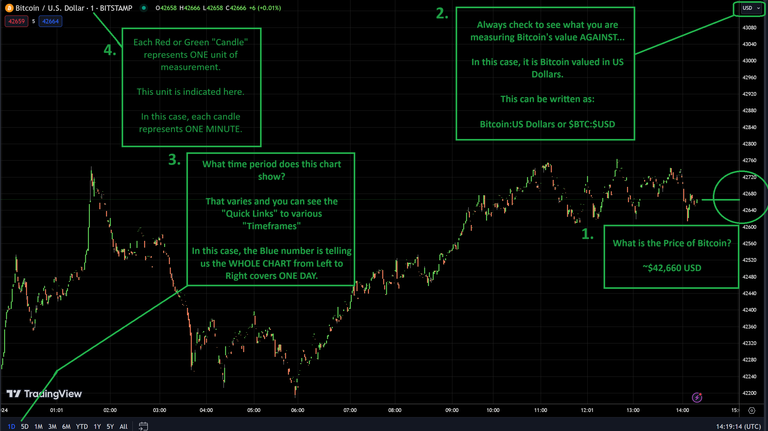
So... What are these four Text Boxes and WHAT do they mean??
Text Box 1. - This box is showing you where you can find the CURRENT PRICE of Bitcoin... as measured in... something? (In this case, US Dollars)
Text Box 2. - This box shows you WHAT you are measuring Bitcoin "AGAINST" or "IN"... as in "How many of "X" do I need to get ONE (1) Bitcoin"... in this case, about 42,660 US Dollars or $42,660.
Text Box 3. - This box is showing us HOW LONG or what "TIMEFRAME" the ENTIRE chart covers, from Left to Right... In this case, the highlighted Blue "1D" lets us know that we are looking at ONE DAY.
Text Box 4. - This box is letting us know how long each individual Red or Green "Candle" represents... In this case, each Candle is ONE MINUTE.

Ok good - simple so far... As you may guess, when you have "Small Timeframe" Chart, you would want to measure it in Small Candles...
In this example the One Minute or (1) Candle works well on the One Day or (1D) Chart... There's 1,440 Minutes in 1 Day... so that could work...
Do you think the 1 Minute Candle would well on the 1 Year (1Y) or 5 Year (5Y) Chart??? No... that's INSANE... 2,628,000 Minutes in Five Years... That's WAY TOO MANY CANDLES to read and it's hard to DRAW THEM... It would take ENORMOUS COMPUTATIONAL POWER to render 2.6M candles!!!

So... what IS the lesson here?? It's quite simple my friends:
On "Short Timeframes" like a 1 Day Chart... we use "Shorter Candles" like the 1 Minute Candle...
As we look at Longer Timeframes such as the 1 Week Chart, the 1 Month Chart, the 1 Year Chart and the "All Time Chart"...
We will need to "expand" our Candles to represent larger units of time too... So the 1 Minute Candle becomes the 1 Hour Candle, 4 Hour, 1 Day, 1 Week, 1 Month??? 1 QUARTER! etc etc etc...

THE ACT OF INCREASING THE LENGTH OF TIME REPRESENTED ON A CHART... IS CALLED "ZOOMING OUT"...

Remember the Timmy/Jimmy examples for Buyers and Sellers? Remember how their Psychology influenced different Price Points where the Price of a Token got "STUCK"... Support and Resistance Levels...
By "Zooming Out" we can see MORE DATA... and with that data we can focus on not only what the price is TODAY... and what direction it is heading FOR THE MOMENT...
But one may be able to glean some REALLY useful information like:
WHERE ARE THESE SUPPORT AND RESISTANCE LEVELS!!!!
Remember... If Jimmy "DiamondHands" Bagholder bought at $.20... and we are getting close to that $.20 Price Point... Buying now might not be a great time because there might be a lot of "Jimmy" out there, just waiting for the price to reach $.20 so they can dump their bags for breakeven and not "Sell for a Loss"...
Now... the opposite can be true too... let's say the price was $.10 and going up... Now MIGHT be a good time to buy... because we can see HISTORICALLY the next level of Resistance would be $.20... and it sure would be nice to DOUBLE our moolah!!
Ok... that covers the basics... you SHOULD understand what you are about to see... are you ready for slightly "Zoomed Out" Bitcoin Chart???

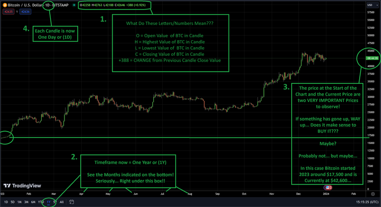
Alrighty - we have some more text boxes... What do they mean?
Text Box 1. - This box is showing you a bunch of random Letters and Numbers... but it explains the MEANING of each one... Good to know!!
Text Box 2. - This box is showing us HOW LONG or what "TIMEFRAME" the ENTIRE chart covers, from Left to Right... In this case, the highlighted Blue "1Y" lets us know that we are looking at ONE YEAR. See the Months listed at the bottom!
Text Box 3. - This box shows you the Price of Bitcoin... I have Circled the CURRENT Price of Bitcoin... as well as one other important Price... I drew a line from the START of the Chart... to the Price Field... and we see the price was around $17,500... Now... this isn't very precise... but it's a good LEARNING instrument!
Text Box 4. - This box shows you the Candle Length again... in this case, we have gone from 1 Minute (1) to 1 Day (1D) per Candle... Could you imagine trying to look at the Year Chart in MINUTE CANDLES???? Yikes.
Ok... With that practice under your belt... let's look at both the 5 Year and All Time Charts!
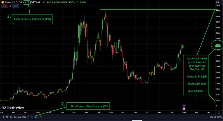
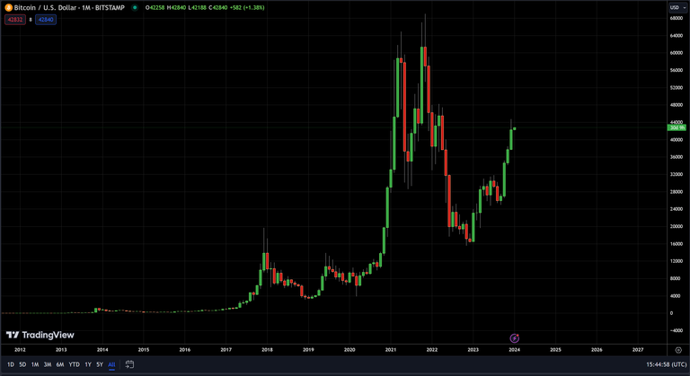
So yeah, I think you can see why it has been a pretty wild ride since the beginning of Bitcoin and Cryptocurrencies!!
I put the text boxes in the 5 Year Chart but I don't think I need to elaborate on them... and I left the All Time Chart blank - I fully trust you can read that chart by yourself at this point...
If you can't, don't worry - just go look at and review the previous Charts and Text Boxes... You will get it... You can do this! I have faith in you!
Ok... I'm sure if this is your first crack at "Reading Charts"... your brain may be reaching capacity and possibly on the point of catching fire or exploding!!

Now here's where the MAGIC HAPPENS... Let's see if we can find places where the Buyers and Sellers created "Support" or "Resistance" Levels!! Remember... those are points where the Price got "Stuck" and/or "Reversed"... These are represented by "Flat" spots on a chart or sharp "Angles"...
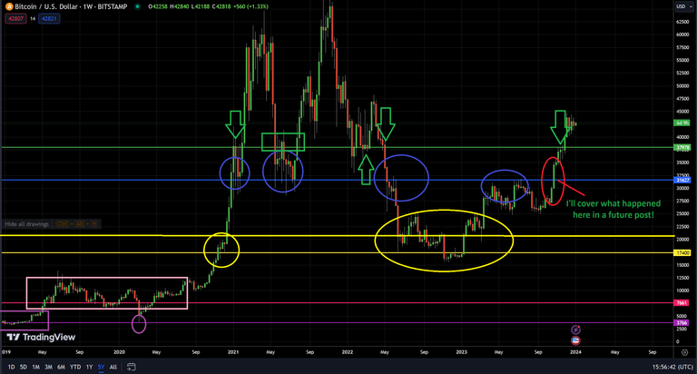
But trust me, it's really simple!! Just look at the color coded Lines and Circles/Boxes/Arrows...
See how the price movement either "Stops" going in one direction and sort of "stutters" along in a "range" that is VERY TIGHT against the line... and see how when it happens in the PAST... IT TENDS TO REPEAT around that same price!!
Or notice sometimes it will get to one of those lines and then REVERSE direction!!
These are "Support" and "Resistance" Levels and I hope that by the time this lesson is over... you will have learned to recognize how to find them on a chart... and understand what they mean!
Which brings me to my final concept and chart of the day:
Market Cap - as it is used in Cryptocurrencies.
Market Cap is short for Market Capitalization. Which still doesn't tell us much... but as confusing as the term may seem... it's just a fancy pants way of sounding smart...
So WHAT is Market Capitalization or Market Cap or MCap or MC???? Why so many variations... WHY????
WHAT it is... is simply THE NUMBER of Tokens currently in existence multiplied by the DOLLAR VALUE of each Token... Most commonly represented in $USD.
Yeah... that's it... Seriously... I'm not joking... Fancy Pants indeed!!
So... to calculate Market Cap of a Token... let us say there is 1,000,000 Tokens as of this EXACT moment... and let us also say, at this VERY MOMENT... each Token is worth PRECISELY $1.00 USD... So what would the Market Cap be???
1,000,000 Tokens x $1.00 = $1,000,000 Market Cap. Yes. It is THAT simple!
But WHY is this important you may wonder - because it tells you HOW MUCH MONEY is already in the SYSTEM...
OK... BUT STILL - WHY IS THAT IMPORTANT!!!!
Imagine you are trying to lift a Rock... I SAID A ROCK... NOT THEE ROCK!!!
Imagine if you were trying to lift or MOVE a rock... If you were trying to move a small rock... you wouldn't need a lot of effort to move it...
However... as you would expect... the bigger the rock... the more FORCE needed to move it...
Why the hell am I talking about ROCKS???
Because that's how Market Caps work... BUT WITH DOLLARS!!!!
Lets use the example Token above with a Market Cap of $1,000,000... How much MORE money has to be ADDED to the SYSTEM (More people BUYING tokens or the SAME PEOPLE buying the tokens with NEW MONEY)... in order for the MC to go up 10%?
Again - this is a SUPER SIMPLIFIED EXAMPLE... but still a TRUE EXAMPLE...
What is 10% of $1,000,000... $100,000... So if $100,000 is added into the system by people taking their Dollars and BUYING TOKENS with them... the Price of each Token will go up...
In addition, now people are paying MORE for each token because the number of tokens hasn't changed - the only way to get the token is to buy the LOWEST selling price of a Token and by adding the $$$ but not increasing the number of tokens, they must be willing to PAY MORE for each token...
A Market Cap of $1,000,000 = 1,000,000 Tokens x $1.00
A Market Cap of $1,100,000 = 1,000,000 Tokens x $1.10
Ok... lets "ZOOM OUT" on that concept and then we will see our FINAL CHART!!!
PREPARE FOR LOTS OF MATH... Kinda simple math... BUT LOTS OF IT!!
If $1,000,000 Market Cap only needs $100,000 to move 10%... then if something had a $1,000,000,000 ($1 Billion) or even a $1,000,000,000,000 ($1 Trillion) Market Cap... It would take WAY MORE MONEY to move... Right? Duh.
Remember, in this example we have EXACTLY 1,000,000 Tokens... No more, no less.
Let's look at what happens when we add $100,000 to each Market Cap!!
For the 1 Million Dollar Market Cap w/ 1,000,000 Tokens...
1Mn Token x $1.00 = $1,000,000 MC
1Mn Token x $1.10 = $1,100,000 MC
That's a +10% Change in Price by adding $100,000!
For the 1 Billion Dollar Market Cap w/ 1,000,000 Tokens... (A Billion is 1,000 Millions)
1Mn Token x $1,000.00 = $1,000,000,000 MC (1 Billion Dollar MC)
1Mn Token x $1,000.10 = $1,000,100,000 MC (1 Billion 100 Thousand Dollar MC)
That's just a +.01% Change in Price by adding $100,000 😱
For the 1 Trillion Dollar Market Cap w/ 1,000,000 Tokens... (A Trillion is 1,000 Billions!!! Or a Trillion is 1,000,000 x 1,000,000)
1Mn Token x $1,000,000 = $1,000,000,000,000 MC (1 Trillion Dollar MC)
1Mn Token x $1,000,000.10 = $1,000,000,100,000 MC (1 Trillion 100 Thousand Dollar MC)
That's only a +.0000001% Change in Price by adding $100,000 😱
Why did I bring this confusing shit up at the end of the brain melter... Three reasons:
The smaller the Market Cap... the SMALLER the amount of MONEY needed to make it move in LARGE %'s (this is how you make lots of money... or lose lots of it).
If you have A LOT of Tokens... the PRICE of each may be SUPER CHEAP... but you would have a HUGE MARKET CAP ($SHIB anyone)... By understanding HOW a Market Cap is calculated... you can see why not all "Cheap" coins are good (or bad)!!!!
YOU CAN APPLY THE SAME PSYCHOLOGY TO ANY MARKET CAP CHART THAT YOU APPLY TO PRICE CHARTS!!!!!!!!
Well of COURSE it does... Because the MARKET CAP MOVED WITH THE PRICE... DUH!!!
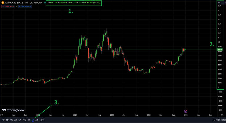
So why am I closing out the post with this chart?!?!?
Look closely at 1. - That tells you the how the Market Cap has performed over the Current Candle (1W)... Those are in Billions of Dollars!
Look at 2. - This isn't measuring in PRICE... it's measuring Market Cap and it shows you some important ones: The Low, The High and the Current... As well as the S/R Levels...
Look at 3. - If you're thinking I am joking... I am not... it's the 5Y Market Cap chart... BUT WHY???
Bitcoin is currently at $42,600... PER... TOKEN... The Market Cap is currently $837.5 Billion...
HOW MUCH MONEY... WILL IT TAKE... TO DOUBLE BITCOIN'S MARKET CAP... AND WHAT WILL BITCOINS PRICE BE THEN!!!!!!!!!!!!!

After the dust clears...
To DOUBLE the Market Cap of $837.5 Billion Dollars... you would OBVIOUSLY need... another $837.5 Billion Dollars... Making the NEW Market Cap $1.675 TRILLION Dollars... with a token price of... $85,200.
The higher the market cap... the harder it is to CHANGE it... the harder it is GAIN or LOSE money on it in the SHORT term... and WHY it is IMPORTANT with Bitcoin or ANY TOKEN... to LOOK AT THE WHOLE PICTURE... THUS the saying...
That's it... That's all I have... If you made it this far, you have concluded in my eyes... one of the most IMPORTANT FUNDAMENTAL Lessons on how to read a chart and understand what it means.

I hope you enjoyed the read and please give it some consideration!!
Leave your feedback, comments and thoughts below!!
I'd love to have you join me in the game Splinterlands and you can sign up at this link:
https://splinterlands.com?ref=captaindingus
Cheers 🍻,
- CaptainDingus
#play2earn #web3 #Splinterlands #NFTGaming #HiveGaming #Crypto #Bitcoin #Chart #TA #Support #Resistance #MarketCap #Token
This is a monster post, full to the brim with useful information especially with the year we have coming.
I was a Jimmy and bought Cardano at the literal top, then as it went down I continued to buy until it hit around .60 and I was like, fuck this. I've been HODLing since then and just want to break even... if I can. Maybe then my girlfriends boyfriend will let me sleep in the house !LOLZ
During the last Bull I was stupid, and didn't really know what I was doing, since joining Hive though I've managed to learn so much.
Keep up the good work man, also you should have posted this into the Leofinance community. Posting into a community helps with visability.
!PIMP
You must be killin' it out here!
@killerwot just slapped you with 1.000 PIMP, @captaindingus.
You earned 1.000 PIMP for the strong hand.
They're getting a workout and slapped 1/1 possible people today.
Read about some PIMP Shit or Look for the PIMP District
lolztoken.com
Never mind, skip it.
Credit: reddit
@captaindingus, I sent you an $LOLZ on behalf of killerwot
(1/10)
Delegate Hive Tokens to Farm $LOLZ and earn 110% Rewards. Learn more.
Aw man @killerwot, you are out of PIMP to slap people.
Go Stake some more and increase your PIMP power.
(We will not send this error message for 24 hours).
Read about some PIMP Shit or Look for the PIMP District
So I am guessing it posts into the Community that you use as the first Hashtag at the end yeah?
I'll have to cross post it and see if that helps...
Yeah man, so whatever the first tag is, is what community it'll post into. What front-end do you use while posting? Above the tag section on Ecency - which I use - you have the option to select a community you want to publish in before posting.
I use Peak'd for my front end but I've seen a bunch of different ones.
I'll make sure to use #LeoFinance for my chart posts!
Ya ppl need to look at mkt cap to really understand especially when there is high inflation in the token