Splinterlands Design Portfolio
Hello and greetings, to all of the amazing community members of the Splinterlands! My IGN is king-arminius, but in the mortal realm, the name bestowed upon me is Dennis, and I hail from the lands of Germany.
Since discovering Splinterlands last August (2021), this game has continually shown me that there’s truly something special within it. The community’s filled with caring, helpful, and generous people, that are loving and friendly in nature. This is a stark contrast to the behaviours one is typically confronted with on social media and other areas of the internet nowadays; very refreshing to say the least.
And at the helm of everything is the Splinterlands team. A team of individuals, that have completely thrown the typical idea one has of a company out the window, and created something that’s hard to put into words. Splinterlands has become more than just a game, there’s a whole philosophy at its core. It embodies elements of stoicism, egalitarianism, free-market trade, transparency, and democracy; all philosophies that resonate with me on a personal level and are worth promoting and fostering. Some may scoff at this remark, however, even a mere video game can convey an amazing message, and touch people in a positive way. Every story about a person, improving their financial situation, with the help of Splinterlands is just mind-blowing for me.
And the only reason this is possible, is because the team is filled with individuals who do things in an unconventional way and are open to new ideas. And that’s exactly what guarantees Splinterlands success for the foreseeable future, in my opinion. The model of listening to the community and their voices, and actually actively developing the game in response to that, is achieved in such a swift and matter-of-fact way, that the Splinterlands team has definitely convinced me of the high-quality that’s being aimed for. Changes that the overall community wants and up-votes, get implemented within the game, sometimes literally in a matter of weeks or days (that’s insane, you guys @splinterlands are awesome). Many of the biggest game developers in the world can learn a lot from the standard practices at Splinterlands, as they usually don’t have that big an ear for the fanbase and players of their games.
This is my long-winded way of declaring, that I would like to cordially apply for a position at the Splinterlands creative team (working as a graphic designer), as that is the skill that god has blessed me with. :) In this regard, I’ve been working on a portfolio for Splinterlands since last November, completely submerging myself in the Splinterverse in the process. In this respect, I would like to take the time, to present to the Splinterlands team as well as the broader community, the portfolio I’ve created in this regard. I hope it’ll give you an insight into the skills and ideas I hope to bring to the game, doing my part to support the whole team in making this game better with each passing day.
(you can skip the following video, if you would like to jump straight into the portfolio)
To present the results of the portfolio, I reached out to my friend Dwayne Cunningham (infidel1258) about presenting everything on his YouTube channel. I had the idea of gathering a jury of SplinterTubers that would judge the concepts of the portfolio and give their feedback. Dwayne got in touch with Jim Morgan HNH (who’s often a guest on Dwayne’s channel) as well as SteveR82, and I was able to have AfterSound join the mix also (check out all their YouTube/Twitch channels by clicking the link on their names…and leave the guys a sub while you’re at it, they all have amazing content ;) ). Big thank you to each and everyone of them for helping me to present these concepts. You guys are awesome and definitely embody the great spirit prevalent in the Splinterlands community.
Due to time constraints, we were unfortunately not able to go through all the concepts in the video. I will be presenting all concepts within this post though, so you can get a detailed look at everything and even see the concepts not covered in the video (as well as having sound and music in the concepts that used them, since those weren't hearable in the video). Now without further ado, let’s get to the eye-candy!
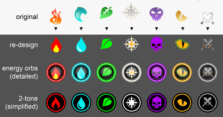
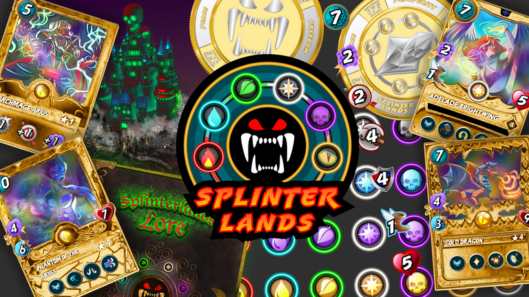
1st Concept: Splinter Icons Re-Design
The first concept I tackled, were the icons representing each Splinter. I felt some of them were a little rough around the edges, while some needed just a slight modification, to get them all looking like a more polished product. Generally I wanted the splinters to have simple two-tone icons, accompanied by a third colour as an added accent for each.
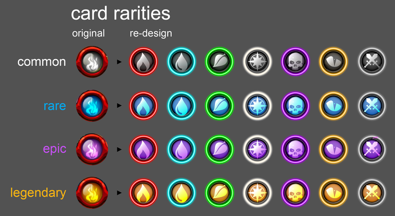
2nd Concept: Rarity Icons Re-Design
I then proceeded to make new and updated rarity icons using the icons created in the first concept. I also made an assortment of card mock-ups for the new icons, so you can see what it would look like for each rarity and splinter.
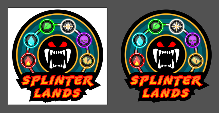
3rd Concept: Splinterlands Logo Re-Design
After having made the icons for each Splinter, I proceeded with a re-design of the Splinterlands logo. I wanted to retain the overall feel of the original logo, but optimise it in terms of overall design and proportions. I re-used most of the colors of the original and refined the elements that were already present in the logo. The first element I redid, were the monster jaws, giving me a foundation, on which I could build the rest of the logo.
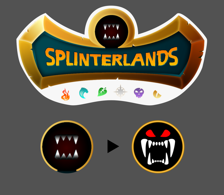
After that, I brought everything together with the detailed energy orbs from the first concept.
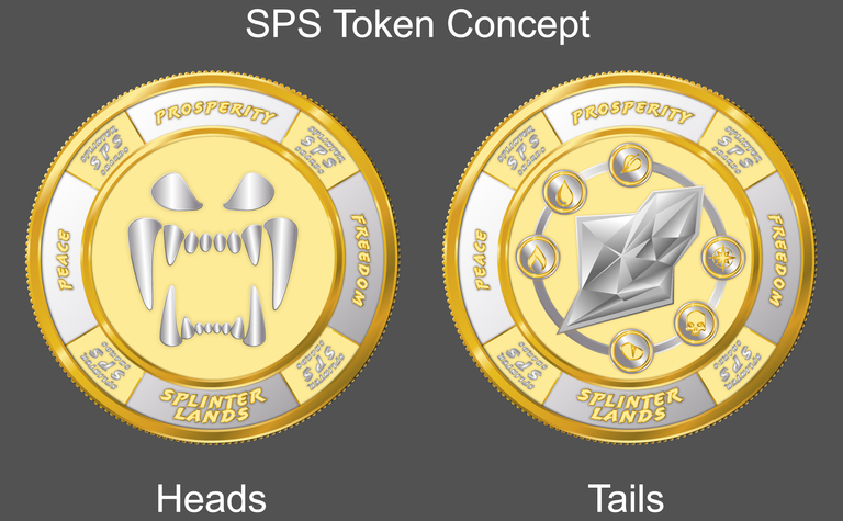
4th Concept: SPS Token Mock-Up
Since I had a good basis for making a token/coin from the re-design of the monster jaws, I decided to make a mock-up, of how an SPS token using the re-designed logo could look like.
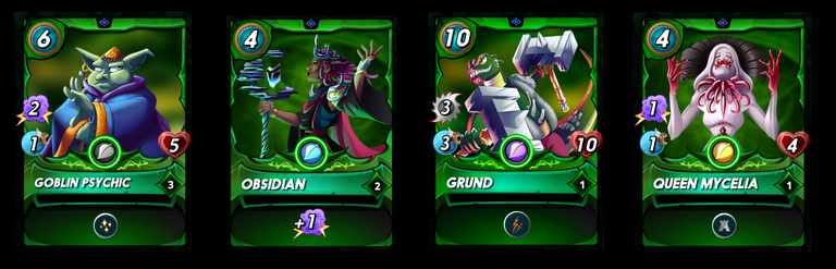
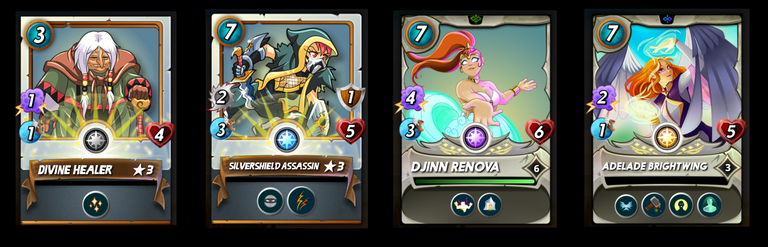
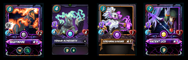
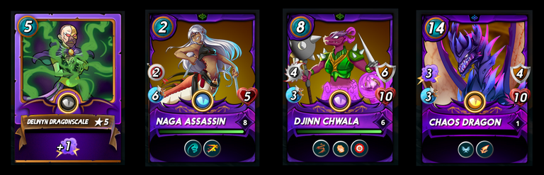
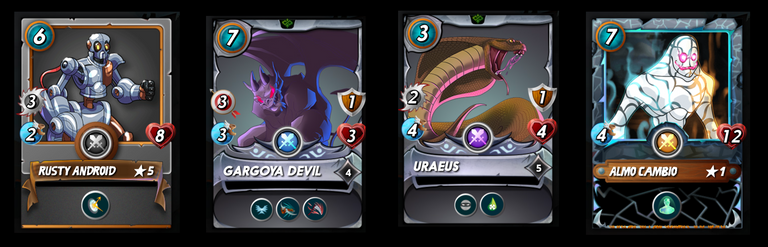
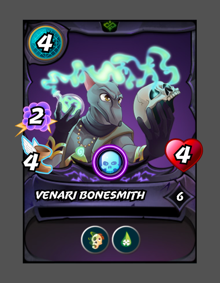
5th Concept: Card Stat Icons Re-Design
Similar to the Splinter icons, I wanted to refine the icons used for the card stats, giving them an overall more polished look. I decided to implement the font used in the SL logo re-design, and I feel the icons definitely pop more because of it, than the font used in the originals.


I also made a mock-up of the Venari Bonesmith card, using the new stat icons as well as the updated rarity orb, so you can see how everything fits together.
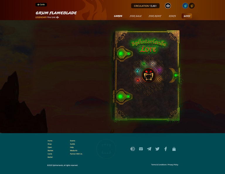
6th Concept: Splinter Lore Tome/Book (not covered in the video, completely forgot to show the guys this)
I love the Splinterlands lore, the team has done great work in creating a detailed history of the magical Splinterlands realm. However, I had an idea, of making the whole experience a little more special and interactive. Therefore, I wanted to immerse players even more when reading the lore, as well as solving the issue of having to scroll down, when reading character lore that has a lot of text. Initially, I wanted to make the animation more complex and detailed. My hardware, however, isn’t the youngest anymore, and the sheer amount of pixel information and the resolution, made it impossible for my rig to let me animate this part of the portfolio properly and how I envisioned. I apologise for this inconvenience and hope you can still get a feel, for what I have in mind for the lore category. With more time and the proper hardware, this concept can be fully fleshed out.
7th Concept: Land Expansion NFTs
For this concept, I wanted to tackle a topic that has thus far, not been implemented in the game yet. Since land is still a really big unknown factor (at least for the community), I decided to let my creativity flow where it may, and came up with some live-action visualisations, that could be implemented when land is released (or even after the release, with upgrades to the land concept that could be integrated in the future).
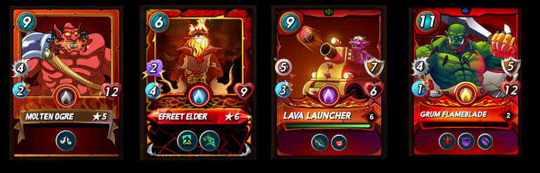
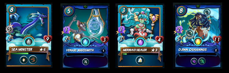
8th Concept: Gold Foil Re-Design
The goal with this concept was to make the gold foil effect in Splinterlands look less "yellow", and to achieve a more realistic “gold” aesthetic. In addition to that, I wanted to make the card art look holographic in nature, to accentuate the uniqueness of the gold foil cards.
I hope it has been enjoyable and interesting, to go through the concepts of this portfolio. Humbly, it would be an honour to become a part of this amazing team of individuals and work to help make this game even more amazing than it already is.
If you like the content of this portfolio, I would really appreciate an up-vote on this post, as well as your support for the weekly Splinterlands art content, which I have entered the portfolio into. Also, show my man Dwayne some love, and leave a like and/or comment on the above posted video, so that more eyes see the content. Thanks for your attention everyone and see you in the Splinterlands arena!
I know I said it enough times but they look gorgeous! I especially love the splinter icons, the castle, and gold foil cards. They are all amazing! The new splinterlands logo is growing on me. I especially like the logo on the lore book!
Haha thanks Yuki, I definitely don't mind hearing and reading positive feedback. Appreciate you my man!
Congratulations @king-arminius! You have completed the following achievement on the Hive blockchain and have been rewarded with new badge(s):
Your next target is to reach 50 upvotes.
You can view your badges on your board and compare yourself to others in the Ranking
If you no longer want to receive notifications, reply to this comment with the word
STOPCheck out the last post from @hivebuzz:
Support the HiveBuzz project. Vote for our proposal!
Thanks for sharing! - castleberry#6859

Hello @king-arminius! This is @chillwithshanna from @ocd (Original Content Decentralized) team. We saw that you already posted your first blog here in Hive! Congratulations and welcome! Great to hear you are enjoying Splinterlands.
Anyways, the best way to start your journey here in Hive is do an awesome introduction post. You can choose on whatever information you would like to share and be creative as you want to be. This will help other Hivers get to know you and be comfortable supporting your works here.
It's also best to subscribe to other Communities you like and share your blogs there to have a wider range of audience. Or you can check out the Communities Incubation Program.
Also, letting you know since content on the Hive platform is monetized, using other people’s ideas or images could be considered as an offense and which is also viewed in a serious light on the blockchain. Here is a useful collection of resources about how plagiarism and abuse is viewed and handled on Hive.
If you are looking for tips and information as a Hive newbie, click here: Newbie guide. If you have questions, you can hop into Discord server and we'll gladly answer your questions. Feel free to tag @lovesniper @chillwithshanna once you have made your awesome introduction post! See you around.
I think I'm a little confused xD Can you maybe send me your intro post, so I can get a feel for how such an intro post is structured? Thank you @chillwithshanna
Hey there! Here's my intro post. it can be any format you want really ☺️ Dont forget to tag me so I can share it 😁https://peakd.com/myhiveintro/@chillwithshanna/who-is-chill-with-shanna
Great stuff @king-arminius. As I love and collect Gold Foils I have to admit they look even better with your re-design. Keep it up!
Thanks for the upvote and encouraging comment @adrianus, really appreciate you taking the time! Glad you like the ideas 😁👌
Great work @king-arminius. I am not a concept/graphic expert but love your work!
/miko
What's up miko, thanks so much for leaving such a nice comment, really appreciate it a lot! Happy you like my concepts 😁
this work looks amazing im in love with the new gold foils,and i feel the love in this artwork,its allways good to see new life ,im so excited for the future of splinterlands great work @king-arminius and @splinterlands ❤️
Very kind and thoughtful comment bro, thank you very much for taking the time. Appreciate it so much!
"Dein Wort in Gottes Ohren ;)"
Well done!
Thanks for your support AfterSound, you've been a big help with all of this! Awesome dude
Unfortunately, not everything convinces me. But I like the splinter lore tome/book.
keep up the good work!
Hi hatoto, thanks for your comment and feedback. What specifically isn't to your liking, if I may ask...anything you would change or do differently? I always want to improve, so if you have some thoughts what could be implemented to better the concepts, I would appreciate any ideas you have. Thanks for the upvote
Du möchtest meine ehrliche Meinung um dich zu verbessern. Okay:
Mir sind die Farben zu grell. Die sind auf den ersten Blick gut, aber sie fügen sich dann nicht auf der Spielkarte ein. Sie stechen unnatürlich hervor. Die ganze Karte müsste also neu designed werden.
Die Schrift beim Logo empfinde ich, entschuldige die Wortwahl... als billig. Sie sieht aus wie von einer Hoot wheels verpackung oder einem Super Soaker. Eine Schrift für ein Kinderspielzeug, dass ich bei Rofu Kinderland kaufe. Generell sind die Farben zu grell.
Beim SPS Token Design frage ich mich wofür man das braucht? Ich finde es passt irgendwie gar nicht zum Thema. Es sind ja SplinterSHARDS und keine "Token". Da steht außerdem zu viel drauf. Und warum Kursiv? Ich finde (Gold-)Münzen aber generell nicht schön. Bin da wahrscheinlich vorbelastet.
Das Stat Icon Design habe ich im Original liebgewonnen. Da gefallen mir die Originalversionen vom Herz und dem Schild besser, weil die hochwertiger aussehen. Die Redesigns sehen aus, als wären sie von einer 0815 Mobile App.
Nur die Schuhe (Speed) gefallen mir.
Das Lore Book gefällt mir. Nur auf dem Cover sind die Farben wieder zu Grell. So ein buch muss abgegriffen und etwas ranzig sein.
Mir gefallen aber die mittelalterlichen Buchstaben am Anfang der Seite sehr! Gute Arbeit.
Zu den Landplots habe ich keine Meinung. Ich weiß nicht was Splinterlands sich da denkt.
Beim Design der goldenen Karten bin ich unentschlossen. Es hat was für sich. Aber ich finde dass das Design der Karte an sich (also zb des Drachen, des Archmage) leidet, wenn es Gold wird. Das Artwork verliert an Ausstrahlungskraft. Da hätte ich dann lieber die Karten als regular, weil das Artwork schöner wäre.
Aber der Rahmen von dir gefällt mir.
So oder so, wünsche ich dir viel Erfolg!
Vielen Dank, dass ist doch mal ein ausführliches Feedback, mit dem ich arbeiten kann! So ausgiebig kriegt man die Meinung der Menschen nicht oft.
Ich glaub den ersten Punkt den du ansprichst, dass die Stat-Icons sich nicht den Karten fügen würden, liegt vermutlich daran, dass ich es (noch) nicht an Hand der original Datei, die Splinterlands vorliegt, anpassen konnte. Ich bin mir ziemlich sicher, wenn ich mich mit der orignal Datei auseinandersetzen darf, würde ich eine gleichmäßige Bilderscheinung erzielen können.
Okay verstehe wie du das meinst, mit der Schriftart des Logos sowie dessen Farbspektrum. Um meine Wahl bei der Schriftart zumindest zu begründen, wollte ich etwas, dass sowohl für Erwachsene sowie Kinder geeignet ist. Ich fand die Dynamik dieser Schriftart spannend, und habe sie deshalb gewählt. Bezüglich der Farben der Schriftart, habe ich tatsächlich den Verlauf im inneren vom original Logo übernommen, und es lediglich mit einer roten Kontour umgeben. Evtl. könnte ich die Sättigkeit des Rotes etwas runterbringen, um es sanfter wirken zu lassen. Danke für den Tipp!
Bei dem SPS Token, war meine Intention, dass SPS eine visuelle Gestaltung erhält, die dem Standard anderer Kryptowährungen entspricht. Es sollte keinerlei Funktion oder nutzen mit sich bringen, und sollte lediglich der Aesthetik dienen. Aber ich stimme dir zu, dass ich die Anzahl der Textblöcke etwas reduzieren und harmonischer gestalten könnte. Ich verstehe aber nicht ganz was du als kursiv warnimmst, die Schriften sind alle die gleiche wie im Logo, und wurden wegen der Münze kreisförmig gekrümmt. Deine Abneigung Goldmünzen gegenüber kann ich nicht ganz teilen...Spaß ;P
Das dir die originalen Stat Icons liebgewonnen hast, kann ich verstehen...man spielt ja längere Zeit, und der Mensch ist bekanntlich ein Gewewohnheitstier...da kann eine neue Gestaltung natürlich irritierend sein. Aber es freut mich, dass dir der Speed Icon gefällt.
Danke für's Feedback zum Lore Buch. Ja du hast recht, ich würde es am liebsten noch altertümlicher aussehen lassen und nach abgelederter...und am besten wenn's aufgemacht wird, fliegt noch so ein bisschen Staub herab. Die grellen Farben vorne sollten eher so ne glühende Energie sein, also nicht ein 0815 Mittelalterbuch, sondern irgend ein Zaubermanifesto oder so. Hier konnte ich die komplexeren Animationen leider am Mac nicht rendern, sonst wäre die ganze Wirkung eines magischen lebendischen Buches sicherlich besser rübergekommen. Muss mir dringend einen neuen Mac zulegen, damit sowas in Zukunft vermieden werden kann.
Zu den Goldfoils verstehe ich was du meinst. Da ich bei dem Card-Artwork versucht habe, es mit einer Art Holografischen Effekt zu versehen, ähnlich wie die Fußball Panini Stickeralben die wir in Deutschland haben, oder wie bei Pokémon Karten früher, verliert man etwas die visuelle Integrität der Character-Art. Aber früher als Kind war mein Gefühl immer, dass bei den Holo Karten oder Sticker es immer schwieriger war, dass tatsächliche Bild zu erkennen...der Effekt aber einfach zu cool war, um die Karte nicht haben zu wollen. ;)
Vielen Dank für dein ausführlichen Kommentar und, dass du dir die Zeit genommen hast hatoto! Besten Gruß
Everything looks super sweet, my favorites are the gold cards and the lorebook! :D
Thanks rayzzor, really appreciate your comment! Glad you like the work. Truly makes me happy to read the communities feedback. :)
These designs and mockups are amazing my dude!! Wow you put alot of effort into this and I love it, from the crazy goil foil shiny cards to the lore book with music in the background. I really hope the Splinterlands team sees this and offers you a position! Keep up the amazing work! I gotta reblog this lol
Thanks for the comment and feedback Gameboy! And really appreciate you reblogging the post, so amazing how people are coming together and offering their support and help. Love this community and the people in it, glad you like the designs 😁
Ya, the new logo has grown on me a lot. I like the way it looks on just about every background. The gold foil blows me away and I like a lot of the upgrades you did to the team symbols.
Thanks for the comment and upvote Steve, appreciate it so much! I'm glad that you liked so many of the concepts, it was awesome to review everything with you guys and get your feedback in the video. Had a lot of fun making that vid!