The -in depth- Guide to Making Wood Nymph Animated Emote

Introduction
I made this art as an emote but made it the same size as a facebook sticker for quality and presentation. Both are exactly the same with the difference of sizes. The largest facebook sticker size is 240 x 240 pixels while Twitch Emotes are 112 x 112 pixels. They're the same, but only different in sizes.
Originally, I wanted to 100% replicate the Splinterlands design but looking at it, I don't have the equipment to do it as I only have mouse and not a graphics tablet.
However, that won't stop me from giving this art some personal flair. I bust up a few tricks up my sleeve and added some of my touch to this week's awesome art.
NOTE: This is a VERY in-depth tutorial. Use the Table of Contents to quickly get back from where you took a break.
TABLE OF CONTENTS
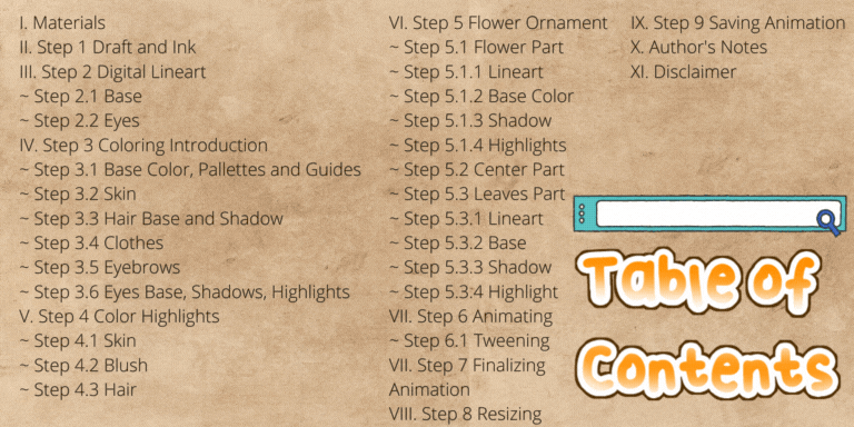
ctrl + f to quickly search for the topics.
Materials and Sources
By iconlibrary.com found via Google Search.
Step 1 Draft and Ink
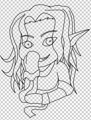
Half body, laughing with hands covering the mouth for a little sophistication. That's my idea for this week's art.
As I previously mentioned on my other works, I don't know how to use guides and I don't use them. I just draw until I get a click that I'm satisfied by it. The only tip I can provide in this step is that Chibi style, or a style of drawing originated in Japan where you emphasize the expressions, you use a big head and smaller body so in this style, proportion, is not 100% followed.
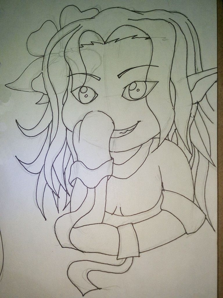
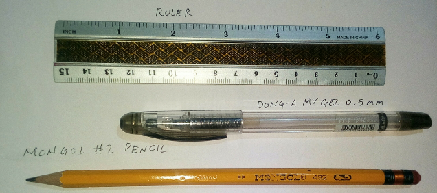
Sketch and Inked using Dong A Gel Pen Black
Step 2 Digital Lineart
Digital Lineart is doing those lines to form a picture but using computer or digitally. The advantage of digital lineart versus traditional pencil and ink is that you can use layers. Having your lineart in another layer allows you to color, erase and add more details to your work without the chance of destroying existing lines.
I always do digital lineart if I'm capable of doing it as I can then apply color the picture without smudging or risk of damaging the lines.
Step 2.1 Base
Using the pen tool, trace the lines in your draft. I use brush size of 8 px when applying the stroke but you're allowed to use more or less depending on your desired size. Pen tool allows you to bend and manipulate a path which you can use to apply a brush stroke after you're satisfied with the line. Do this until you get the whole line art for your drawing.
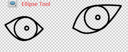
Step 2.2 Eyes
Do the same as the base of the art. One tip I would say is that you can use the Ellipse Tool in making the eye balls and making it proportion. Press shift on your keyboard as you drag your mouse and it would resize proportionally.
Step 3 Coloring Introduction
Splinterland's Wood Nymph is probably a good way to use as a guide color-wise. The reason for this is that even just looking at the drawings allows you to see the different shades of colors used in it. I used that drawing as the color pallette and used that picture as the guide for the colors.
Step 3.1 Base Color, Pallettes and Guides
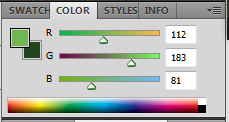
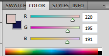
Before we apply the highlights and shadows, we need to do the base. I used the color pallette on Splinterland's Wood Nymph to use as my guide. You can copy the color pallette by using the Eyedropper Tool or by pressing alt + left mouse button while on Brush Tool.
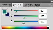
Step 3.2 Skin
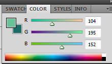
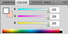
For the skin base, you can use the eyedropper or use this color pallette.
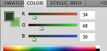
For the shadow, I just normally follow the lines and imagine which is the foreground. Foreground like the bangs produces shadow as well as clothes and the breasts as it is round and the surrounding part leaves a shadow.
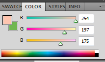
Below is the color pallette for the skin's shadow.
Using a white brush, fill in the mouth part to show her white teeth.
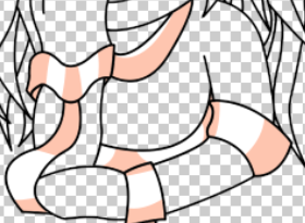
The end result should be something like this:
Step 3.3 Hair Base and Shadow
Looking at the hair of the original artwork, it is possible to do the highlights and shadows using mouse but it will take me A LOT of time because they applied multiple layers of colors in one highlight and not to mention that the edge is kind of spiky versus the brush tool which is round. If you wanted to recreate this, you either need to use a graphics tablet with pressure applied or pen tool for each strand.
With those considerations, I took a different approach and used gradient instead. Using the colors below, you can apply gradients to the hair by using the Gradient Tool.
To do the gradient method, apply the base color first on your hair. Once that's done, lock the pixels of your layer by clicking the Lock Transparent Pixel button found on the layer panel.
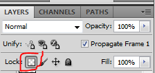
Lock Transparent Pixel allows you to only affect the current pixel of the active layer. Combining this with the gradient allows for the color not to bleed on other layer or the whole page.
Once the layer's pixels is locked, using the gradient tool, drag the mouse upwards from the middle. The color combination should be that the darker green is the foreground and the lighter is the background.

The end product should look something like this:
Step 3.4 Clothes
The clothes has two colors white and the pink. Use these color palletes as a guide.
For the clothes, this applies both the base and highlights. I did not apply any shadow for this part.
Step 3.5 Eyebrows
For the Eyebrows, just use the base color for the hair and apply it. This is different than the original but they normally use this effect on anime so I decided to use this as my color instead.
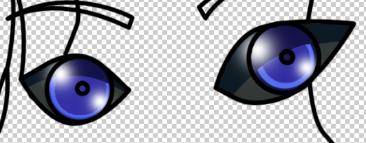
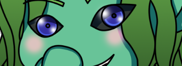
Step 3.6 Eyes Base, Shadows, Highlights
The eyes are a bit complicated. I completely changed this again from the original because that number of layers from the original is hard for me to replicate. I think they also added different transparency to Wood Nymph's eyes so I wasn't able to completely decipher how they did that. Instead, I provided my own touch on this art's eyes.
For the outer part, two colors of these pallettes are used. This is like a shadow and base from the original.
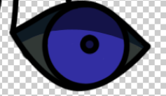
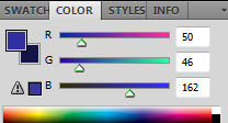
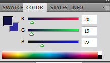
For the inner eyes, these two are used as the color base and shadow.
Unfortunately, we're nowhere near the end for the eyes. Applying the detail part, add another layer and use brush like 108 px to fill a lighter color. Then get a smaller brush like 100 px, use the eye base color and put it in the center. That's how to get the lighter outline-like part in the middle eye.
Get your pen tool and make a curve above in line with the shadow and delete it. You should get something look like below:
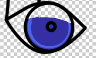
If we combine the two eye layers, the dark base and shadow around the eyeballs, and the eyes itself, this is how it should look.
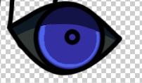
For the highlight, pick up your brush again, make the hardness to 0, and just click on the top side of the eye. Make it smaller and add another on the opposite side.
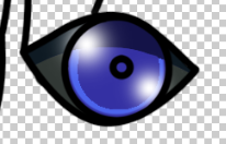
Do the same thing on the other eye and this finishes the eye part.
Step 4 Color Highlights
Highlights increases a depth in image. It breaks the big block of colors that makes the drawing flat and boring and most importantly, as the meaning of its term, "highlight", it allows certain parts of the body to shine and get focused at.
Step 4.1 Skin
Using your Brush Tool, put down the hardness to 0. This allows your brush to have a transparent middle with a softer edge mimicking a spray paint. Put a few taps here and there with different brush sizes on white color and it gives you a look like a light is reflecting on the skin.
I added a few taps on the shoulders same as the original and I added another one on the top side of the breast as they normally reflect light. This also hides a bit of the shadow transition on the cleavage making it more realistic.
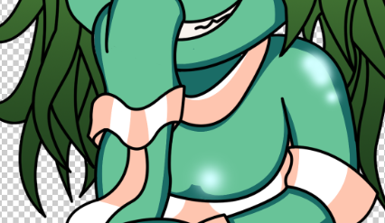
Step 4.2 Blush
Instead of a white highlight on the cheeks, I decided to put a pinkish blush instead. This also works out as I made my Wood Nymph art with a smug look as if she just saw something embarassing.
Here is the color that I used for the blush effect.
Here is how it look with the blush applied.
Step 4.3 Hair
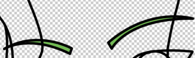
For the hair's highlight, first, prepare your brush tool. Make your Brush 0 hardness and brush size of at least 100 px. Then, using your Pen Tool, make a curve line across the face. Right click, Sroke Brush, Select the Brush Tool, then press ok.
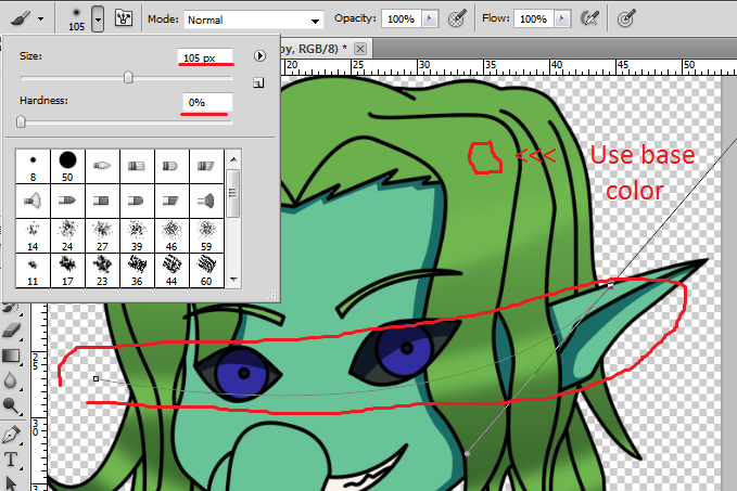
Make sure you're selecting the Hair layer and the Pixel Transparency is currently locked.
What this does is it takes the brush hardness and brush size and do a quick stroke on the path that the pen tool made. Since we locked the pixel transparency of the layer, it would only affect the part of the layer that has color on it.
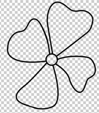
Step 5 Flower Ornament
For the flower ornament, I divided it into three parts, the center, the flower and the leaves.
Step 5.1 Flower Part
Step 5.1.1 Lineart
I used an ellipse tool to create a circle for the middle part. Attached to it are four petals in heart shapes.
Step 5.1.2 Base Color
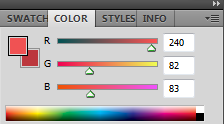
Using the eyedropper tool, this is the color pallette that I got from the original art.
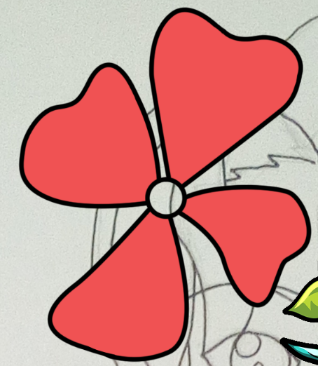
Add a new layer and rename it Flower Color so you could organize it better. Put this layer below the lineart so the line pops up.
Simply paint the whole lineart with this color and you're good to go on this step.
To do it quicker, you can click the lineart to make it the active layer, use your wand tool and click on any empty space on one of the petals. Hold shift, then click on the other three. What this does is it selects and closed shape.
On your menu bar, click Select, Modify, increase selection by 2 px, ok. This increases the selection by 2 px allowing you to get the little white spaces produced in the lineart.
Using your paint bucket, click on each petal selected to fill it or just press ctrl + backspace to fill all of them at the same time.
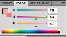
Step 5.1.3 Shadow
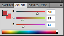
For the shadow, first, lock your color layer by clicking the Lock Transparent Layer. Using the pen tool, draw curves then right click and fill the pen path with this color:
After doing the four petals, you should have something that looks like this:
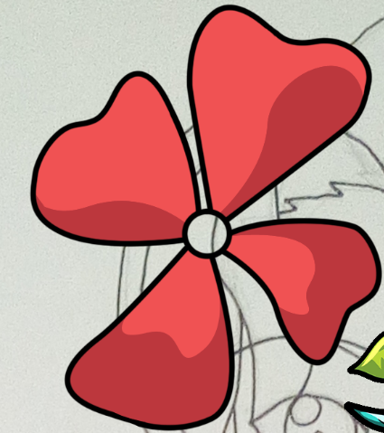
Step 5.1.4 Highlights
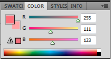
For the highlights, on the same layer, again, use the pen tool to add curve paths. Fill it using the this swatch first:
Then, on those shadow parts that the highlight came in contact to, we use a darker highlight:
For the circular ones below, I use and ellipse tool and made something that looks like an egg. You can use the free transform or ctrl + t on the path to rotate it.
You can hold ctrl then drag the path in order to reposition it to your liking.
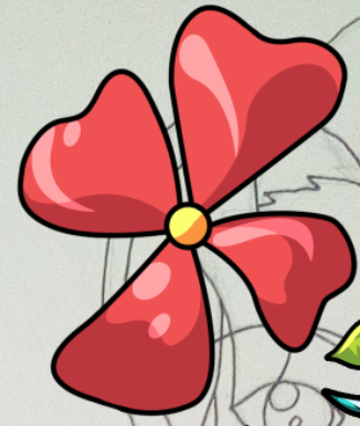
Step 5.2 Center Part
For the center part, use this swatch:
This one's easy. Fill the circle for the base, then a bit of curvy line, fill one side with this swatch:
At the end, it should look like this:

The final result for the flower should look like this:
Step 5.3 Leaves Part
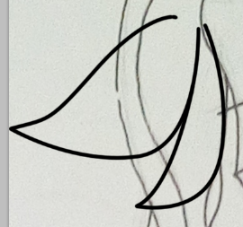
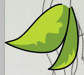
Step 5.3.1 Lineart
Using your pen tool, make a two leaves shape. If you drag your pen tool, you can make curve paths on it which you can fill, do a brush stroke, or make selection. If you're only using mouse and not a graphics tablet, your pen tool is your best friend.
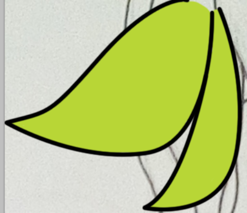
Step 5.3.2 Base
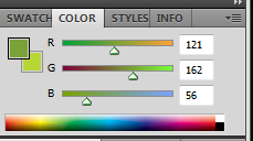
For the base color, use this color palette.

Unlike the petals, since there's an open area at the top, you cannot use Magic Wand tool. So, we do this manually. Using the brush tool, fill in the lineart to serve as a base. It should look something like this:
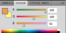
Step 5.3.3 Shadow
Lock the Transparent Layer. Fill a part of your base color with the shadow color:
Next, get your pen tool again, and with the series of small triangles, add accent to the shadow with your base color.
By the end of this step, it should look like this:
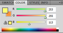
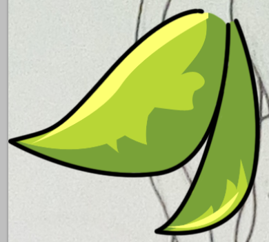
Step 5.3.4 Highlight
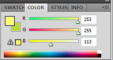
For the highlight, this is the swatch to use:
With the pen tool, do a big curve on the side. Use the lineart as a guide to follow. Don't worry about your path from the pen tool not being perfect. The transparent lock allows you to not affect anything else besides color on the current layer. The final product should look like this:
All colors used in this part is taken from the original via Eyedropper tool.
Step 6 Animating
Animating or animation in layman's term is the process of making an image move. Before making the animation for this art, we need to have a vision first. Since she has a smug face with a blush like being embarased, we'll do a simple laugh animation and I will show you a step by step way to do it.
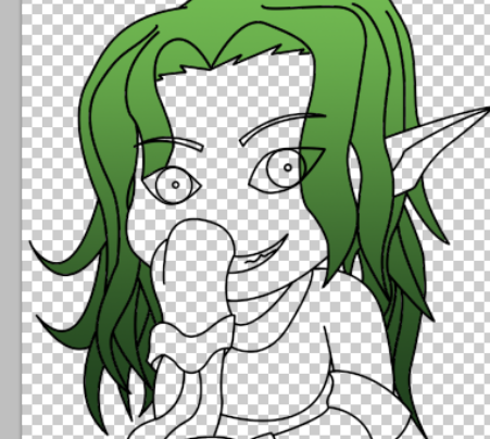
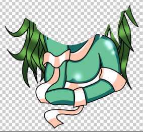
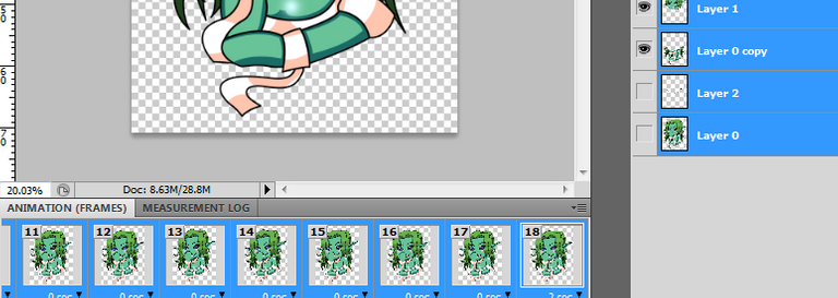
To do it, first, we're merging all the layers to make one final image. Then we're dividing it in two segments, the head and the body like in the pic below.
Using your pen tool, trace the head, then right click, Make selection and layer via cut. Layer via cut makes new layer by using your traced lines. This divides your drawing into two layers, the head and the body. Once you've done the cutting, there would be a few pixels that would be missing along the cut as effect of the transition. You can fix this simply by overlapping the same color on the layer.
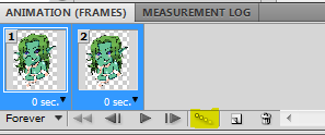
For the laugh animation, it is really REALLY simple. Let's get the animation window out by going to Window menu, then make sure Animation is checked. Then, it would display the animation bar at the bottom.
We then need to make a second animation frame. Click on the Duplicates Selected Frames. This makes a second frame and then click on your head layer to make it the active layer. Using your Move tool, nudge the head layer by about 10 pixels down using your down arrow key.
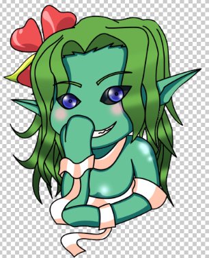
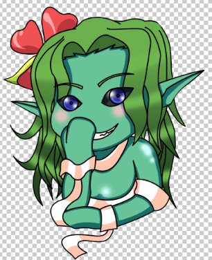
See the difference?
Step 6.1 Tweening
Tweening or in-between is an animation process of adding animation frame in between two actions in order to make a smoother animation.
For this step, you can do it manually but we will do it automatically using Photoshop CS5's tool. Highlight both frames 1 and 2 with the shift key, then on the tools below the animation bar, select Tweens Animation Frame.
Once you click the Tween Animation Frame button, the Tween Menu will pop up. Use the settings I used below for this part.
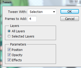
This then creates 4 more frames in between those two selected frames with Photoshop automatically creating the animation for you by spacing out the movement you did. Since you made 10 pixels of movement from point A to point B in the beginning, and you're adding 4 frames in between, Photoshop then makes that middle frames around 2-3 pixels of movement from point A to point B until it satisfies the difference creating an illusion of movement.
Step 7 Finalizing Animation
I want to make a 3 head bobs to mimic a ha-ha-ha movement. So, select the 1st animation frame, hold shift, and click the 6th animation frame to highlight all. Beside the trash can-like button below, click "Duplicates Selected Frame" two times to make 3 copies of this head bobbing animation.
At the very last frame, at frame 18, we will add delay of 2 seconds like in the picture below.
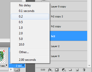
This stops the animation for 2 seconds before it loops from the beginning.
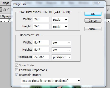
Step 8 Resizing
Resizing your animation is the same as resizing any other images. It is not necessary but on some sites, this is required a they have limit on the upload size or image size. As an example, Twitch only allows emote sizes of 28 x 28 pixels, 56 x 56 pixels, and 112 x 112 pixels.
Since this one is made with Facebook Sticker in mind, the available sizes are 240 x 240 pixels, 32 x 32 pixels and 16 x 16 pixels.
To resize the image and animation, highlight all layers and animation frames. Click the layer 1, hold shift, click layer 4, release. Click animation frame 1, hold shift, click animation layer 18, release.
Go to Image, then image size, uncheck the Constrain Proportions, and indicate your desired height and width. Click ok and we'll save the animation next.
Step 9 Saving Animation
Go to File, Save for web and devices, on the lower right of your screen, there's a Looping Option drop down menu and make sure it's selected as Forever to make your animations loop. Press Save, type your desired file name and we're done.
This will export your work into a gif file which allows your image to do the animation on other web sites like hive.blog or Peakd or even your own blog.
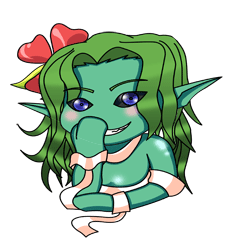
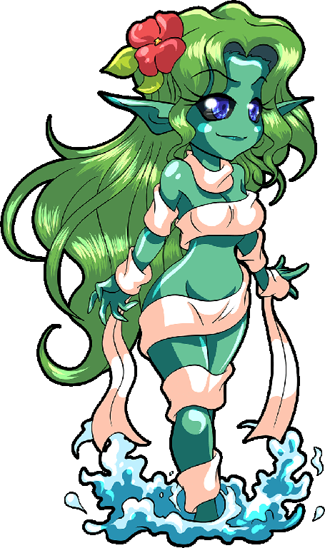
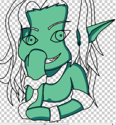
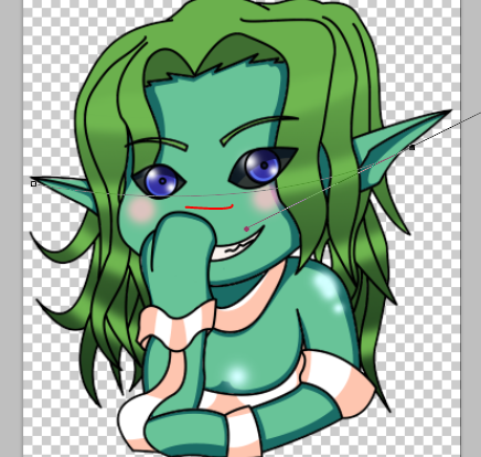
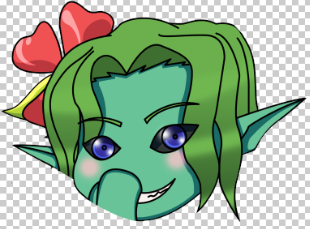
This is how the final product looks like.
Below is the same art with Twitch recommended sizes for emotes.
 ...
...  ...
...

112 x 112 pixels ... 56 x 56 pixels ... 28 x 28 pixels
Author's Notes
Why did an ear magically appear on the left side of the face?
There's no other way to explain it other than I forgot it while I was doing the documentations. I felt something was missing and when I check the ear length, some part of it should be seen. I added it while I was doing the documentation and making sure everything's okay.
Lock Transparent Layer
Locking the transparents on a layer allows you to apply color without damaging or overlapping on other colors and layers. If I have lock on the hair layer, whatever I do, it would only interact on that colored part. Remember that you cannot create new colors on the transparent area so if you're adding new lines, take out the lock transparent layer, do the lines, then put it back on.
What is the "hi-hi-hi" animation? Why was it not included in the steps above?
I intentionally left out this part both as a challenge for you and because it's my own touch and it's not directly necessary for the art. I used the same animation steps above without any fancy things. So, if you followed the animation steps in this article, and you're able to create the animation properly, then you can also add any movement effects you want including, but not limited to, eye or hand movements, background, text movement animation, etc.
Disclaimer
- This post is an entry for Splinterland's art contest.
- Other sources that I do not own are cited under their respective photos. Photos and drawings without cited sources are mine and made for this post.
- Outro banner edited in Canva.
If you're interested in playing the game, support me by registering using my referral link here.
Have Fun Drawing!
Thanks for sharing! - castleberry#6859

This is indeed a very in-depth tutorial that can be followed along by anyone who is not familiar with animation.
I admire very much the effort you put on documenting your steps - it's a tutorial.
Great job.
Keep it up.
!1UP
Thank you. I had fun doing it.
The pleasure is mine. 😊
You have received a 1UP from @thecuriousfool!
@monster-curator, @oneup-curator, @fun-curator
And they will bring !PIZZA 🍕.
Learn more about our delegation service to earn daily rewards. Join the Cartel on Discord.
She is so cute! she is my favorite character! 👨🎨😊
This is great! 💚 That's very cool how you did a video of the process.
Thank you. Yeah, it's technically a video in text and picture format