Digital Art / Splinterlands Art Contest Week 254 / Countess Sinash / Eng- Esp
Countess Sinash- It's time to run

English
Greetings friends! I hope you are very well.
I'm happy, I'm bad but I'm happy, and I want to tell you the reason why.
Reason of my happiness; I'm happy for the result of this week, I finally managed to draw a fire as I wanted and it was really easier than I thought, when I have more practice I will upload a post explaining much more detail about the fire.
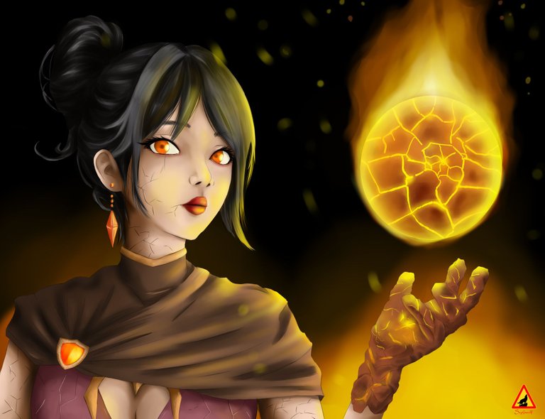
Well, let's talk about the artwork, the chosen character was Countess Sinash, I had a lot of time thinking about drawing this character because she reminds me of Azula "character from Avatar the last airbender" and I really love it.
It was a good opportunity to apply some techniques that I learned recently and even though I'm doing a little bit bad this motivates me a lot.
We will use a canvas of 1952X1500 pixels horizontally, the final format is JPG " in my last publications I had some problems trying to upload in PNG format", I think it still keeps its resolution in jpg.
Well, let's get started I don't want to bore you with this data hehe!
Español
¡Saludos amigos! Espero esten muy bien!.
Estoy feliz, estoy mal pero estoy feliz, y quiero contarles el motivo.
Motivo de mi alegría; estoy feliz por el resultado de esta semana, por fin logre dibujar un fuego tal y como quería y fue realmente mas fácil de lo que pensaba, cuando tenga mas práctica subiré un post explicando mucho mas adetalle sobre el fuego.
Bien, hablemos de la obra, el personaje elegido fue Countess Sinash, tenía muchísimo tiempo pensando en dibujar este personaje ya que me recuerda a Azula "personaje de Avatar el ultima maestro aire" y realmente me encanta.
Fue una buena oportunidad para aplicar ciertas técnicas que aprendí recientemente y pese a que me va algo mal esto me motiva muchísimo.
Usaremos un lienzo de 1952X1500 pixeles de forma horizontal, el formato final es JPG " en mis últimas publicaciones tuve algunos problemas al tratar de subir en formato PNG", creo que aún mantiene su resolución en jpg.
¡Bueno, empecemos no quiero aburrirlos con estos datos jeje!
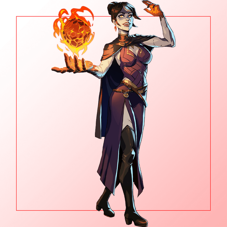
Reference
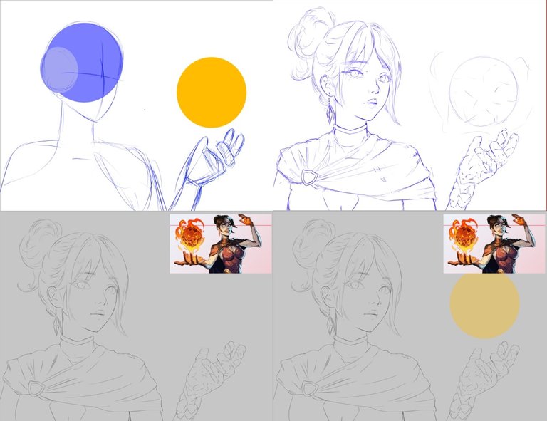
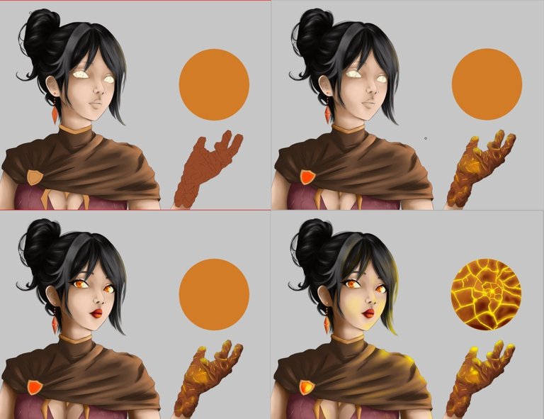
We start the drawing with the basic shape of the character, The program I used is the Pain tool sai 2, this has very good tools that facilitate certain tasks, one of them is the function to make circles these help a lot when making the shape of the head of the character before this step took me some time because I liked to make the circles as symmetrical as possible.
After a couple of sketches and corrections we can shape the character before making the final lines.
In this stage the part that presented more problems was the hand, because it is very different, but I imagined that it was something like a glove and so I managed to shape it.
Iniciamos el dibujo con la forma básica del personaje, El programa que use es el Pain tool sai 2, este tiene herramientas muy buenas que facilitan ciertas tareas, una de ellas es la función de hacer círculos estos ayudan mucho al momento de hacer la forma de la cabeza del personaje antes este paso me quitaba algo de tiempo pues me gustaba hacer los círculos los mas simétricos posibles.
después de un par de bocetos y correcciones podemos dar forma al personaje antes de hacer las lineas definitivas.
En esta etapa la parte que mas problemas presento fue la mano, pues es muy diferente, pero imagine que era algo parecido a un guante y asi logre darle forma.
In the next step we add the base color, very similar to the one in the reference, but taking into account that the whole drawing would have a warm tone.
In the same way we start with the shading, this is done in two parts, the first one is to apply a shade of shadow and then with the blending brush we mix the colors, the skin layer has an option to block so we avoid going out of the margin and damage the base color.
in this same step I apply some highlights before blending so I achieve that everything is integrated and it is with the same color as the base color.
En la siguiente etapa agregamos el color base, muy similar al de la referencia, pero teniendo en cuenta que todo el dibujo tendría un tono cálido.
De igual forma empezamos con el sombreado, esto se hace en dos partes la primera es aplicar un tono de sombra y luego con el pincel de difuminar mezclamos los colores, la capa de piel tiene una opción para bloquear, asi evitamos salirnos del margen y dañar el color base.
en este mimo paso aplico algunas luces antes de mezclar asi logro que todo se integre y quede con mucha mas armonía.
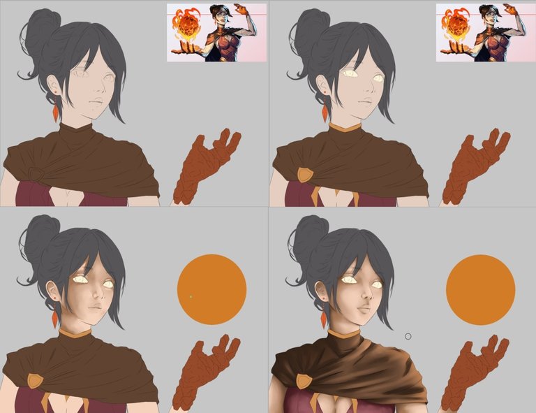
The hair requires special attention, with a darker tone and the blending tool we apply the basic shadows keeping in mind that our main source of light is the fire sphere.
The next step is to detail with other brushes each strand of hair with a darker and a lighter color to give it depth.
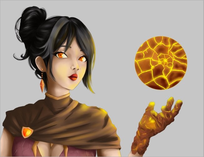
The fire sphere is my favorite part and I would like to explain in much more detail how I did it, it has two layers one on top of the other, the background is a lighter and brighter tone.
El cabello requiere atención especial, con un tono mas oscuros y la herramienta de difuminado aplicamos las sombras básicas teniendo en cuenta que nuestra principal fuente de luz es la esfera de fuego.
El siguiente paso es detallar con otros pinceles cada mechón de cabello con un color mas oscuro y otro mas claro para darle profundidad.
La esfera de fuego es mi parte favorita y quisiera explicarles con mucho mas detalle como la hice, cuenta de dos capas una sobre otra, la del fondo es de un tono más claro y luminoso.
I took some time to visualize how much the light interacts with the character and correct each place where it was needed.
Hay zonas de la esfera que tienen su sombra, esto ayuda a resaltar los brillos internos. me tomé un tiempo para visualizar que tanto interactúa esa luz en el personaje y corregir cada lugar que hiciera falta.
I promise to do a tutorial on the fire, I really liked the result.
I achieved this with 3 layers, the first one in an orange tone with little brightness, the second one with a little more brightness and less size and the last one with much more brightness and smaller size than the other two.
All of them have a little bit of blurring and I erased a little bit in the center to make the lava sphere more visible.
To make it more visible I have to add a dark background to contrast with the fire, which brings us to the next step.
Les prometo hacer un tutorial sobre el fuego, realmente me gusto muchísimo el resultado.
Esto lo logré con 3 capas la primera de un tono naranja con poco brillo, la segunda con un poco mas de brillo y menos tamaño y la última con mucho más brillo y de menor tamaño a las otras dos.
Todas tienen un poco de difuminado y borré un poquito en el centro para que sea más visible la esfera de lava.
Para que se pueda apreciar bien debo agregar un fondo oscuro que haga contraste con el fuego. lo que nos lleva al siguiente paso.
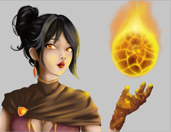
Time to add final details and a background.
I chose a dark tone to highlight the fire and the sphere, we also added some fathoms of fire floating.
On the character I added some lines on his skin as if his skin was breaking similar to what happens on his hands.
Another detail is that I applied more shadows in certain areas to give it more depth and logic.
Momento de agregar detalles finales y un fondo.
Elegí un tono oscuro para resaltar el fuego y la esfera, también agregamos algunas brazas de fuego flotando.
En el personaje agregué algunas líneas en su piel como si su piel se quebrara parecido a lo que pasa en sus manos.
Otro detalle es que aplique más sombras en ciertas sobas para darle más profundidad y logica.
If you don't play splinterlands yet you can join here!
Si aún no juegas splinterlands puedes unirte aquí!
Join here // Unete aqui
Friends we reached the end of the post, I want to dedicate this illustration to all of you who are still watching and supporting my drawings.
We will continue to grow and share.
See you cowboys!
Amigos llegamos al final del post, quiero dedicar esta ilustración a todos ustedes que aún siguen mirando y apoyando mis dibujos.
Seguiremos creciendo y compartiendo.
¡Nos vemos vaqueros!
Tools:
- PaintTool SAI 2
- Inspiroy H640 Pen Tablets
- Corel photo paint x3
OMG
Gracias por comentar :"3
Congratulations @sephiwolf! You have completed the following achievement on the Hive blockchain And have been rewarded with New badge(s)
Your next target is to reach 38000 upvotes.
You can view your badges on your board and compare yourself to others in the Ranking
If you no longer want to receive notifications, reply to this comment with the word
STOPTo support your work, I also upvoted your post!
Check out our last posts:
Eres increible amo tus avances en serio t.t
Thanks for sharing! - castleberry#6859
