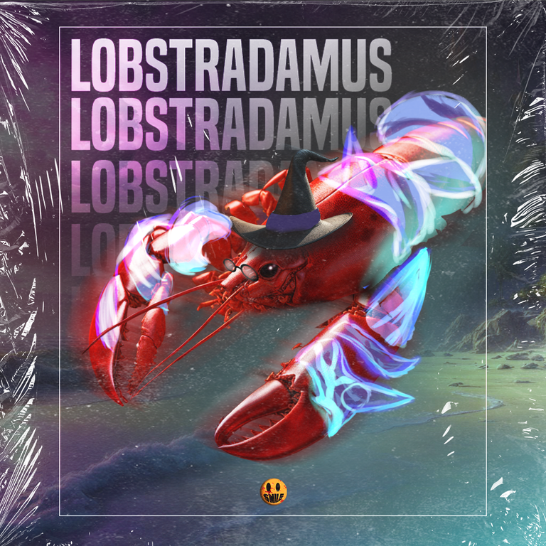
Splinterlands Art Contest Week 272 | [ESP/ENG] LOBSTRADAMUS🦐
Otra participación más,
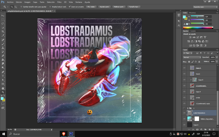
esta vez junto a Lobstradamus, un diseño llevadero que me impulsó a animarme un poco más a los "cambios". Una mezcla de colores creó un fondo adecuado para presentar el personaje. Espero que me acompañes en el desarrollo del diseño, nos veremos más abajo.
Another participation,
this time with Lobstradamus, a manageable design that encouraged me to embrace a bit more of "change." A blend of colors created a suitable background to showcase the character. I hope you join me in the development of the design, we'll see each other below.

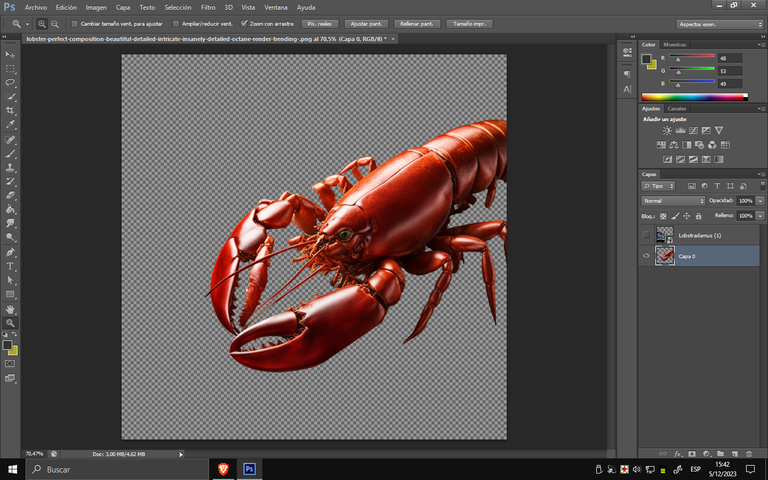
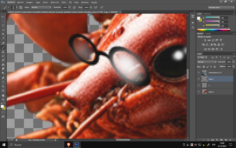
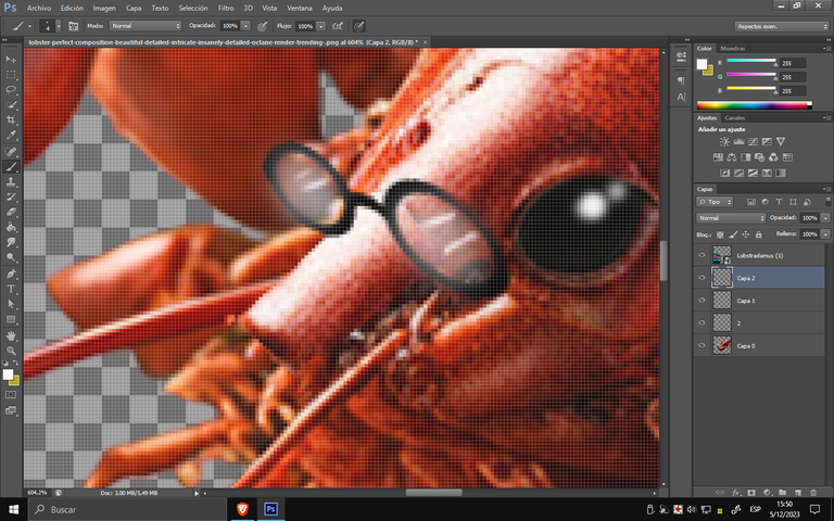
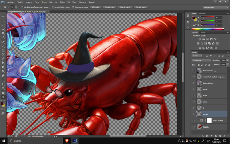
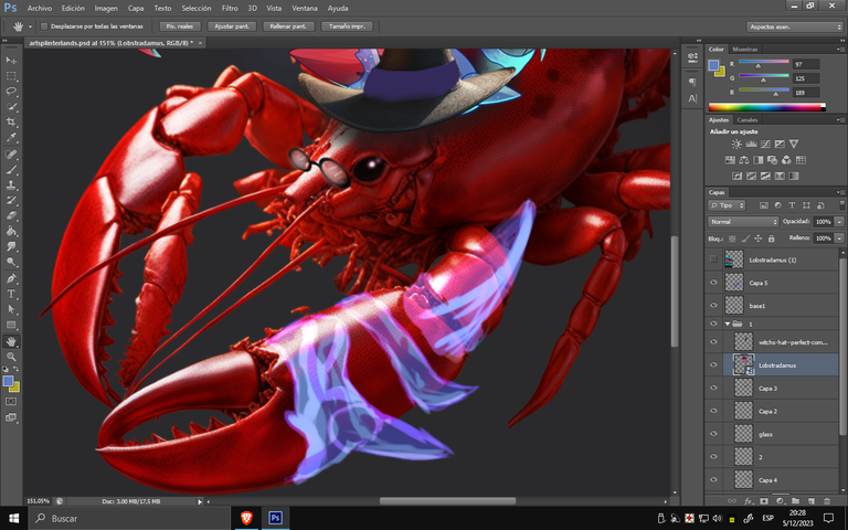
Una vez obtenida la imagen, comencé a crear los lentes utilizando el pincel y aplicando poca opacidad para lograr el interior del cristal, con reflejos en una capa adicional y resaltándolo aún más. Los ojos también tuvieron que ser retocados con el pincel, ya que no tenían la misma colorimetría que el diseño de la carta. Se añadió un detalle adicional al extender su nariz, ya que en la imagen generada quedaba corta para poder ubicar los lentes.
Once the image was obtained, I began creating the glasses using the brush tool, applying low opacity to achieve the interior of the glass, with reflections on an extra layer and emphasizing it even more. The eyes also had to be touched up with the brush, as they didn't have the same color scheme as the card design. An additional detail was added to extend his nose, as in the generated image, it was too short to place the glasses.
image generated
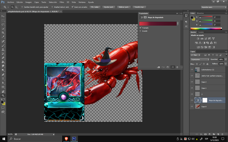
Para conseguir su tonalidad, añadí un mapa de degradado encima para seleccionar sus colores y transferirlos a la paleta de degradado, logrando así el color deseado. Luego, procedí a colocar el sombrero y, mediante un conjunto de sombras, logré darle perspectiva. En cuanto a las manchas de piel, agregué una capa extra con un color aún más intenso y, al configurar la capa en "superponer", obtuve un efecto similar a la ilustración de la carta.
To achieve its tonality, I added a gradient map on top to pick its colors and transfer them to the gradient palette, thus achieving the desired color. Then, I proceeded to place the hat, and with a set of shadows, I managed to give it perspective. As for the skin blemishes, I added an extra layer with an even stronger color, and setting the layer to "overlay" achieved a similar effect to the card illustration.
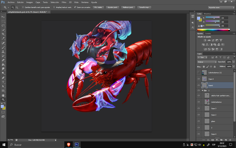
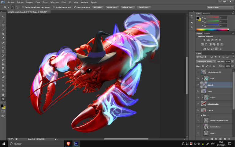
En esta sección, utilicé fusiones para "asimilar" los colores de ese efecto. Se añadió un tono azul neón, violeta y colores base de violeta pastel, logrando los efectos deseados. Finalmente, apliqué un toque de celeste con baja opacidad para darle el destello final.
In this section, I used blends to "blend in" the colors of that effect. I added a neon blue tone, violet, and base pastel violet colors, achieving the desired effects. Finally, I applied a touch of light blue with low opacity to give it the final sparkle.
BACKGROUND
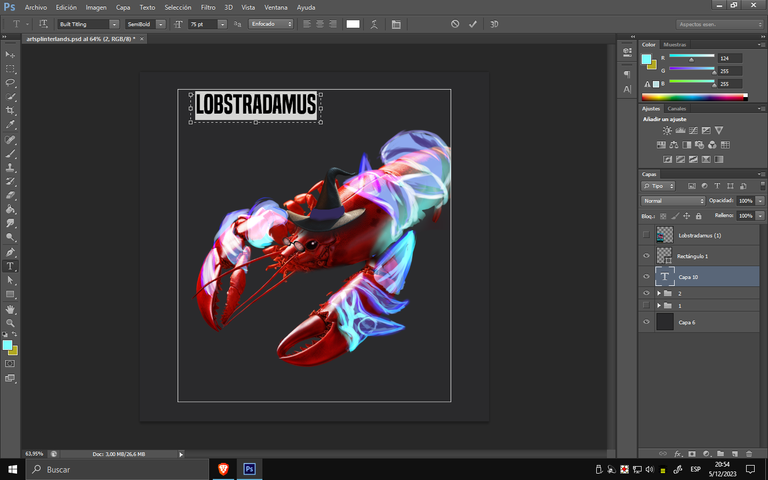
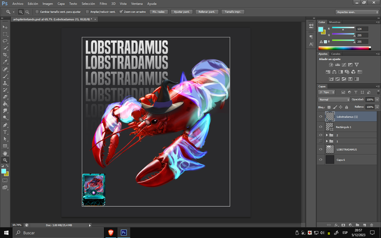
Para comenzar con la parte de su título, utilicé una fuente que fuera fácil de leer. Al clonar parte del texto para lograr un aspecto más elegante, acompañé la figura con un cuadro para acomodarla y enmarcar la carta.
To start with the title part, I used a font that was easy to read. When cloning part of the text for a more elegant look, I accompanied the figure with a box to accommodate it and frame the letter.
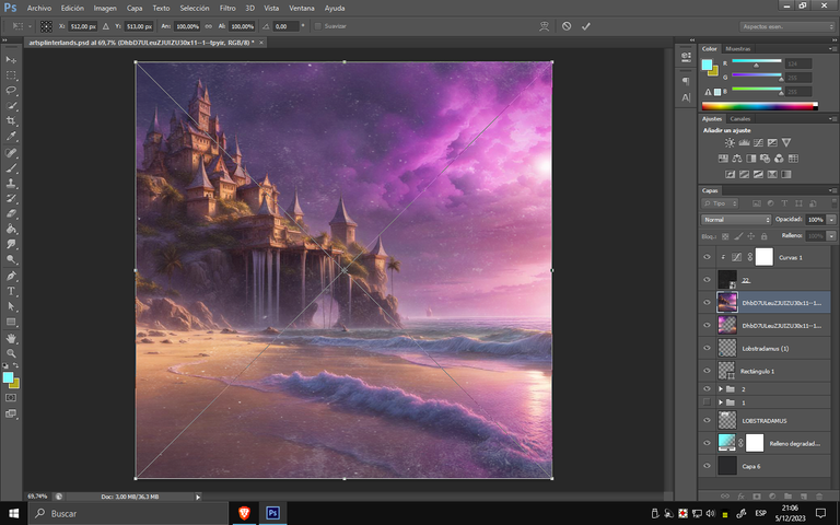
Para mezclar los colores del fondo, utilicé una imagen de una playa con un castillo al fondo, con un estilo mágico, para emparejar los aspectos de la langosta y la magia.
To blend the background colors, I used an image of a beach with a castle in the background, with a magical style, to match the lobster and magic aspects.
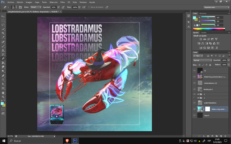
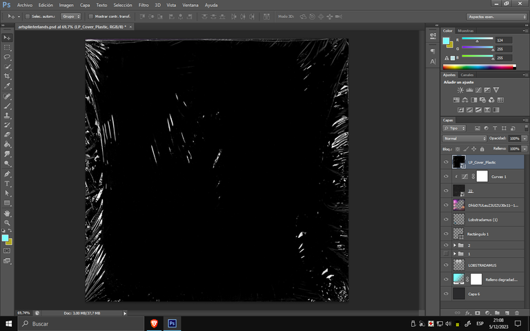
Aplicando por última instancia una textura de plástico, para finalizar con esta especie de portada. Para resaltar debo admitir que me resulto gratificante hasta el momento poder realizar estas interpretaciones , ya que gracias al concurso pude desplegar ciertas habilidades que crecía obsoletas , hasta acá llegando al final del post y agradecer por la posibilidad que brindan a los diseñadores a sumarse a este concurso.
Applying finally a plastic texture, to finish with this kind of cover. To highlight I must admit that I found it gratifying so far to be able to make these interpretations, because thanks to the contest I could deploy certain skills that grew obsolete, so far reaching the end of the post and thank you for the opportunity to provide designers to join this contest.
Tools Used :
Photoshop
WACOM CTL 472
Font AI
Congratulations @smile27! You have completed the following achievement on the Hive blockchain And have been rewarded with New badge(s)
You can view your badges on your board and compare yourself to others in the Ranking
If you no longer want to receive notifications, reply to this comment with the word
STOPCheck out our last posts:
Nice Poster again Bro.. Brilliant Idea,
Hello, thank you very much
I would have liked to have more time to make a better one, but for the next one we will raise the level a bit.
Hope you will find that satisfaction Bro.. Though this one is good 😊, best luck.