⚔️🔥 TENYII STRIKER 🔥⚔️ Splinterlands Art Contest SPT W-267
🔥¡Hola amigos de Hive! Sean bienvenidos a este nuevo Post.
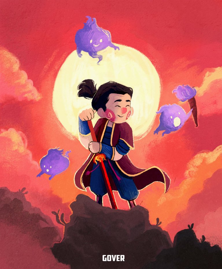
El día de hoy quiero presentar mi entrada al concurso de arte semanal de @splinterlands , en esta ocasión he decidido hacer al personaje TENYII STRIKER.
Elegí a este personaje porque me llamó mucho la atención su diseño, tanto su ropa como su apariencia me parecieron muy buenas para adaptarlas a mi estilo. No soy de hacer dibujos con personajes japoneses o algo que tenga que ver con su mitología, ya que no le gustan los samuráis ni nada que tenga que ver con ellos, pero a pesar de eso decidí hacer una excepción y probar algo nuevo, desafiarme una vez más y creo que puedo decir que salió un dibujo muy bonito.
¡Vamos con el proceso!
- 🔥 Hello friends of Hive, welcome to this new post.
- Today I want to present my entry to the @splinterlands weekly art contest, this time I decided to do the character TENYII STRIKER.
- I chose this character because his design caught my attention, both his clothes and his appearance seemed to me very good to adapt them to my style. I'm not used to make drawings with Japanese characters or anything that has to do with their mythology, since I don't like samurai or anything that has to do with them, but despite that I decided to make an exception and try something new, challenge myself once again and I think I can say that it came out a very nice drawing.
- Let's go with the process!
PROCESO | PROCESS
Creo que puedo decir que este es el dibujo al cual le he hecho más bocetos en los meses que llevo dibujando en digital. Esto pasó porque mi idea original era hacer al personaje con un estilo Cómic, tipo Marvel o DC, puesto que siempre he visto series y películas de esas empresas y se me hace más fácil hacer ese tipo de proporciones y personajes, es algo que me sale naturalmente, pero después de ver el boceto y empezar a delinearlo de una manera más limpia me di cuenta el porqué no hago ese estilo, a pesar de saberlo hacer y de que me resulta más fácil, no me siento feliz ni cómodo con ese estilo, me resulta muy monótono y sin gracia, es por eso que decidí volver a mi estilo y divertirme un poco, además de que ya tenía un día muy estresante y dibujar en mi estilo me tranquilizó un montón, me sentí en paz.
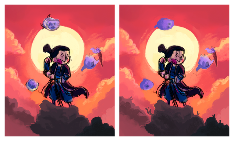
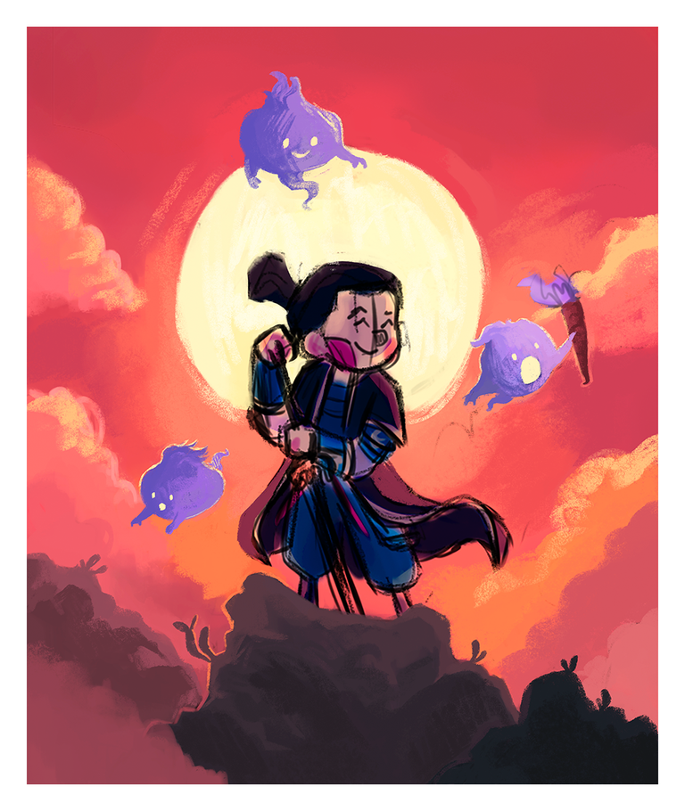
Al final, después de varios bocetos, decidí quedarme con esta idea. Es el personaje principal, rodeado de algunos fueguitos, situados en una montaña después de ganar una gran batalla. Quise hacer al personaje con una pose dominante, que él sea el centro de atención, pero también quise agregarle algunos personajes secundarios, decidí hacer algunos fueguitos porque el personaje tiene símbolos de fuego en su armadura, así que en vez de hacer ese fuego en la armadura, los quité de ahí y los puse a su lado para que lo acompañaran en la batalla.
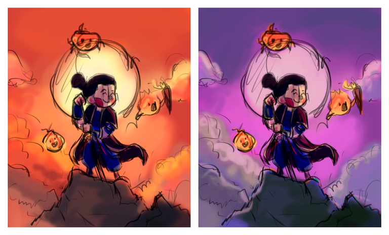
Luego hice el estudio de color, para ello hice 3 versiones, pero al final me quedé con la foto que está al lado del boceto. Fue la que más me gustó porque tiene algo de las otras dos versiones, aparte de que quería hacer un fondo muy rojizo, porque es algo muy típico de los dibujos japoneses, aparte de que la bandera de Japón es un sol, por eso le dicen el país del sol naciente y por eso decidí hacer un dibujo con mucho fuego jaja.
- I think I can say that this is the drawing to which I've done more sketches in the months I've been drawing in digital. This happened because my original idea was to make the character with a comic style, like Marvel or DC, since I've always seen series and movies from those companies and it's easier for me to make that kind of proportions and characters, it's something that comes naturally to me, but after seeing the sketch and start to outline it in a cleaner way I realized why I don't do that style, even though I know how to do it and I find it easier, I don't feel happy or comfortable with that style, I find it very monotonous and unfunny, that's why I decided to go back to my style and have some fun, besides I had a very stressful day and drawing in my style calmed me down a lot, I felt at peace.
- In the end, after several sketches, I decided to keep this idea. It's the main character, surrounded by some little fires, located on a mountain after winning a big battle. I wanted to make the character with a dominant pose, that he is the center of attention, but I also wanted to add some secondary characters, I decided to make some fireworks because the character has fire symbols on his armor, so instead of making that fire on the armor, I removed them from there and put them next to him to accompany him in the battle.
- Then I did the color study, for that I did 3 versions, but in the end I kept the picture next to the sketch. It was the one I liked the most because it has something of the other two versions, besides I wanted to make a very reddish background, because it is something very typical of Japanese drawings, besides the fact that the flag of Japan is a sun, that's why they call it the country of the rising sun and that's why I decided to make a drawing with a lot of fire haha.
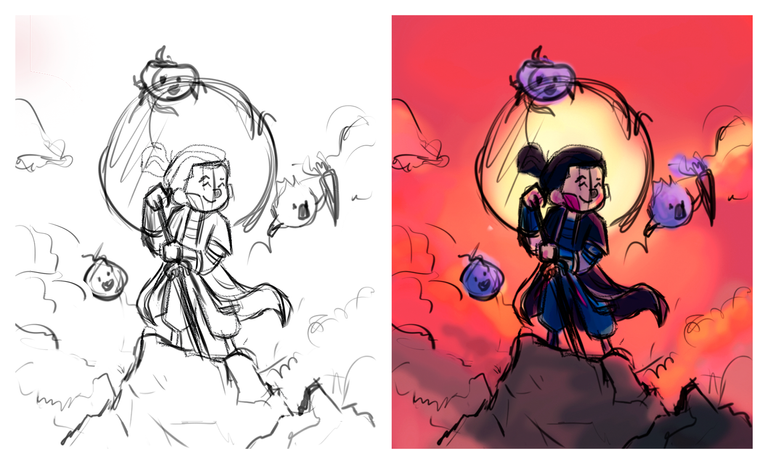
Una vez que hice el boceto procedí a colorear el dibujo, al principio me costó mucho porque al hacer el estudio de color tuve que hacer bastantes modificaciones y se me olvidó duplicar las capas, así que quedaron juntas las capas del boceto y del estudio de color, por eso se ven las líneas del boceto muy pronunciadas, ya que si le bajaba la opacidad los colores no se iban a ver porque las dos capas estaban unidas, al principio fue un dolor de cabeza, pero después me acostumbré y con paciencia fui borrando esas líneas del boceto poco a poco.
Bueno, primero empecé por el fondo, decidí colorear el sol y las nubes para facilitarme más el trabajo, en este dibujo utilicé un solo pincel, así que todo el dibujo tendrá la misma textura. Para las nubes lo único que hice fue ir mezclando los colores y darle esa apariencia 'realista', originalmente iba a usar otro pincel para hacer el dibujo, por eso las nubes están hechas en forma realista, pero al final decidí cambiar ese pincel y usar uno con el que me siento más cómodo. A pesar de hacer cambiado de pincel, decidí quedarme con las nubes realistas, así no destacan tanto y los personajes se pueden llevar toda la atención. Luego procedí a colorear las montañas, que tampoco tienen tantos detalles, solo agregué algunas luces y sombras para darle un poco de volumen y unas hojas extra para darle más detalle.
Una vez que hice el fondo procedí a colorear a los fueguitos, honestamente me divertí muchísimo coloreando a los fueguitos, tenía tiempo que no disfrutaba tanto colorear algo, en esta parte ya dejé de dibujar siempre y volví a mis garabatos que tanto me hacen feliz jaja, cómo pueden ver para hacer a los fueguitos tuve que unir los diferentes tonos de morado y también les hice un delineado usando el color del sol y así separarlos un poco del fondo.
- Once I made the sketch I proceeded to color the drawing, at first it cost me a lot because when I made the color study I had to make many modifications and I forgot to duplicate the layers, so the layers of the sketch and the color study were together, that's why the lines of the sketch are very pronounced, because if I lowered the opacity the colors were not going to be seen because the two layers were joined, at first it was a headache, but then I got used to it and with patience I was erasing those lines of the sketch little by little.
- Well, first I started with the background, I decided to color the sun and the clouds to make my work easier, in this drawing I used only one brush, so the whole drawing will have the same texture. For the clouds the only thing I did was to mix the colors and give it that 'realistic' look, originally I was going to use another brush to make the drawing, that's why the clouds are made in a realistic way, but in the end I decided to change that brush and use one that I feel more comfortable with. In spite of changing the brush, I decided to keep the realistic clouds, so they don't stand out so much and the characters can get all the attention. Then I proceeded to color the mountains, which don't have so many details either, I just added some lights and shadows to give it some volume and some extra leaves to give it more detail.
- Once I did the background I proceeded to color the fireworks, honestly I had a lot of fun coloring the fireworks, it had been a long time since I enjoyed coloring something so much, in this part I stopped drawing and went back to my doodles that make me so happy haha, as you can see to make the fireworks I had to join the different shades of purple and I also made an outline using the color of the sun to separate them a little bit from the background.
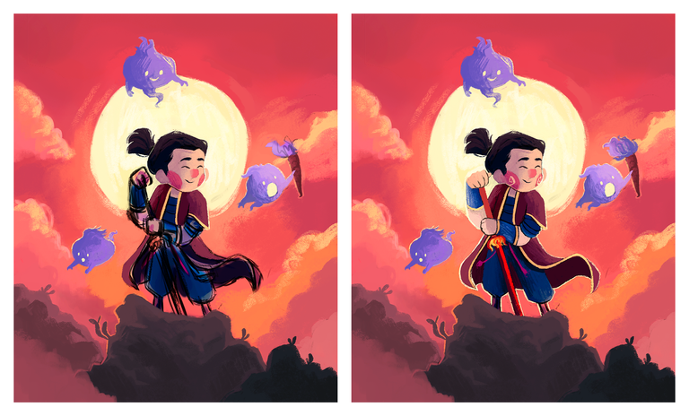
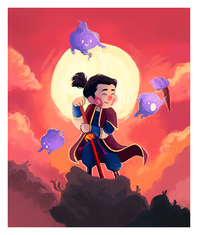
Después de haber terminado el fondo y a los fueguitos llegó la hora de colorear al personaje. Para ello empecé con el rostro, uniendo los colores y haciendo que se vea una textura muy homogénea, coloreé la nariz y las mejillas y le añadí ese remolino que siempre les hago, también coloreé el cabello y debo decir que me encantó como quedó y resalta muy bien con la luz del sol.
Una vez lista esta parte, procedí a colorear el resto del personaje, primero coloreé los brazos, después la armadura y el pantalón, todo ello lo hice usando el mismo pincel y poco a poco iba desvaneciendo la línea del boceto, no le agregué mucho detalle a la armadura ni a la ropa porque iba a sobrecargar al personaje. Para finalizar coloreé la túnica que tiene y por último coloreé la espada de fuego. Vieron que el dibujo literalmente es puro fuego jajaja.
Para concluir con el dibujo agregué algunas texturas extras que casi no se ven, las agregué por el cielo y por las montañas, también agregué un poquito en el sol, pero la verdad son casi imperceptibles.
- After finishing the background and the fireworks it was time to color the character. For this I started with the face, joining the colors and making it look a very homogeneous texture, I colored the nose and cheeks and added that swirl that I always do, I also colored the hair and I must say that I loved how it looked and it stands out very well with the sunlight.
- Once this part was ready, I proceeded to color the rest of the character, first I colored the arms, then the armor and the pants, I did all this using the same brush and little by little I was fading the line of the sketch, I didn't add much detail to the armor or the clothes because it would overload the character. To finish I colored the tunic he has and finally I colored the fire sword. You saw that the drawing is literally pure fire hahaha.
- To conclude with the drawing I added some extra textures that are almost not seen, I added them for the sky and the mountains, I also added a little bit in the sun, but the truth is that they are almost imperceptible.
🔥 ¡Y listo amigos! Espero que les haya gustado mucho el dibujo. Fue un reto hacerlo, pero estoy muy contento con el resultado final.
¡Nos vemos en el próximo post!
- 🔥 And that's it folks! I hope you liked the drawing very much. It was a challenge to do it, but I'm very happy with the final result.
- See you in the next post!
Tableta gráfica Huion. / Huion graphics tablet.
Programa Photoshop. / Photoshop program.
Traductor Deepl. / Deepl Translator.
Instagram:@artbygover
Separador y Fotos editadas en Canva
Photos edited in Canva
Aaaaw This is Incredible😊😍
Thanks so much!!! I'm glad you liked the drawing!!! 😊
Hermoso amigo @vicente99, de verdad admiro mucho tu estilo de dibujar, me encanta. Este fan-art te quedo precioso. Mucha suerte en el concurso...
!DIY
Muchas gracias por tus palabras! Me alegra mucho saber que te gusta como dibujo y que te haya gustado la ilustración, gracias por tu apoyo. Saludos!
You can query your personal balance by
!DIYSTATSGenial, esa textura que le diste le quedo muy bien y los tonos de los colores geniales, saludos
Muchas gracias amigo, siempre trato de darle textura de crayón a todos mis dibujos. Que bueno que te ha gustado el dibujo. Saludos compañero.