Splinterlands Art Contest Week 250 | LUNAKARI MISTRESS [ES/EN]

Hola querida comunidad @alienarthive, Cómo están?👋🤠
En esta ocasión les comparto mi participación para el concurso de arte de @splinterlands
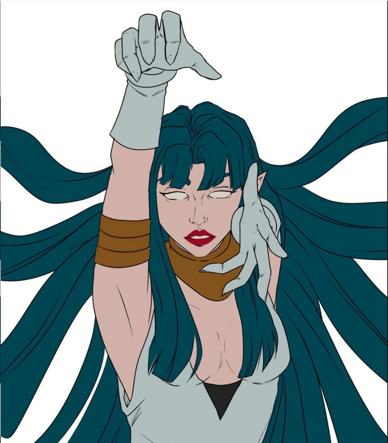
Para esta ilustración utilice la carta LUNAKARI MISTRESS, me gustó mucho la forma del personaje pero sobretodo su combinacion de colores
hice una combinación de técnica semi realista y anime, al final ni yo mismo sé si esto tendrá algún nombre pero creo que quedó bastante bien 😅
Hello dear community @alienarthive, How are you doing?
This time I share with you my participation for the @splinterlands art contest.
For this illustration I used the card LUNAKARI MISTRESS, I really liked the shape of the character but above all its color combination.
I did a combination of semi realistic and anime technique, in the end I don't even know if this will have a name but I think it turned out pretty good 😅
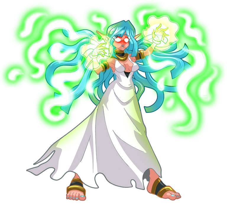
Referencia | Reference
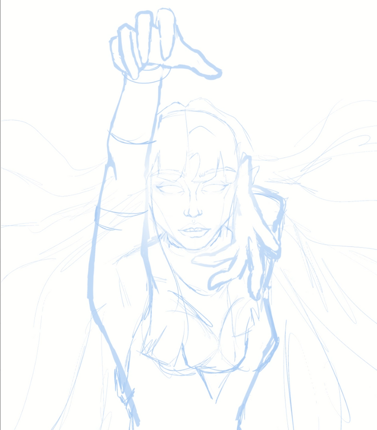
Paso 1.- Como siempre empiezo haciendo un boceto dejándome llevar por la imaginación o a veces alguna referencia de una postura que me guste, para mi lo mejor es hacer dos bocetos uno general para ver por donde iremos con el dibujo y ya luego un segundo con detalles mas pulidos.
Step 1.- As always, I start by sketching, letting my imagination flow or sometimes using a reference of a pose that I like. For me, the best approach is to create two sketches - a general one to see where the drawing is headed and a second one with more polished details.
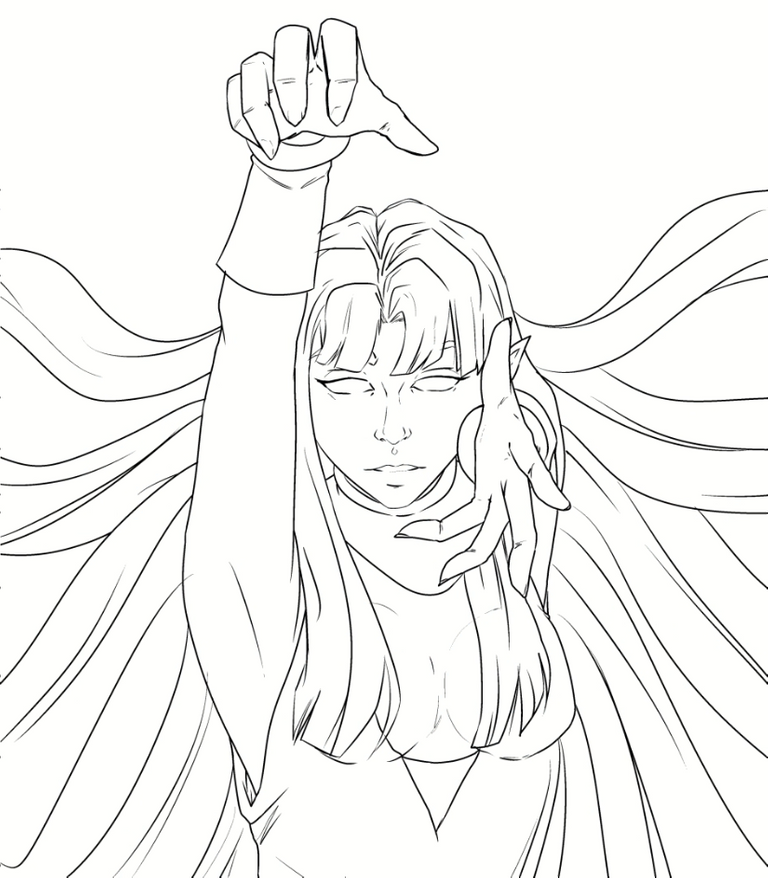
Paso 2.- Luego pasamos al line art, mi parte favorita, es tan relajante.
Step 2.- Then we move on to the line art, my favorite part. It's so relaxing.
Paso 3.- Por ultimo de las partes mas complicadas para mi, el color, aun tengo que aprender sobre la teoría del color pero esta vez me encantó la combinación de tonos azules y verdes del personaje,
Step 3.- Finally, one of the most challenging parts for me, the coloring. I still have to learn about color theory, but this time I loved the combination of blue and green tones on the character. I added a yellowish-green color to highlight certain parts of Pete's jacket.
Paso 4.- Al final agregué contraluces en un tono azulado para jugar más con el fondo y así darle mas volumen al personaje
Step 4.- Finally, I added backlights in a bluish tone to play more with the background and give more volume to the character.
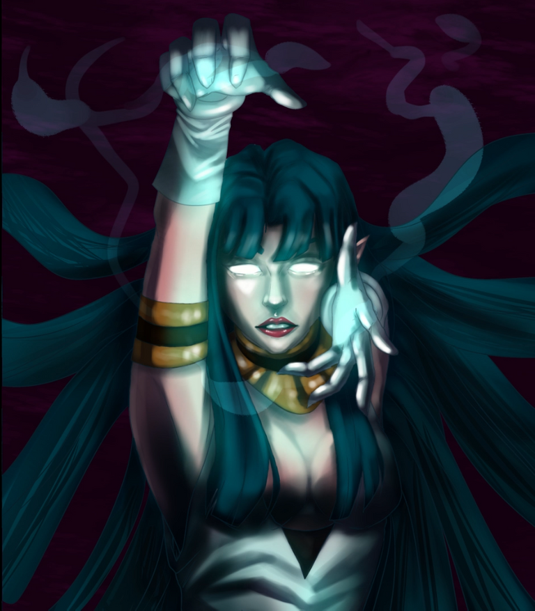
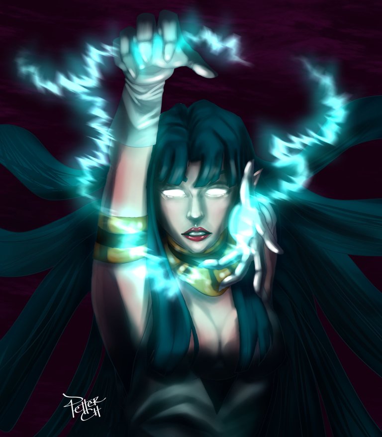
Este es el resultado final, jugué con los colores del fondo para dar resalte al personaje y que todo la atención vaya hacia a el, espero que les guste 😁
This is the final result. I played with the colors of the background to highlight the character and draw all the attention towards it. I hope you like it 😁

Herramientas Utilizadas
CLIP STUDIO PAINT
ONE BY WACOM
Tools Used
CLIP STUDIO PAINT
ONE BY WACOM

Thanks for sharing! - castleberry#6859

Your version is beautiful. Although you made it in a different version than the one on the card, I loved it, it's great!
Hey, thanks a lot buddy😊
Yeah, I wanted to try something a little different !luv
@gaboamc2393, @petterch(1/10) sent LUV. | connect | community | HiveWiki | NFT | <>< daily
! help(no space) to get help on Hive. Info