[ESP/ENG] Fanart Malric Inferno - Splinterlands Art Contest Week 253!
Malric Inferno! 🔥🔥
¡Un gran saludo comunidad de Aliens! Quiero darles la bienvenida a mi nuevo post. Últimamente he estado ausente dentro de la comunidad estos últimos días, la verdad es que he tenido muchas evaluaciones y se me ha complicado mantener el ritmo que tenía con mis publicaciones dentro de la red. Hoy finalmente puedo compartir con ustedes mi participación al concurso de arte de @splinterlands, esta vez he tomado como referencia al personaje de Malric Inferno el cual siempre me ha gustado mucho, tanto por sus colores como por el diseño del personaje, así que quise realizar mi propia versión jugando nuevamente con diferentes estilos de ilustración. ¡Espero que les guste tanto como a mí y les doy las gracias por tomarse el tiempo de leer mi publicación!
A big hello Aliens community! I want to welcome you to my new post. Lately I've been absent from the community these last days, the truth is that I've had a lot of evaluations and it's been difficult for me to keep the rhythm I had with my posts on the net. Today I can finally share with you my participation to the @splinterlands art contest, this time I have taken as a reference the character Malric Inferno which I have always liked a lot, both for its colours and the character design, so I wanted to make my own version playing again with different illustration styles, I hope you like it as much as I do and I thank you for taking the time to read my post!

Creative Process | Proceso Creativo✏️
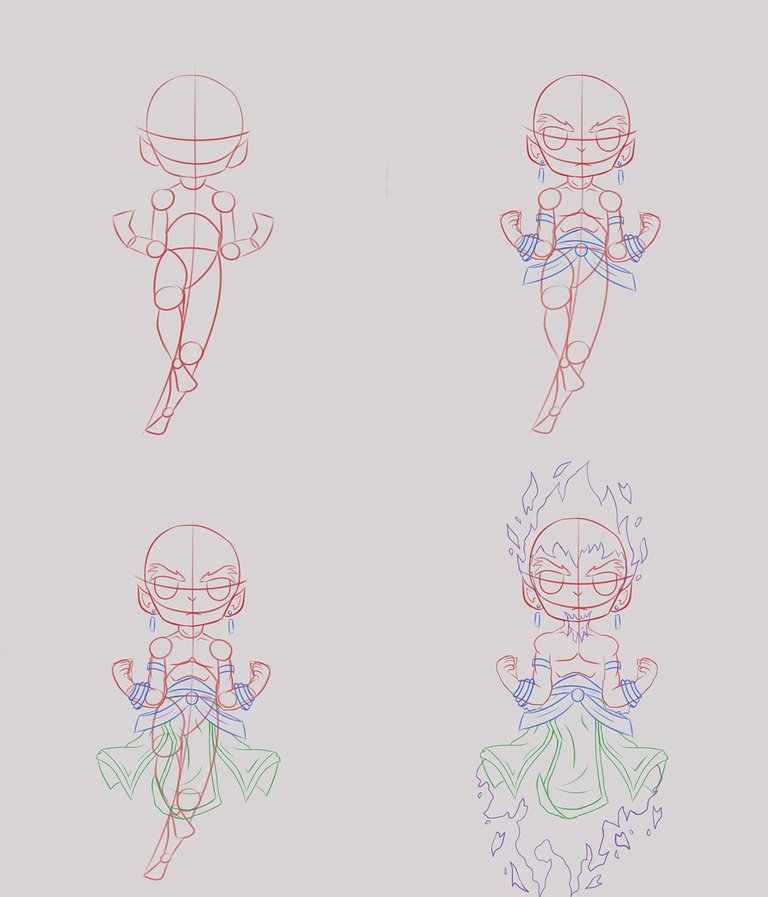
Comencé realizando un pequeño boceto del personaje, el cual fui poco a poco limpiando hasta tener un cuerpo base bastante definido. Posteriormente fui agregando los elementos del personaje de referencia, tales como su ropa y llamas que cubren a este. Al tratarse de un boceto bastante limpio no realice ningún tipo de Lineart a la ilustración ya que mi objetivo es realizar una imagen con un estilo más enfocado hacia la pintura.
I started by making a small sketch of the character, which I gradually cleaned up until I had a fairly well-defined base body. Later I added the elements of the reference character, such as his clothes and the flames that cover him. As it was a pretty clean sketch I didn't make any kind of lineart to the illustration because my goal is to make an image with a style more focused towards painting.
Completado el boceto, empecé a trabajar en la aplicación del color de la ilustración. Aplique una capa base de color morado y a través de esta, fui colocando todos los colores base del personaje sirviendo como guía el boceto para ubicar todos los colores y detalles que tendría la ilustración. Después de colocar los colores base fui agregando las sombras generales poco a poco hasta ir profundizando más para crear el volumen que quería.
Once the sketch was completed, I started to work on the colour application of the illustration. I applied a purple base layer and through this, I placed all the base colours of the character, using the sketch as a guide to place all the colours and details that the illustration would have. After placing the base colours I added the general shadows little by little until I went deeper and deeper to create the volume I wanted.
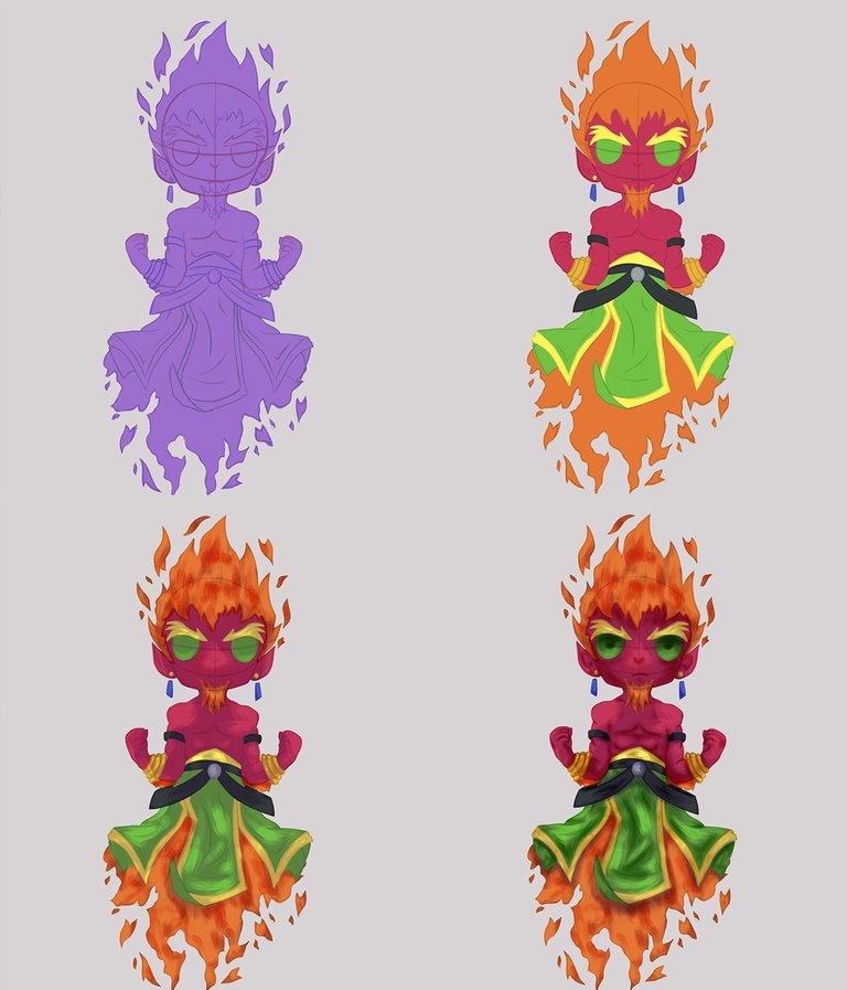
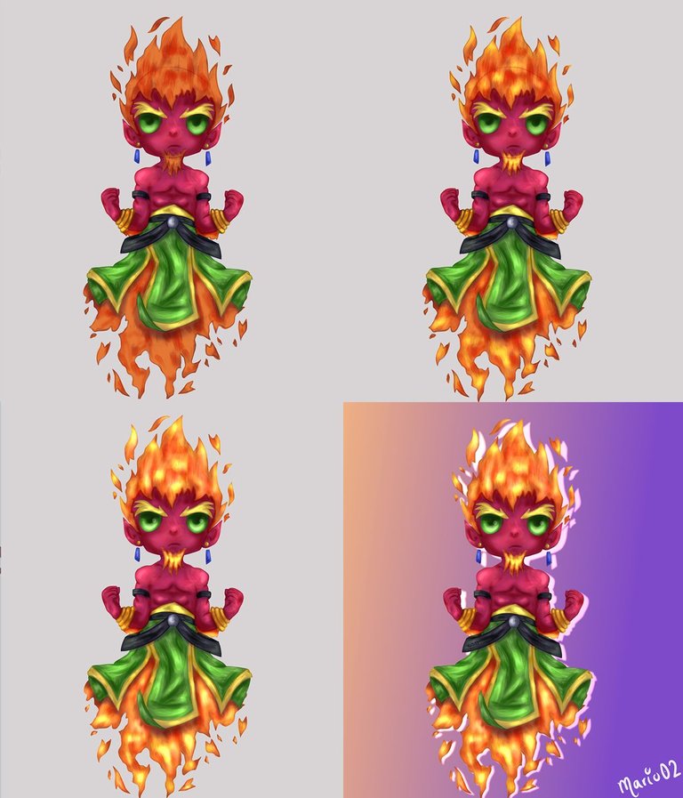
Finalizado la aplicación de colores base y sombras, procedí a dar aún más volumen aplicando luces y detalles a la ilustración. Para ello, agregué luces generales en aquellas partes donde la luz era más intensa y estas las fui integrando y degradando con los elementos del personaje, aplicando así varios niveles de luces para lograr el efecto deseado. Para el fuego coloque aún más niveles de luces ya que buscaba que este se viera lo bastante intenso al tratarse de una gran fuente de luz. Para finalizar fui desvaneciendo poco a poco el boceto para que este no fuera tan visible, además trabaje en un pequeño fondo sencillo a partir de degradados entre tonos naranjas y morados el cual fui profundizando y agregando más detalles para que sirviera de complemento para el personaje.
Once the application of base colours and shadows was finished, I proceeded to give even more volume by applying lights and details to the illustration. To do this, I added general lights in those parts where the light was more intense and I integrated and degraded them with the elements of the character, applying several levels of lights to achieve the desired effect. For the fire I placed even more levels of lights as I wanted it to look intense enough as it is a large light source. To finish I was fading little by little the sketch so that this one was not so visible, in addition I worked in a small simple background from gradients between orange and purple tones which I was deepening and adding more details so that it served as complement for the character.
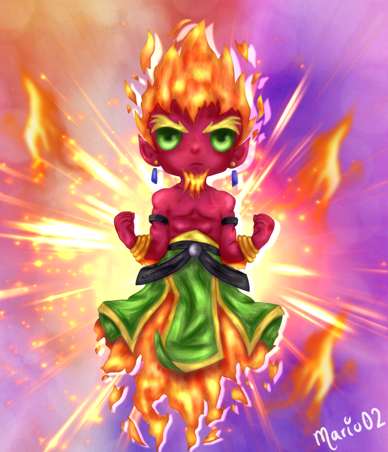
Final result of the Illustration | Resultado final de la ilustración
Tools Used | Herramientas Utilizadas:
- Medibang Paint Pro PC version 64 bits
- PhotoMosh
- Tablet Huion H610 PRO V2
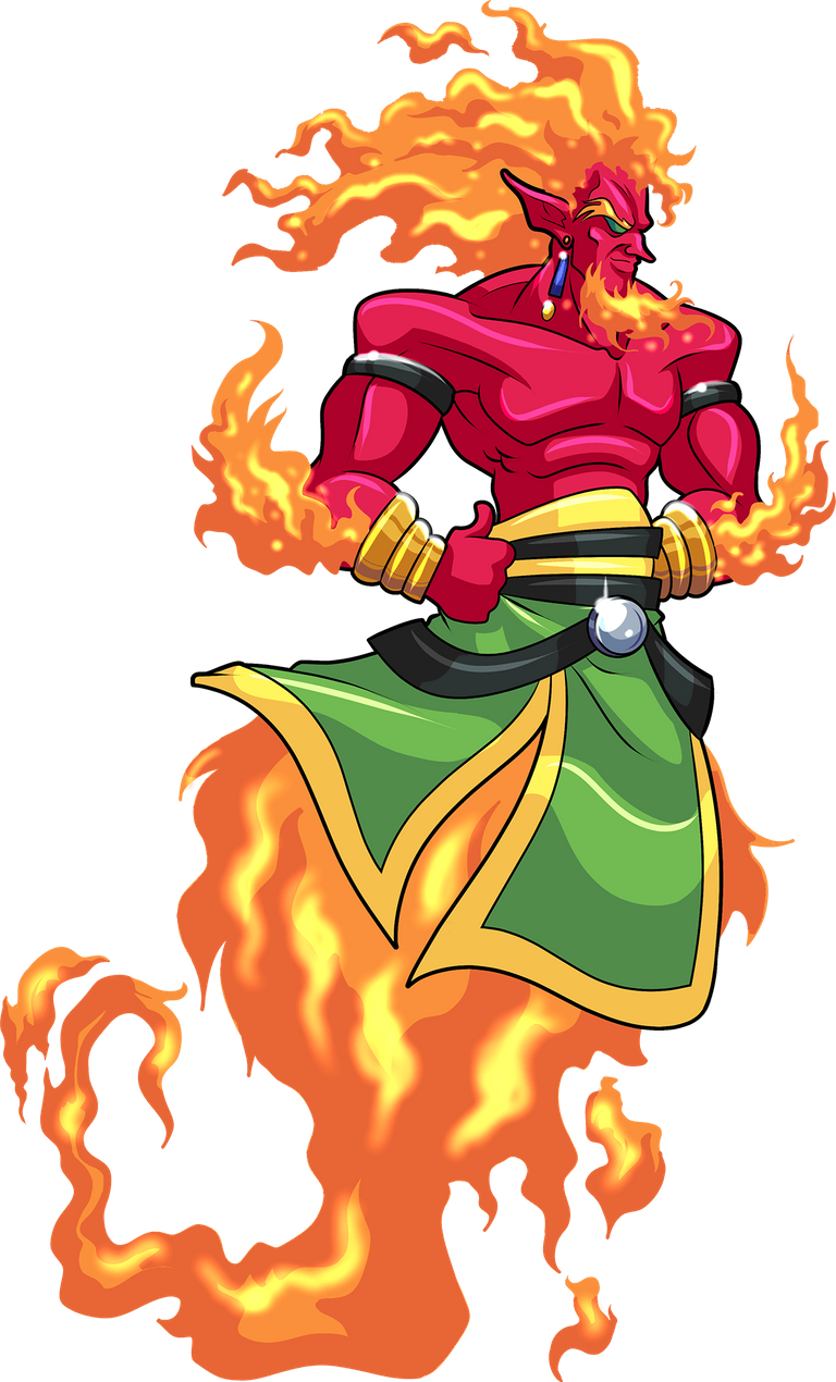
REFERENCE

The illustration and separators used in the post are my property.
Translated with DeepL (free versión)
Contáctenos para saber más del proyecto a nuestro servidor de Discord.
Si deseas delegar HP al proyecto: Delegue 5 HP - Delegue 10 HP - Delegue 20 HP - Delegue 30 HP - Delegue 50 HP - Delegue 100 HP.
Muchas gracias por su apoyo!
What an original way to redesign this character. I really liked it. Excellent!
Thank you very much for your comment my friend, I appreciate it a lot!
Guao!! Pero qué estupendo trabajo! Y chibiiiiiiiiiiiiiiii! Amo los chibi. Es dificil recrear fuego, lo he intentado muchas veces, pero no agarro el toque. Me gustó más tu versión, es más tierna, más linda. Tu proceso habla mucho de la dificultad del personaje y esos brillos, ohhh esas luces, brillos y llamas... demasiado estupendo.
¡¡Muchísimas gracias!! Realmente realizar este personaje fue todo un reto, pero me fue de mucha ayuda no rendirme para terminar lo que había empezado, gracias nuevamente por tú comentario 🙏
Thanks!!
Thanks for sharing! - castleberry#6859

Thank you very much for supporting my work!